- Power BI forums
- Updates
- News & Announcements
- Get Help with Power BI
- Desktop
- Service
- Report Server
- Power Query
- Mobile Apps
- Developer
- DAX Commands and Tips
- Custom Visuals Development Discussion
- Health and Life Sciences
- Power BI Spanish forums
- Translated Spanish Desktop
- Power Platform Integration - Better Together!
- Power Platform Integrations (Read-only)
- Power Platform and Dynamics 365 Integrations (Read-only)
- Training and Consulting
- Instructor Led Training
- Dashboard in a Day for Women, by Women
- Galleries
- Community Connections & How-To Videos
- COVID-19 Data Stories Gallery
- Themes Gallery
- Data Stories Gallery
- R Script Showcase
- Webinars and Video Gallery
- Quick Measures Gallery
- 2021 MSBizAppsSummit Gallery
- 2020 MSBizAppsSummit Gallery
- 2019 MSBizAppsSummit Gallery
- Events
- Ideas
- Custom Visuals Ideas
- Issues
- Issues
- Events
- Upcoming Events
- Community Blog
- Power BI Community Blog
- Custom Visuals Community Blog
- Community Support
- Community Accounts & Registration
- Using the Community
- Community Feedback
Register now to learn Fabric in free live sessions led by the best Microsoft experts. From Apr 16 to May 9, in English and Spanish.
- Power BI forums
- Forums
- Get Help with Power BI
- Desktop
- Re: Line and stacked column chart - Y-axis
- Subscribe to RSS Feed
- Mark Topic as New
- Mark Topic as Read
- Float this Topic for Current User
- Bookmark
- Subscribe
- Printer Friendly Page
- Mark as New
- Bookmark
- Subscribe
- Mute
- Subscribe to RSS Feed
- Permalink
- Report Inappropriate Content
Line and stacked column chart - Y-axis
Hello,
I am trying to do a line and stacked column chart to compare revenue and cost. My axis is month. I am thinking to use the line for revenue, stacked column for costA and costB(costA+costB = total cost). Unfortuntely in some cases the costs can be much higher than revenue. My question is how to make sure the scales of Y-axis for the line and the column are the same so the visualization represents the cost/revenue comparison correctly?
Thanks,
Hui
Solved! Go to Solution.
- Mark as New
- Bookmark
- Subscribe
- Mute
- Subscribe to RSS Feed
- Permalink
- Report Inappropriate Content
@hwan You can do 2 things...
1) Enter start and end values to match the primary axis
OR
2) Turn off the secondary axis
- Mark as New
- Bookmark
- Subscribe
- Mute
- Subscribe to RSS Feed
- Permalink
- Report Inappropriate Content
Can you explain this a little more? There is only one Y-Axis for both the line and column series. Is the issue that the costs are so high as compared to revenue that you effectively see a flat line for revenue? Can you post an image and point out the issue? What would be your preferred outcome?
@ me in replies or I'll lose your thread!!!
Instead of a Kudo, please vote for this idea
Become an expert!: Enterprise DNA
External Tools: MSHGQM
YouTube Channel!: Microsoft Hates Greg
Latest book!: The Definitive Guide to Power Query (M)
DAX is easy, CALCULATE makes DAX hard...
- Mark as New
- Bookmark
- Subscribe
- Mute
- Subscribe to RSS Feed
- Permalink
- Report Inappropriate Content
Sure.
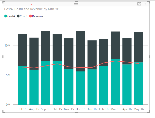
1. this one below has only one Y-axis and the proportion is what I want.
2. This one below has 2 Y-axises and the image is misleading. You can see that in July the total costs is abut $3M vs. $800k revenue while the chart might deliver a quite different impression at first look.
Hope this makes sense,
Hui
- Mark as New
- Bookmark
- Subscribe
- Mute
- Subscribe to RSS Feed
- Permalink
- Report Inappropriate Content
@hwan You can do 2 things...
1) Enter start and end values to match the primary axis
OR
2) Turn off the secondary axis
- Mark as New
- Bookmark
- Subscribe
- Mute
- Subscribe to RSS Feed
- Permalink
- Report Inappropriate Content
I'll be honest, I don't think either of these solutions really resolves it. If you don't show the secondary y axis, the line will appear at the wrong level. If you fix the axis to specific ranges then they are not scalable for when you apply filters etc.
In Tableau you are able to 'synchornize axis', which is the right solution. I don't think this is available in Power BI it seems.
- Mark as New
- Bookmark
- Subscribe
- Mute
- Subscribe to RSS Feed
- Permalink
- Report Inappropriate Content
I experienced the same thing; that my secondary y-axis was still there (invisible) when I turned off the secondary axis and that the line wasn't aligned with the primary y-axis. But in my case it was because I hade set a start value (0) for my secondary axis before turning it off, as opposed to keeping it as Auto. Once I went back to Auto for the start value of the secondary axis it dropped the "invisible" axis and aligned with the primary one.
- Mark as New
- Bookmark
- Subscribe
- Mute
- Subscribe to RSS Feed
- Permalink
- Report Inappropriate Content
Thanks Sean! Didn't know there is an option to turn off the secondary axis.
Helpful resources

Microsoft Fabric Learn Together
Covering the world! 9:00-10:30 AM Sydney, 4:00-5:30 PM CET (Paris/Berlin), 7:00-8:30 PM Mexico City

Power BI Monthly Update - April 2024
Check out the April 2024 Power BI update to learn about new features.

| User | Count |
|---|---|
| 114 | |
| 100 | |
| 81 | |
| 70 | |
| 62 |
| User | Count |
|---|---|
| 148 | |
| 116 | |
| 104 | |
| 90 | |
| 65 |


