- Power BI forums
- Updates
- News & Announcements
- Get Help with Power BI
- Desktop
- Service
- Report Server
- Power Query
- Mobile Apps
- Developer
- DAX Commands and Tips
- Custom Visuals Development Discussion
- Health and Life Sciences
- Power BI Spanish forums
- Translated Spanish Desktop
- Power Platform Integration - Better Together!
- Power Platform Integrations (Read-only)
- Power Platform and Dynamics 365 Integrations (Read-only)
- Training and Consulting
- Instructor Led Training
- Dashboard in a Day for Women, by Women
- Galleries
- Community Connections & How-To Videos
- COVID-19 Data Stories Gallery
- Themes Gallery
- Data Stories Gallery
- R Script Showcase
- Webinars and Video Gallery
- Quick Measures Gallery
- 2021 MSBizAppsSummit Gallery
- 2020 MSBizAppsSummit Gallery
- 2019 MSBizAppsSummit Gallery
- Events
- Ideas
- Custom Visuals Ideas
- Issues
- Issues
- Events
- Upcoming Events
- Community Blog
- Power BI Community Blog
- Custom Visuals Community Blog
- Community Support
- Community Accounts & Registration
- Using the Community
- Community Feedback
Register now to learn Fabric in free live sessions led by the best Microsoft experts. From Apr 16 to May 9, in English and Spanish.
- Power BI forums
- Forums
- Get Help with Power BI
- Desktop
- Line and column chart, Line one two axis
- Subscribe to RSS Feed
- Mark Topic as New
- Mark Topic as Read
- Float this Topic for Current User
- Bookmark
- Subscribe
- Printer Friendly Page
- Mark as New
- Bookmark
- Subscribe
- Mute
- Subscribe to RSS Feed
- Permalink
- Report Inappropriate Content
Line and column chart, Line one two axis
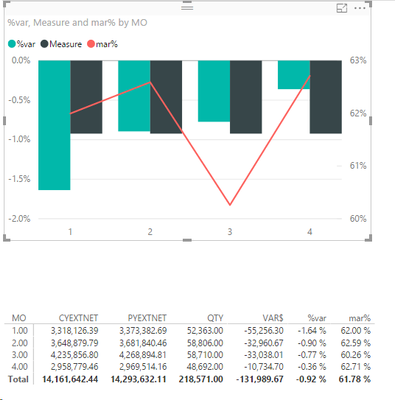
I have created a Line and clustered column chart and i have the columns and lines working correctly except for the measure for the columns i want to change from a column to a line. The measure field is a total average of the %var. I want this to be a line but stay on the column axis. please note that the mar% is on a different axis than measure and %var
Solved! Go to Solution.
- Mark as New
- Bookmark
- Subscribe
- Mute
- Subscribe to RSS Feed
- Permalink
- Report Inappropriate Content
It appears there is currently no way to do this in PowerBI
- Mark as New
- Bookmark
- Subscribe
- Mute
- Subscribe to RSS Feed
- Permalink
- Report Inappropriate Content
It appears there is currently no way to do this in PowerBI
- Mark as New
- Bookmark
- Subscribe
- Mute
- Subscribe to RSS Feed
- Permalink
- Report Inappropriate Content
Hi @nrahn,
Taking into account that both your axis are in percentage if in the Y-Axis options you turn off the secondary axys the visual will be reformated to only use one axis for both columns and lines.
Regards,
MFelix
Regards
Miguel Félix
Did I answer your question? Mark my post as a solution!
Proud to be a Super User!
Check out my blog: Power BI em Português- Mark as New
- Bookmark
- Subscribe
- Mute
- Subscribe to RSS Feed
- Permalink
- Report Inappropriate Content
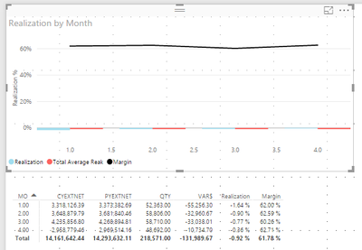
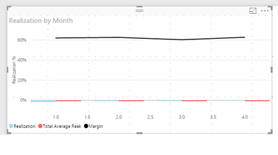
You are correct but this will not work for my solution as the data realistically could be as separate as they are. Columns and total avg in the -% while the margin above +50%. turning off the secondary changes the chart to look like the below.
- Mark as New
- Bookmark
- Subscribe
- Mute
- Subscribe to RSS Feed
- Permalink
- Report Inappropriate Content
Did you try use the star and end to reset the size of you two Y-axis
Regards
Miguel Félix
Did I answer your question? Mark my post as a solution!
Proud to be a Super User!
Check out my blog: Power BI em Português- Mark as New
- Bookmark
- Subscribe
- Mute
- Subscribe to RSS Feed
- Permalink
- Report Inappropriate Content
yes even when changing to my min of realization (-.018 and max of margin (.63) the columns are discernable from each other
- Mark as New
- Bookmark
- Subscribe
- Mute
- Subscribe to RSS Feed
- Permalink
- Report Inappropriate Content
What kind of result you need or want? Because since your data as so much variance between the positive and negative using a single Y-Axis will always give you this chart.
Regards
Miguel Félix
Did I answer your question? Mark my post as a solution!
Proud to be a Super User!
Check out my blog: Power BI em Português- Mark as New
- Bookmark
- Subscribe
- Mute
- Subscribe to RSS Feed
- Permalink
- Report Inappropriate Content
as stated in the original post I want to convert the Total Average Realization field to a line on the same axis as the realization column.
Left Axis (Realization%) (-)2% - 0%
-Realization (column)
-Total Average Realization (line)
Right Axis (Margin %) 60%-63%
-Margin % (line)
- Mark as New
- Bookmark
- Subscribe
- Mute
- Subscribe to RSS Feed
- Permalink
- Report Inappropriate Content
Hi @nrahn,
Sorry but at first I didn't understood wht you needed, Again the questions is the range of values that you use for you information, if your chart was only Clustered columns you add the option to add analytics to it, check this link: https://powerbi.microsoft.com/en-us/documentation/powerbi-desktop-analytics-pane/
However the type of chart you chose only gives trend lines not averages, again I believe that the question you have is related with the difference between your two averages.
Even in excel this would go trough several change in the "standard" charts and selecting wich type of charts correspond to each series of data.
In my opinion the best way would be to separe both visuals doing a visual with the Realization and adding the trend line average and another with realization, ormaybe put the average value or realization in a separate card visual.
For me as a end user it's confusing to have to axis with different scales in all of my years making reports and preparing charts, I have always tried to have the information in the same format in order to have it comparable, it's one of my best practices.
Regards,
MFelix
Regards
Miguel Félix
Did I answer your question? Mark my post as a solution!
Proud to be a Super User!
Check out my blog: Power BI em PortuguêsHelpful resources

Microsoft Fabric Learn Together
Covering the world! 9:00-10:30 AM Sydney, 4:00-5:30 PM CET (Paris/Berlin), 7:00-8:30 PM Mexico City

Power BI Monthly Update - April 2024
Check out the April 2024 Power BI update to learn about new features.

| User | Count |
|---|---|
| 112 | |
| 97 | |
| 85 | |
| 67 | |
| 59 |
| User | Count |
|---|---|
| 150 | |
| 120 | |
| 99 | |
| 87 | |
| 68 |


