- Power BI forums
- Updates
- News & Announcements
- Get Help with Power BI
- Desktop
- Service
- Report Server
- Power Query
- Mobile Apps
- Developer
- DAX Commands and Tips
- Custom Visuals Development Discussion
- Health and Life Sciences
- Power BI Spanish forums
- Translated Spanish Desktop
- Power Platform Integration - Better Together!
- Power Platform Integrations (Read-only)
- Power Platform and Dynamics 365 Integrations (Read-only)
- Training and Consulting
- Instructor Led Training
- Dashboard in a Day for Women, by Women
- Galleries
- Community Connections & How-To Videos
- COVID-19 Data Stories Gallery
- Themes Gallery
- Data Stories Gallery
- R Script Showcase
- Webinars and Video Gallery
- Quick Measures Gallery
- 2021 MSBizAppsSummit Gallery
- 2020 MSBizAppsSummit Gallery
- 2019 MSBizAppsSummit Gallery
- Events
- Ideas
- Custom Visuals Ideas
- Issues
- Issues
- Events
- Upcoming Events
- Community Blog
- Power BI Community Blog
- Custom Visuals Community Blog
- Community Support
- Community Accounts & Registration
- Using the Community
- Community Feedback
Register now to learn Fabric in free live sessions led by the best Microsoft experts. From Apr 16 to May 9, in English and Spanish.
- Power BI forums
- Forums
- Get Help with Power BI
- Desktop
- Line and Stacked column chart
- Subscribe to RSS Feed
- Mark Topic as New
- Mark Topic as Read
- Float this Topic for Current User
- Bookmark
- Subscribe
- Printer Friendly Page
- Mark as New
- Bookmark
- Subscribe
- Mute
- Subscribe to RSS Feed
- Permalink
- Report Inappropriate Content
Line and Stacked column chart
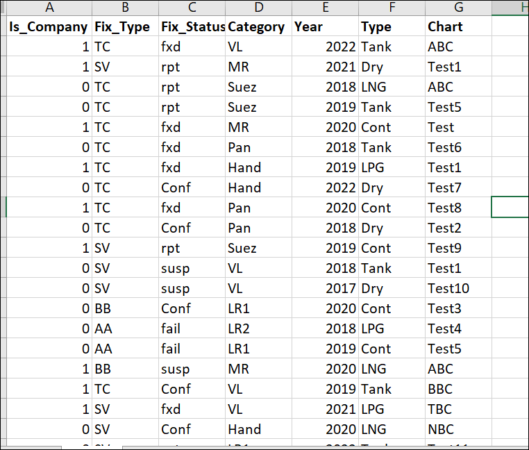
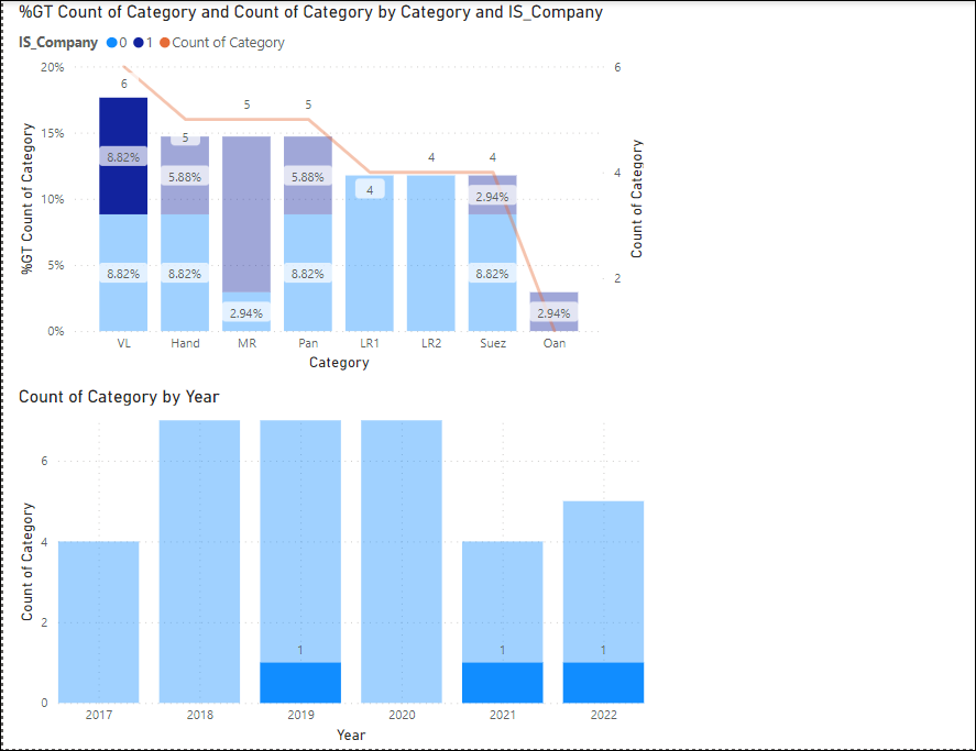
I have to create a 1st chart with the Category on the x-axis and percentage and count on the y-axis. The Bars on the chart needs to be split further into 2 based on the Is_Company field.
I have to create a 2nd chart which will show the data for a specific category yearwise based on the selection on the 1st chart. The Year on the X axis and count on the y-axis for that specific category. So basically the 2nd chart is dependent on the 1st chart and updates when any selection is performed on the 1st charts
I am not able to achieve the 2nd chart functionality and it shows all the category data instead of the one selected on the 1st chart. I am able to achieve this slighlty in a different way by a drilldown into the Is_Company on the x-axis shared with category and then using the tooltip to link it to a different report which is hidden.
Can someone please explain how it can be achieved?
I have attached the sample data and the visualization how it needs to be look like. For ex - in the below visualization screenshot, I have selected the VL category where Is_Company = 1 but in the 2nd chart, it still shows the data for other categories and Is_Company = 1 whereas I would like it to show the count of only the VL category where Is_Company = 1 by year.
- Mark as New
- Bookmark
- Subscribe
- Mute
- Subscribe to RSS Feed
- Permalink
- Report Inappropriate Content
Thanks Sheng and apologies for a delay in response. Can you please provide a sample code for your statement :
"write a measure formula to extract the table 1 selection and compare it with table 2 records, and return the tags to filter on the 'visual level filter' to apply filter effects to achieve the chart interactions."
- Mark as New
- Bookmark
- Subscribe
- Mute
- Subscribe to RSS Feed
- Permalink
- Report Inappropriate Content
HI @rahul9731,
Do these two charts use the same data source? If that is the case, they can't directly achieve the custom filter effect.
I think you need to create a duplicate table without a relationship and use it as the source to create the second chart.
Then you can write a measure formula to extract the table 1 selection and compare it with table 2 records, and return the tags to filter on the 'visual level filter' to apply filter effects to achieve the chart interactions.
Regards,
Xiaoxin Sheng
If this post helps, please consider accept as solution to help other members find it more quickly.
Helpful resources

Microsoft Fabric Learn Together
Covering the world! 9:00-10:30 AM Sydney, 4:00-5:30 PM CET (Paris/Berlin), 7:00-8:30 PM Mexico City

Power BI Monthly Update - April 2024
Check out the April 2024 Power BI update to learn about new features.

| User | Count |
|---|---|
| 118 | |
| 107 | |
| 69 | |
| 68 | |
| 43 |
| User | Count |
|---|---|
| 148 | |
| 104 | |
| 102 | |
| 89 | |
| 66 |


