- Power BI forums
- Updates
- News & Announcements
- Get Help with Power BI
- Desktop
- Service
- Report Server
- Power Query
- Mobile Apps
- Developer
- DAX Commands and Tips
- Custom Visuals Development Discussion
- Health and Life Sciences
- Power BI Spanish forums
- Translated Spanish Desktop
- Power Platform Integration - Better Together!
- Power Platform Integrations (Read-only)
- Power Platform and Dynamics 365 Integrations (Read-only)
- Training and Consulting
- Instructor Led Training
- Dashboard in a Day for Women, by Women
- Galleries
- Community Connections & How-To Videos
- COVID-19 Data Stories Gallery
- Themes Gallery
- Data Stories Gallery
- R Script Showcase
- Webinars and Video Gallery
- Quick Measures Gallery
- 2021 MSBizAppsSummit Gallery
- 2020 MSBizAppsSummit Gallery
- 2019 MSBizAppsSummit Gallery
- Events
- Ideas
- Custom Visuals Ideas
- Issues
- Issues
- Events
- Upcoming Events
- Community Blog
- Power BI Community Blog
- Custom Visuals Community Blog
- Community Support
- Community Accounts & Registration
- Using the Community
- Community Feedback
Register now to learn Fabric in free live sessions led by the best Microsoft experts. From Apr 16 to May 9, in English and Spanish.
- Power BI forums
- Forums
- Get Help with Power BI
- Desktop
- Line and Stacked Column chart - hide specific data...
- Subscribe to RSS Feed
- Mark Topic as New
- Mark Topic as Read
- Float this Topic for Current User
- Bookmark
- Subscribe
- Printer Friendly Page
- Mark as New
- Bookmark
- Subscribe
- Mute
- Subscribe to RSS Feed
- Permalink
- Report Inappropriate Content
Line and Stacked Column chart - hide specific data points
Hi
Is there a way within a line and stacked column chart to hide some of the data (in this case, the bars) so I'm only showing the oldest and the latest data points
Here's what I have
Here's what I'd like to achieve
Any help would be appreciated.
Thanks
Solved! Go to Solution.
- Mark as New
- Bookmark
- Subscribe
- Mute
- Subscribe to RSS Feed
- Permalink
- Report Inappropriate Content
Hi, @aaronvincentnz ;
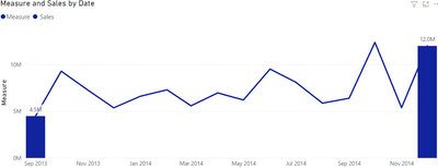
Such as Pragati11 said, however One thing is different, what I'm establishing here is the values of the earliest and latest dates.
Measure =
var _max=CALCULATE(MAX('financials'[Date]),ALL(financials))
var _min=CALCULATE(min('financials'[Date]),ALL(financials))
return CALCULATE(SUM(financials[ Sales]),FILTER('financials',[Date] in {_max,_min}))
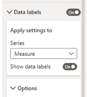
Then change the data label.(close line's label and retain column's)
The final show:
Best Regards,
Community Support Team _ Yalan Wu
If this post helps, then please consider Accept it as the solution to help the other members find it more quickly.
- Mark as New
- Bookmark
- Subscribe
- Mute
- Subscribe to RSS Feed
- Permalink
- Report Inappropriate Content
managed to get it to work. thanks all
- Mark as New
- Bookmark
- Subscribe
- Mute
- Subscribe to RSS Feed
- Permalink
- Report Inappropriate Content
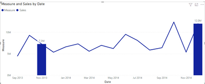
Hi, @aaronvincentnz ;
Try it.
Measure =
var _max=EOMONTH( CALCULATE(MAX('financials'[Date]),ALLSELECTED(financials)),0)
var _min=EOMONTH(_max,-13)
return CALCULATE(SUM(financials[ Sales]),FILTER('financials', EOMONTH([Date],0) in {_max,_min}))
The final show:
If the above one can't help you get the desired result, please provide some sample data in your tables (exclude sensitive data) with Text format and your expected result with backend logic and special examples. It is better if you can share a simplified pbix file. You can refer the following link to upload the file to the community. Thank you.
How to upload PBI in Community
Best Regards,
Community Support Team _ Yalan Wu
If this post helps, then please consider Accept it as the solution to help the other members find it more quickly.
- Mark as New
- Bookmark
- Subscribe
- Mute
- Subscribe to RSS Feed
- Permalink
- Report Inappropriate Content
Hi, @aaronvincentnz ;
Such as Pragati11 said, however One thing is different, what I'm establishing here is the values of the earliest and latest dates.
Measure =
var _max=CALCULATE(MAX('financials'[Date]),ALL(financials))
var _min=CALCULATE(min('financials'[Date]),ALL(financials))
return CALCULATE(SUM(financials[ Sales]),FILTER('financials',[Date] in {_max,_min}))
Then change the data label.(close line's label and retain column's)
The final show:
Best Regards,
Community Support Team _ Yalan Wu
If this post helps, then please consider Accept it as the solution to help the other members find it more quickly.
- Mark as New
- Bookmark
- Subscribe
- Mute
- Subscribe to RSS Feed
- Permalink
- Report Inappropriate Content
Thanks for the above. It partially worked....
- for some reason, the line is not displaying (i've checked the various axis to make sure what's meant to be 'on' is on)
- I'm wanting to chart a set date range, basically the last 13 months (e.g. aug 21 to aug 22), but when I change this, the 'min' data point disappears (I guess because the formula is taking the oldest date in the entire file as opposed to the oldest date that I want to chart)
- For some reason, I don't have the FX option within the column sections when it comes to change the columns to 'white' (to hide them)
- Mark as New
- Bookmark
- Subscribe
- Mute
- Subscribe to RSS Feed
- Permalink
- Report Inappropriate Content
HI @aaronvincentnz ,
This can be achieved by a little hack in Power BI. There can be multiple ways of achieving this, but this is what I found out as a solution to this problem.
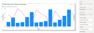
Consider the following example chart:
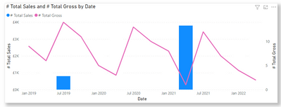
Now in this chart, I want to display bars for only MIN and MAX sales value but the line should be there for everything.
I created a following DAX measures.
Max sales & Min sales measures for sales. I want my sales to change with YEAR column therefore an ALLEXCEPT is used. You can ignore it in your case.
# Max Sales = MAXX(ALLEXCEPT(Sales, Sales[Year]), [# Total Sales])# Min Sales = MINX(ALLEXCEPT(Sales, Sales[Year]), [# Total Sales])
# Sales Dynamic display Max Min Bars =
IF(
    [# Total Sales] = [# Max Sales] || [# Total Sales] = [# Min Sales] , "#118DFF", // show BLUE color for the bars
    "#FFFFFF" // show WHITE color for bars (this should be your visual background color)
)
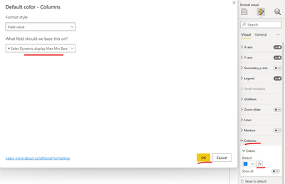
Now I go to my visual formatting settings and use this measure for formatting on bars:
After hitting ok I get the desired result:
Now the chart shows lines for all the points, but the bars for only min and max values.
The trick here is to give your other bars on the chart same color as your visual background by using the measure calculation.
Let me know if this solution helps.
Helpful resources

Microsoft Fabric Learn Together
Covering the world! 9:00-10:30 AM Sydney, 4:00-5:30 PM CET (Paris/Berlin), 7:00-8:30 PM Mexico City

Power BI Monthly Update - April 2024
Check out the April 2024 Power BI update to learn about new features.

| User | Count |
|---|---|
| 117 | |
| 105 | |
| 69 | |
| 67 | |
| 43 |
| User | Count |
|---|---|
| 151 | |
| 103 | |
| 102 | |
| 87 | |
| 63 |


