- Power BI forums
- Updates
- News & Announcements
- Get Help with Power BI
- Desktop
- Service
- Report Server
- Power Query
- Mobile Apps
- Developer
- DAX Commands and Tips
- Custom Visuals Development Discussion
- Health and Life Sciences
- Power BI Spanish forums
- Translated Spanish Desktop
- Power Platform Integration - Better Together!
- Power Platform Integrations (Read-only)
- Power Platform and Dynamics 365 Integrations (Read-only)
- Training and Consulting
- Instructor Led Training
- Dashboard in a Day for Women, by Women
- Galleries
- Community Connections & How-To Videos
- COVID-19 Data Stories Gallery
- Themes Gallery
- Data Stories Gallery
- R Script Showcase
- Webinars and Video Gallery
- Quick Measures Gallery
- 2021 MSBizAppsSummit Gallery
- 2020 MSBizAppsSummit Gallery
- 2019 MSBizAppsSummit Gallery
- Events
- Ideas
- Custom Visuals Ideas
- Issues
- Issues
- Events
- Upcoming Events
- Community Blog
- Power BI Community Blog
- Custom Visuals Community Blog
- Community Support
- Community Accounts & Registration
- Using the Community
- Community Feedback
Register now to learn Fabric in free live sessions led by the best Microsoft experts. From Apr 16 to May 9, in English and Spanish.
- Power BI forums
- Forums
- Get Help with Power BI
- Desktop
- Re: Line and Stacked Column Chart - Tableau to Pow...
- Subscribe to RSS Feed
- Mark Topic as New
- Mark Topic as Read
- Float this Topic for Current User
- Bookmark
- Subscribe
- Printer Friendly Page
- Mark as New
- Bookmark
- Subscribe
- Mute
- Subscribe to RSS Feed
- Permalink
- Report Inappropriate Content
Line and Stacked Column Chart - Tableau to Power BI Migration
Hi Experts,
I am migrating one of the existing Tableau dashboard to Power BI and stuck with below. I need to develop the same visual in Power BI. Could you pls help?
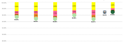
Tableau Visual:
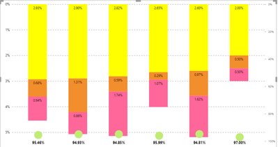
I am able to achieve below but couldn't get the line bubble at the tip of every bar as in Tableau. Please note, the column values and line values are using different measures. Could you pls advise if exactly similar thing can be achieved in Power Bi?
Solved! Go to Solution.
- Mark as New
- Bookmark
- Subscribe
- Mute
- Subscribe to RSS Feed
- Permalink
- Report Inappropriate Content
Hi @Anonymous
I created a pbix file the same as the image @AlexisOlson provided.
Pbix file in the end.
Best Regards
Community Support Team _ chenwu zhu
If this post helps, then please consider Accept them as the solutions to help the other members find it more quickly.
- Mark as New
- Bookmark
- Subscribe
- Mute
- Subscribe to RSS Feed
- Permalink
- Report Inappropriate Content
Try turning off the secondary y-axis (under the Format pane) so that both columns and dots are plotted on the same scale.
- Mark as New
- Bookmark
- Subscribe
- Mute
- Subscribe to RSS Feed
- Permalink
- Report Inappropriate Content
As advised, I have turned off the secondary y-axis, but it didn't solve the problem. Please note, the column and line values are different for each category.
- Mark as New
- Bookmark
- Subscribe
- Mute
- Subscribe to RSS Feed
- Permalink
- Report Inappropriate Content
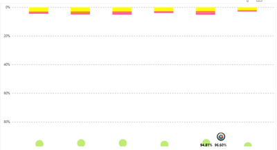
Ah, I think I get it now.
I don't think it's currently possible to have a regular and inverted axis on the same chart. The closest you could get would probably be with some "cheating" using white columns and extra dimensions and putting them on the same axis like this (too hacky for me to describe in more detail):
- Mark as New
- Bookmark
- Subscribe
- Mute
- Subscribe to RSS Feed
- Permalink
- Report Inappropriate Content
@AlexisOlson Thanks for the hint! Could you please share a sample pbix for the above solution you mentioned?
- Mark as New
- Bookmark
- Subscribe
- Mute
- Subscribe to RSS Feed
- Permalink
- Report Inappropriate Content
Hi @Anonymous
I created a pbix file the same as the image @AlexisOlson provided.
Pbix file in the end.
Best Regards
Community Support Team _ chenwu zhu
If this post helps, then please consider Accept them as the solutions to help the other members find it more quickly.
- Mark as New
- Bookmark
- Subscribe
- Mute
- Subscribe to RSS Feed
- Permalink
- Report Inappropriate Content
- Mark as New
- Bookmark
- Subscribe
- Mute
- Subscribe to RSS Feed
- Permalink
- Report Inappropriate Content
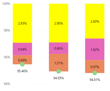
The file got lost but I plotted data that looked like this:
Where the "Green" bar is colored white and the line included only the "Green" values.
Helpful resources

Microsoft Fabric Learn Together
Covering the world! 9:00-10:30 AM Sydney, 4:00-5:30 PM CET (Paris/Berlin), 7:00-8:30 PM Mexico City

Power BI Monthly Update - April 2024
Check out the April 2024 Power BI update to learn about new features.

| User | Count |
|---|---|
| 115 | |
| 100 | |
| 88 | |
| 68 | |
| 61 |
| User | Count |
|---|---|
| 152 | |
| 120 | |
| 102 | |
| 87 | |
| 68 |


