- Power BI forums
- Updates
- News & Announcements
- Get Help with Power BI
- Desktop
- Service
- Report Server
- Power Query
- Mobile Apps
- Developer
- DAX Commands and Tips
- Custom Visuals Development Discussion
- Health and Life Sciences
- Power BI Spanish forums
- Translated Spanish Desktop
- Power Platform Integration - Better Together!
- Power Platform Integrations (Read-only)
- Power Platform and Dynamics 365 Integrations (Read-only)
- Training and Consulting
- Instructor Led Training
- Dashboard in a Day for Women, by Women
- Galleries
- Community Connections & How-To Videos
- COVID-19 Data Stories Gallery
- Themes Gallery
- Data Stories Gallery
- R Script Showcase
- Webinars and Video Gallery
- Quick Measures Gallery
- 2021 MSBizAppsSummit Gallery
- 2020 MSBizAppsSummit Gallery
- 2019 MSBizAppsSummit Gallery
- Events
- Ideas
- Custom Visuals Ideas
- Issues
- Issues
- Events
- Upcoming Events
- Community Blog
- Power BI Community Blog
- Custom Visuals Community Blog
- Community Support
- Community Accounts & Registration
- Using the Community
- Community Feedback
Register now to learn Fabric in free live sessions led by the best Microsoft experts. From Apr 16 to May 9, in English and Spanish.
- Power BI forums
- Forums
- Get Help with Power BI
- Desktop
- Line and Stacked Column Chart - Display Total with...
- Subscribe to RSS Feed
- Mark Topic as New
- Mark Topic as Read
- Float this Topic for Current User
- Bookmark
- Subscribe
- Printer Friendly Page
- Mark as New
- Bookmark
- Subscribe
- Mute
- Subscribe to RSS Feed
- Permalink
- Report Inappropriate Content
Line and Stacked Column Chart - Display Total with quarter series
I'm struggle with getting this to work as I hope and am wondering if someone can provide a littel insight.
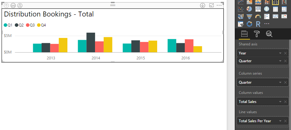
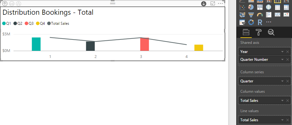
I have the following Line and Stacked Column Chart
The issue is when I add Total Sales YTD to the Line Values the line isn't drawn showing the total sales per year: (stays the same as above)
But if I remove the Quarter column series than it works as expected although not what I'm after:
I am trying to show sales per quarter per year, with the line showing the total sales per year. I thought I could use the same measure but perhaps not? The measure is defined as:
Total Sales YTD = SUMX('Table1', 'Table1'[Unit Price]* 'Table1'[Quantity])
Any suggestions?
Solved! Go to Solution.
- Mark as New
- Bookmark
- Subscribe
- Mute
- Subscribe to RSS Feed
- Permalink
- Report Inappropriate Content
Hi @Promethes_2
>>The issue is when I add Total Sales YTD to the Line Values the line isn't drawn showing the total sales per year.
There are four values according to each quarter when you add Total Sales YTD. It’s confusing to match which value when draw the line. So the line isn't drawn showing the total sales per year.
>> But if I remove the Quarter column series than it works as expected although not what I'm after.
The total is not categorized by quarter when you remove the Quarter column series. There is one value based on each year, and drawing line works.
For your issue, please refer to the following solution.
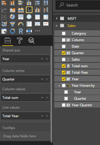
First, you’d better to create a column which returns the year and quarter of the date in table. Then you create a another column to calculate the total sum of each year using the formulas below.
Year-Quarter = CONCATENATE(YEAR(Sales[Date]),CONCATENATE("Q",ROUNDUP(MONTH([Date])/3,0)))
Total-Year = CALCULATE(SUM(Sales[Sales]),ALLEXCEPT(Sales,Sales[Year]))
Finally, drag the Year-Quarter from fields to Line values when you create a Line and Stacked Column Chart. The value in each year is same, so you can select the Max or Min(the result is same) to summarize the line value avoid using Sum. You will get the expected result like the following screenshot.
If this is not what you want, please share us more details or the sample date for further analysis.
Best Regards,
Angelia
- Mark as New
- Bookmark
- Subscribe
- Mute
- Subscribe to RSS Feed
- Permalink
- Report Inappropriate Content
There were two issues I discovered:
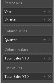
1. If I use Quarter defined as: "Quarter", "Q" & FORMAT([Date], "Q" ) in the Shared Axis (Year, Quarter) the line does not render:
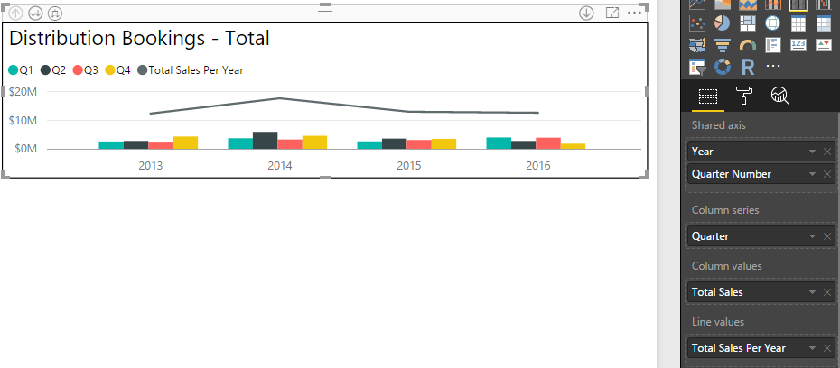
2. If I defined Quarter as: "Quarter Number", FORMAT([Date], "Q" ) then the line will draw:
3. Your measure shows total sales per year (which is what I was after), my measure shows total sales per year which filters to total sales per quarter and when drilled (which is not what I wanted). Thank you for this.
This is what drilling down on 2016 looked like with my measure:
This is what drilling down on 2016 looked like with your measure (which is better):
- Mark as New
- Bookmark
- Subscribe
- Mute
- Subscribe to RSS Feed
- Permalink
- Report Inappropriate Content
Hi @Promethes_21.
1.what the difference between quarter and Quarter number shown in field of first and second picture?
2. In the Shared axis, you add the Year and Quarter number, so it drill down. Please remove the Quarter number just leave Year in shared axis, you will get the expected result.
Thanks,Angelia
- Mark as New
- Bookmark
- Subscribe
- Mute
- Subscribe to RSS Feed
- Permalink
- Report Inappropriate Content

1. The difference between Quarter and Quarter number is that Quarter is displayed like this: Q1 while Quarter number is displayed like this: 1.
2. If I remove Quarter number in the Shared axis I lose the ability to drill down which is what I desire. If I create a hierarchy with Year/Quarter or Year/Quarter Number I lose the ability to display the drill down as Q1, Q2, Q3, Q4.
Example 1:
When I drill down the bar is off center and the X axis displays as 1 (Quarter Number). I am trying to get it to display as Q1 (Quarter). With your measure the sales line shows total sales for the year which is what I was after:
If I change the shared Axis to Year/Quarter and then use Quarter as the column series I get an error:
I am trying to get it to display so that the column series shows as Q1, Q2 ect and the shared Axis shows as Q1, Q2 ect. I have a calendar table with the dates (Year, Quarter) that is linked to the Sales table. The Shared Axis values and Column series values are all coming from the Calendar table. While the Column values and Line Values are coming from the Sales table.
Helpful resources

Microsoft Fabric Learn Together
Covering the world! 9:00-10:30 AM Sydney, 4:00-5:30 PM CET (Paris/Berlin), 7:00-8:30 PM Mexico City

Power BI Monthly Update - April 2024
Check out the April 2024 Power BI update to learn about new features.

| User | Count |
|---|---|
| 113 | |
| 97 | |
| 85 | |
| 70 | |
| 61 |
| User | Count |
|---|---|
| 151 | |
| 121 | |
| 104 | |
| 87 | |
| 67 |

