- Power BI forums
- Updates
- News & Announcements
- Get Help with Power BI
- Desktop
- Service
- Report Server
- Power Query
- Mobile Apps
- Developer
- DAX Commands and Tips
- Custom Visuals Development Discussion
- Health and Life Sciences
- Power BI Spanish forums
- Translated Spanish Desktop
- Power Platform Integration - Better Together!
- Power Platform Integrations (Read-only)
- Power Platform and Dynamics 365 Integrations (Read-only)
- Training and Consulting
- Instructor Led Training
- Dashboard in a Day for Women, by Women
- Galleries
- Community Connections & How-To Videos
- COVID-19 Data Stories Gallery
- Themes Gallery
- Data Stories Gallery
- R Script Showcase
- Webinars and Video Gallery
- Quick Measures Gallery
- 2021 MSBizAppsSummit Gallery
- 2020 MSBizAppsSummit Gallery
- 2019 MSBizAppsSummit Gallery
- Events
- Ideas
- Custom Visuals Ideas
- Issues
- Issues
- Events
- Upcoming Events
- Community Blog
- Power BI Community Blog
- Custom Visuals Community Blog
- Community Support
- Community Accounts & Registration
- Using the Community
- Community Feedback
Register now to learn Fabric in free live sessions led by the best Microsoft experts. From Apr 16 to May 9, in English and Spanish.
- Power BI forums
- Forums
- Get Help with Power BI
- Desktop
- Line and Clustered column chart - works in Excel, ...
- Subscribe to RSS Feed
- Mark Topic as New
- Mark Topic as Read
- Float this Topic for Current User
- Bookmark
- Subscribe
- Printer Friendly Page
- Mark as New
- Bookmark
- Subscribe
- Mute
- Subscribe to RSS Feed
- Permalink
- Report Inappropriate Content
Line and Clustered column chart - works in Excel, not in PowerBI
Hi all,
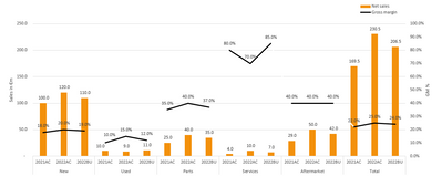
currently converting our Excel-reports to PowerBI-reports. Now I know not everything can be translated one-on-one, but I currently have this chart in Excel which I would really like to translate as good as possible:
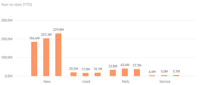
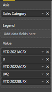
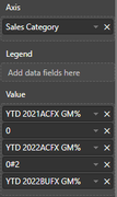
I've managed to recreate the bar-part of this chart quite easily using a 'Clustered column chart' (different figures due to outdated data inside PBI at the moment) - I've added the settings I've used in the 'Visualizations'-part of the chart as well.
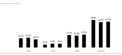
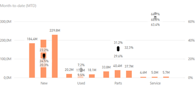
I've managed to create the % as well (three seperate measures), so like this:
However: how can I combine these in one chart (or two charts with one behind the other)? I've tried turning the chart into a 'Line and clustered column chart', but somehow it ignores the 'Sales Category' for the markers and groups them together:
My second idea was to put the %-chart 'behind' the value-chart and make the columns completely transparent. I can't seem to make the columns transparent though, only a 'full' color, so this didn't work either.
Does anybody have an idea on how to achieve somethings like the image from Excel in PowerBI?
Thanks for any help!
- Mark as New
- Bookmark
- Subscribe
- Mute
- Subscribe to RSS Feed
- Permalink
- Report Inappropriate Content
@Anonymous , I doubt the line can break. But You can try Line Clustered bar visual with Sorted Axis and Concatenate label off
Concatenate Label off : https://youtu.be/QgI0vIGIOOk
Microsoft Power BI Learning Resources, 2023 !!
Learn Power BI - Full Course with Dec-2022, with Window, Index, Offset, 100+ Topics !!
Did I answer your question? Mark my post as a solution! Appreciate your Kudos !! Proud to be a Super User! !!
- Mark as New
- Bookmark
- Subscribe
- Mute
- Subscribe to RSS Feed
- Permalink
- Report Inappropriate Content
Thanks for the reaction.
I tried switching the 'Concatenate'-label off as suggested, but sadly nothing changed...
I agree with you that it's probably not possible to 'break' the line - that's why I attempted to turn them into markers, but sadly those operate similar to a line for most purposes...
Helpful resources

Microsoft Fabric Learn Together
Covering the world! 9:00-10:30 AM Sydney, 4:00-5:30 PM CET (Paris/Berlin), 7:00-8:30 PM Mexico City

Power BI Monthly Update - April 2024
Check out the April 2024 Power BI update to learn about new features.

| User | Count |
|---|---|
| 107 | |
| 93 | |
| 77 | |
| 65 | |
| 53 |
| User | Count |
|---|---|
| 147 | |
| 106 | |
| 104 | |
| 87 | |
| 61 |
