- Power BI forums
- Updates
- News & Announcements
- Get Help with Power BI
- Desktop
- Service
- Report Server
- Power Query
- Mobile Apps
- Developer
- DAX Commands and Tips
- Custom Visuals Development Discussion
- Health and Life Sciences
- Power BI Spanish forums
- Translated Spanish Desktop
- Power Platform Integration - Better Together!
- Power Platform Integrations (Read-only)
- Power Platform and Dynamics 365 Integrations (Read-only)
- Training and Consulting
- Instructor Led Training
- Dashboard in a Day for Women, by Women
- Galleries
- Community Connections & How-To Videos
- COVID-19 Data Stories Gallery
- Themes Gallery
- Data Stories Gallery
- R Script Showcase
- Webinars and Video Gallery
- Quick Measures Gallery
- 2021 MSBizAppsSummit Gallery
- 2020 MSBizAppsSummit Gallery
- 2019 MSBizAppsSummit Gallery
- Events
- Ideas
- Custom Visuals Ideas
- Issues
- Issues
- Events
- Upcoming Events
- Community Blog
- Power BI Community Blog
- Custom Visuals Community Blog
- Community Support
- Community Accounts & Registration
- Using the Community
- Community Feedback
Register now to learn Fabric in free live sessions led by the best Microsoft experts. From Apr 16 to May 9, in English and Spanish.
- Power BI forums
- Forums
- Get Help with Power BI
- Desktop
- Line and Clustered column chart issue
- Subscribe to RSS Feed
- Mark Topic as New
- Mark Topic as Read
- Float this Topic for Current User
- Bookmark
- Subscribe
- Printer Friendly Page
- Mark as New
- Bookmark
- Subscribe
- Mute
- Subscribe to RSS Feed
- Permalink
- Report Inappropriate Content
Line and Clustered column chart issue
Hello all,
I have been struggling to manipulate the lines in a line and clustered column chart in my work and largely attribute this to lacking an option of not sumarizing the line values (which in most field settings you can) and therefore i have been stuck setting up my data to sum.
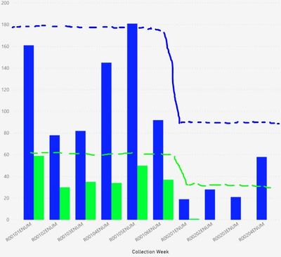
Anyways, my work requires target lines that vary according to which block/cycle of weeks i am observing. I have 2 seperate cycles (1 with 6 weeks and another with 4 weeks, both with different target values) which i have been able to distinguish using filters. However, i am required to now show both cycles at the same time on an x-axis and the line values become summarized, meanwhile i need them to be relevant specifically to each cycle.
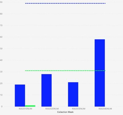
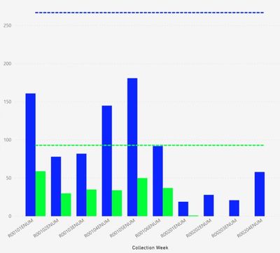
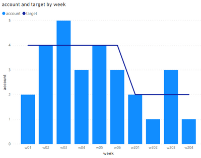
I hope this makes sense but if not the screen shots below should explain what i am aiming for. The first is showing cycle 1, the second screenshot is of cycle 2, the third screenshot shows when cycle 1 and 2 are being aggregated but the line values are being summarized and then screen shot 4 indicates what i am aiming for. I have been dabling with various measures and approaches to fix this but would really appreciate some help.
Thanks, Pat.
- Mark as New
- Bookmark
- Subscribe
- Mute
- Subscribe to RSS Feed
- Permalink
- Report Inappropriate Content
Hi @pat_b ,
Could you please share some sample data to me if you don't have any Confidential Information?
I wonder if they are in the same table or different tables and what's the table structure like.
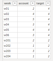
Maybe you can refer to the below table:
Best Regards,
Jay
Community Support Team _ Jay Wang
If this post helps, then please consider Accept it as the solution to help the other members find it more quickly.
If this post helps, then please consider Accept it as the solution to help the other members find it.
- Mark as New
- Bookmark
- Subscribe
- Mute
- Subscribe to RSS Feed
- Permalink
- Report Inappropriate Content
Hi Jay,
Thanks for your response.
Unfortunately this data is confidential, and for now would like to try and talk this out if possible. I can expand that i am basically filtering a large dataset with individual respondents by City, which can consist of one or many neighbourhoods of data, and have two different weekly blocks i need to trend the data by (my x-axis) that have different targets.
I have multiple tables for this work but i have also merged all the tables together using merged queries to try and have everything setup in one table like you have shown in your example. (I have triple checked that when the merge is performed that all the data lines up and is matched properly). Each individual response has week, cycle, targets, etc.
The only time i was able to get the target line to behave the way i need was setting the line value to a 'maximum' or 'minimum' condition rather than sum. When using sum it would add up all my entries and have values in the high thousands range, likely because my table is massive and filled with individual respondents which appears to add the same target value X amount of times. Lets say in your example you had more entries with many duplicates of weeks in the data, how would you be able to have the target stay the same without adding them all together?
My approach of min or max also doesnt work fully because i have instances where certain cities have multiple neighbourhoods of data and then would only display data for either the min or max targets of one neighbourhood rather than all of them.
It does appear to be more of an issue with how the data is structured but i also have a hunch it could be due to a limitation of the lines on this type of chart.
I wonder if a measure could be used as a work around to have distinct values that can be filtered by a condition of cycle and display that on the line without summarizing them for every weeks entry.
Sorry if this is confusing, the dataset has many factors within it and makes something as simple as a target line much more complex. Let me know if i can provide any other info to clarify or help find a solution
Thanks,
Pat
Helpful resources

Microsoft Fabric Learn Together
Covering the world! 9:00-10:30 AM Sydney, 4:00-5:30 PM CET (Paris/Berlin), 7:00-8:30 PM Mexico City

Power BI Monthly Update - April 2024
Check out the April 2024 Power BI update to learn about new features.

| User | Count |
|---|---|
| 107 | |
| 100 | |
| 78 | |
| 64 | |
| 58 |
| User | Count |
|---|---|
| 148 | |
| 113 | |
| 97 | |
| 84 | |
| 67 |

