- Power BI forums
- Updates
- News & Announcements
- Get Help with Power BI
- Desktop
- Service
- Report Server
- Power Query
- Mobile Apps
- Developer
- DAX Commands and Tips
- Custom Visuals Development Discussion
- Health and Life Sciences
- Power BI Spanish forums
- Translated Spanish Desktop
- Power Platform Integration - Better Together!
- Power Platform Integrations (Read-only)
- Power Platform and Dynamics 365 Integrations (Read-only)
- Training and Consulting
- Instructor Led Training
- Dashboard in a Day for Women, by Women
- Galleries
- Community Connections & How-To Videos
- COVID-19 Data Stories Gallery
- Themes Gallery
- Data Stories Gallery
- R Script Showcase
- Webinars and Video Gallery
- Quick Measures Gallery
- 2021 MSBizAppsSummit Gallery
- 2020 MSBizAppsSummit Gallery
- 2019 MSBizAppsSummit Gallery
- Events
- Ideas
- Custom Visuals Ideas
- Issues
- Issues
- Events
- Upcoming Events
- Community Blog
- Power BI Community Blog
- Custom Visuals Community Blog
- Community Support
- Community Accounts & Registration
- Using the Community
- Community Feedback
Register now to learn Fabric in free live sessions led by the best Microsoft experts. From Apr 16 to May 9, in English and Spanish.
- Power BI forums
- Forums
- Get Help with Power BI
- Desktop
- Line Graph has dots?
- Subscribe to RSS Feed
- Mark Topic as New
- Mark Topic as Read
- Float this Topic for Current User
- Bookmark
- Subscribe
- Printer Friendly Page
- Mark as New
- Bookmark
- Subscribe
- Mute
- Subscribe to RSS Feed
- Permalink
- Report Inappropriate Content
Line Graph has dots?
I am using Power BI Desktop and am trying to create a line chart with varying interval durations. The interval durations are the way they are for a reason.
However, the line chart is not connecting the dots as I want it to. I am guessing it is because they are different interval durations along the x axis. Is there a way to get around this without having to change my data source? Like I said, the interval durations are the way they are for a reason.
Here is a OneDrive link to the data source if you can use OneDrive.
https://onedrive.live.com/view.aspx?resid=C2D8F82CECEA928%21696&id=documents
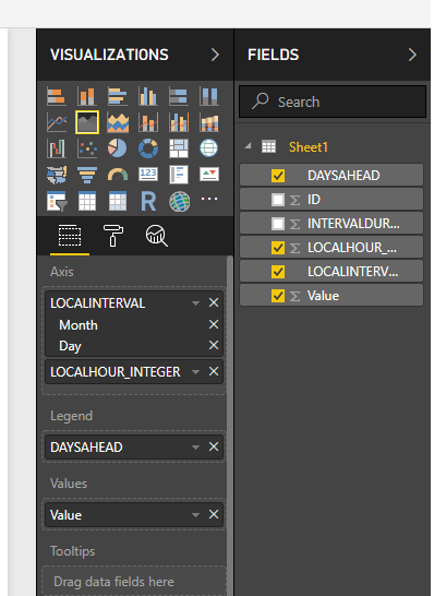
Just upload that to a new .pbix file and create the graph using the following settings:
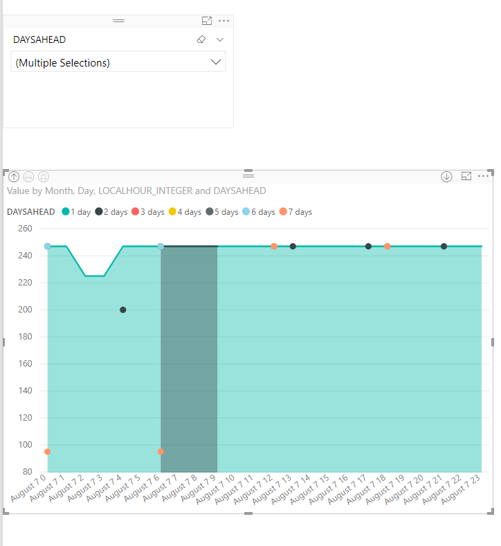
The graph produced is shown below:
As you can see, the graph above has a line graph with dots on it because of varying interval durations.
I would like to be able to have a line graph with lines using the data from the graph with varying interval durations. Like I asked, is there a way to do this without having to change my data source?
- Mark as New
- Bookmark
- Subscribe
- Mute
- Subscribe to RSS Feed
- Permalink
- Report Inappropriate Content
What structure is your data in as I cant replicate the issue
- Mark as New
- Bookmark
- Subscribe
- Mute
- Subscribe to RSS Feed
- Permalink
- Report Inappropriate Content
The data structure (type?) for each column is shown below:
LOCALINTERVAL | LOCALHOUR_INTEGER | DAYSAHEAD | INTERVALDURATION | ID | VALUE |
Date/Time | Whole Number | Text | Whole Number | Whole Number | Whole Number |
- Mark as New
- Bookmark
- Subscribe
- Mute
- Subscribe to RSS Feed
- Permalink
- Report Inappropriate Content
I meant more about if you have a wide or narrow table for example.
Is each value for a dateime its own row so that you have multiple rows for each datetime or are all items for one datetime on the same row with each value having its own column
- Mark as New
- Bookmark
- Subscribe
- Mute
- Subscribe to RSS Feed
- Permalink
- Report Inappropriate Content
My data table is structured as a wide table. The “Values” are all the same measurement/unit.
So for example, for “LocalInterval” 8/7/2018 12:00 AM, I have “Values”: 95 (1 row) and 247 (6 rows), one for each “Days Ahead” category for that interval.
- Mark as New
- Bookmark
- Subscribe
- Mute
- Subscribe to RSS Feed
- Permalink
- Report Inappropriate Content
Hi @Twinkie124,
Can you share the pbix file? Which visual is it? Seems there isn't a line existed.
Best Regards,
Dale
If this post helps, then please consider Accept it as the solution to help the other members find it more quickly.
- Mark as New
- Bookmark
- Subscribe
- Mute
- Subscribe to RSS Feed
- Permalink
- Report Inappropriate Content
I wasn't sure how to share the pbix file on here...Sorry I am new to Power BI and this forum. I shared the data source with Onedrive in my first post, and you can download that and setup the pbix file yourself the way I showed? I was using the area chart. If there is an easy way to share the pbix file, I will gladly do that!
- Mark as New
- Bookmark
- Subscribe
- Mute
- Subscribe to RSS Feed
- Permalink
- Report Inappropriate Content
Hi @Twinkie124,
You did the right way to share a file. But it seems unavailable. Could you please upload it again? Please mask the sensitive data first.
Best Regards,
Dale
If this post helps, then please consider Accept it as the solution to help the other members find it more quickly.
- Mark as New
- Bookmark
- Subscribe
- Mute
- Subscribe to RSS Feed
- Permalink
- Report Inappropriate Content
Here is the regenerated shared onedrive link for the .pbix file and the Excel file.
- Mark as New
- Bookmark
- Subscribe
- Mute
- Subscribe to RSS Feed
- Permalink
- Report Inappropriate Content
Hi @Twinkie124,
The root cause is that many values don't exist in the context even as a 0. We need to bring them in though they are 0s. Please check out the demo in the attachment.
1. Create a new table and establish a relationship.
Hours = VALUES(Sheet1[LOCALHOUR_INTEGER])
2. Create a new column like below and set its format as the snapshot shows. Why? Because the date hierarchy introduces new context.
Date = [LOCALINTERVAL].[Date]
3. Create a measure. I used 200 in the demo to show the effects clearly.
Measure =
IF ( ISBLANK ( SUM ( Sheet1[Value] ) ), 0, SUM ( Sheet1[Value] ) )
4. Result is as follows.
Best Regards,
Dale
If this post helps, then please consider Accept it as the solution to help the other members find it more quickly.
- Mark as New
- Bookmark
- Subscribe
- Mute
- Subscribe to RSS Feed
- Permalink
- Report Inappropriate Content
@v-jiascu-msft,
The values that aren't included shouldn't be 0 though. They should be the last value that has been entered.
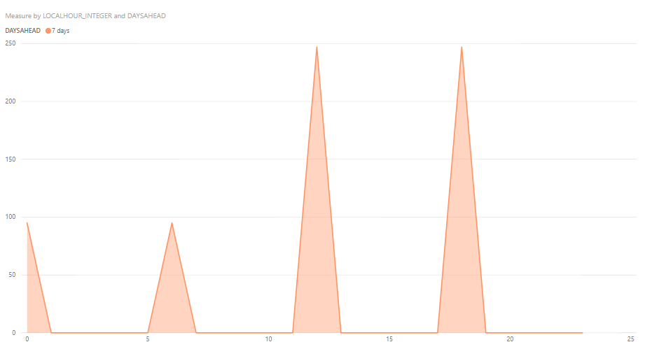
I want the data to look like this for example
Not like this which is what the given measure is producing:
Is there a measure that can be used to take the last given value? Like "Measure = IF ( ISBLANK ( SUM ( Sheet1[Value] ) ), Last Entered Value, SUM ( Sheet1[Value] ) )? Hope that is easy enough...I just don't know what it would be?
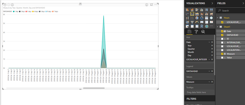
I also was unable to get the new Date column to work as you showed. Here is what I did:
It looks like the same settings as what you had, but this is what I get when I drag and drop the Date column into my graph.
Not sure why the Date column has all the extra subheadings underneath it...yours does not so if there is a way to change that, then I think we would be good on that issue.
Thanks for your continued help. I think we've almost got it.
- Mark as New
- Bookmark
- Subscribe
- Mute
- Subscribe to RSS Feed
- Permalink
- Report Inappropriate Content
Hi @Twinkie124,
Please check out the demo in the attachment. It's based on your description.
Regarding the dates in the x-axis, it a MMDD day. We need to use it directly instead of its hierarchy.
Measure 6 =
VAR latestdate =
    CALCULATE (
        MAX ( Sheet1[LOCALINTERVAL] ),
        FILTER (
            ALLEXCEPT ( Sheet1, Sheet1[DAYSAHEAD] ),
            Sheet1[LOCALHOUR_INTEGER] < MIN ( Hours[LOCALHOUR_INTEGER] )
        )
    )
VAR lastValue =
    CALCULATE (
        MAX ( Sheet1[Value] ),
        FILTER (
            ALLEXCEPT ( Sheet1, Sheet1[DAYSAHEAD] ),
            Sheet1[LOCALINTERVAL] = latestdate
        )
    )
RETURN
    IF ( ISBLANK ( SUM ( Sheet1[Value] ) ), lastValue, SUM ( Sheet1[Value] ) )
Best Regards,
Dale
If this post helps, then please consider Accept it as the solution to help the other members find it more quickly.
- Mark as New
- Bookmark
- Subscribe
- Mute
- Subscribe to RSS Feed
- Permalink
- Report Inappropriate Content
@v-jiascu-msft, Just wanted to let you know that I haven't forgotten about your response. My power BI desktop is currently not working for me and I can't even open up Power BI Desktop. So I can't open your demo.
Not sure if you would know who to ask about the error: "Unable to start Power BI Desktop-We weren't able to connect to the model"? I tried uninstalling and updating the version but it still doesn't work. Or would you know how to troubleshoot this issue?
- Mark as New
- Bookmark
- Subscribe
- Mute
- Subscribe to RSS Feed
- Permalink
- Report Inappropriate Content
Hi @Twinkie124,
That's weird. Did you use the latest version of Desktop? I would suggest uninstall it and restart the computer and then install the latest version. I downloaded the file from my last post. It's good on my side.
Best Regards,
Dale
If this post helps, then please consider Accept it as the solution to help the other members find it more quickly.
- Mark as New
- Bookmark
- Subscribe
- Mute
- Subscribe to RSS Feed
- Permalink
- Report Inappropriate Content
@v-jiascu-msft, Yeah I will have to get my my company's IT department to do that as I can't do it myself here. It may take a while for them to get around to it, but I will ask and let you know when that is done and if it is working. I also have someone who I am working with who is on vacation right now who said he had problems getting Power BI to work for him as well. I will talk with him beginning of next week too and see if we can resolve the issue.
Thanks for the help
Helpful resources

Microsoft Fabric Learn Together
Covering the world! 9:00-10:30 AM Sydney, 4:00-5:30 PM CET (Paris/Berlin), 7:00-8:30 PM Mexico City

Power BI Monthly Update - April 2024
Check out the April 2024 Power BI update to learn about new features.

| User | Count |
|---|---|
| 114 | |
| 99 | |
| 83 | |
| 70 | |
| 60 |
| User | Count |
|---|---|
| 150 | |
| 115 | |
| 104 | |
| 89 | |
| 65 |


