- Power BI forums
- Updates
- News & Announcements
- Get Help with Power BI
- Desktop
- Service
- Report Server
- Power Query
- Mobile Apps
- Developer
- DAX Commands and Tips
- Custom Visuals Development Discussion
- Health and Life Sciences
- Power BI Spanish forums
- Translated Spanish Desktop
- Power Platform Integration - Better Together!
- Power Platform Integrations (Read-only)
- Power Platform and Dynamics 365 Integrations (Read-only)
- Training and Consulting
- Instructor Led Training
- Dashboard in a Day for Women, by Women
- Galleries
- Community Connections & How-To Videos
- COVID-19 Data Stories Gallery
- Themes Gallery
- Data Stories Gallery
- R Script Showcase
- Webinars and Video Gallery
- Quick Measures Gallery
- 2021 MSBizAppsSummit Gallery
- 2020 MSBizAppsSummit Gallery
- 2019 MSBizAppsSummit Gallery
- Events
- Ideas
- Custom Visuals Ideas
- Issues
- Issues
- Events
- Upcoming Events
- Community Blog
- Power BI Community Blog
- Custom Visuals Community Blog
- Community Support
- Community Accounts & Registration
- Using the Community
- Community Feedback
Register now to learn Fabric in free live sessions led by the best Microsoft experts. From Apr 16 to May 9, in English and Spanish.
- Power BI forums
- Forums
- Get Help with Power BI
- Desktop
- Line Graph Y2 axis
- Subscribe to RSS Feed
- Mark Topic as New
- Mark Topic as Read
- Float this Topic for Current User
- Bookmark
- Subscribe
- Printer Friendly Page
- Mark as New
- Bookmark
- Subscribe
- Mute
- Subscribe to RSS Feed
- Permalink
- Report Inappropriate Content
Line Graph Y2 axis
Hello,
I have data with just 3 columns: date / currency / fx rate.
Most of my currencies fall between 1.2 and 1.9, so work well on the y-axis. Japanese Yen, however, is between 130 and 150. I would like to plot this on the same line graph, but using the Y2 axis on the right. However, none of these fields can be dragged into the Y2 data field.
Is it possible to achieve this?
Many thanks,
Mike
Solved! Go to Solution.
- Mark as New
- Bookmark
- Subscribe
- Mute
- Subscribe to RSS Feed
- Permalink
- Report Inappropriate Content
Hi @PBIMike ,
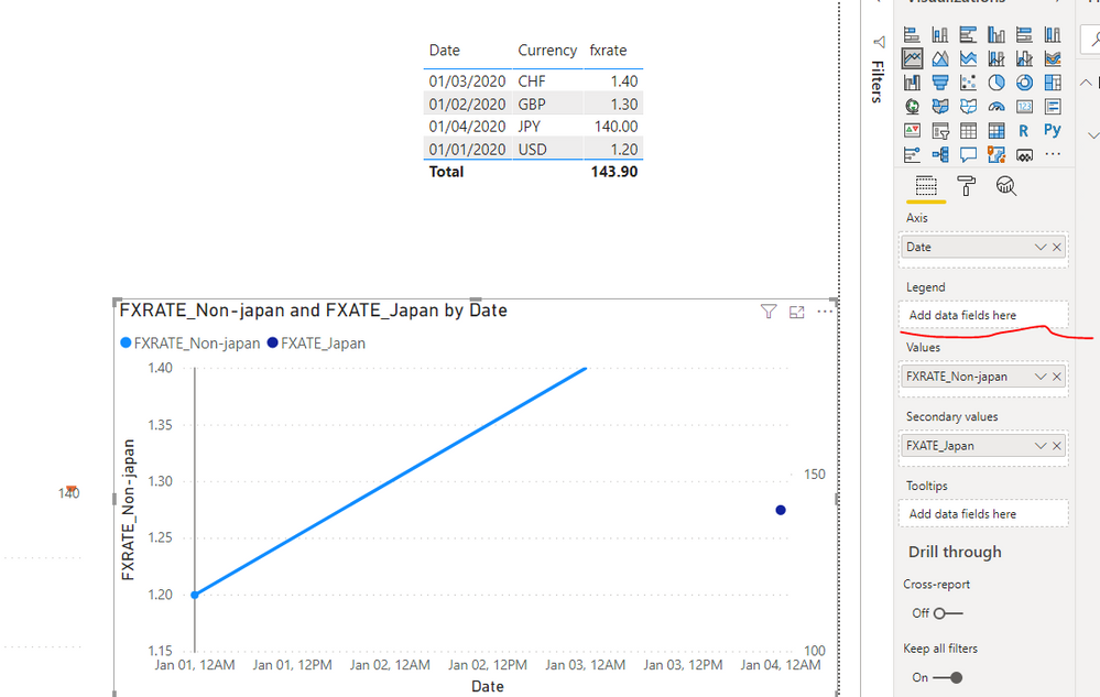
Like this?
FXATE_Japan =
IF(
    [Currency] = "JPY",
    [fxrate],
    BLANK()
)
FXRATE_Non-japan =
IF(
[Currency] = "JPY",
BLANK(),
[fxrate]
)
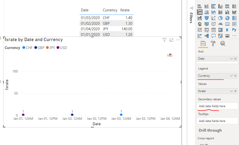
Or like this?
If you use 'Secondary values' label, you can't use use 'Legend' label.
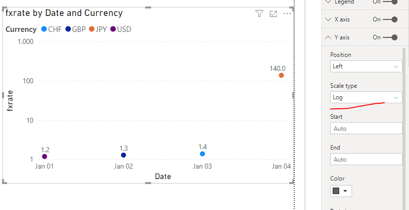
Perhaps this is the best way.
Best regards,
Lionel Chen
If this post helps, then please consider Accept it as the solution to help the other members find it more quickly.
- Mark as New
- Bookmark
- Subscribe
- Mute
- Subscribe to RSS Feed
- Permalink
- Report Inappropriate Content
@PBIMike , it was part of March 2020 release , refer
https://powerbi.microsoft.com/en-us/blog/power-bi-desktop-march-2020-feature-summary/#_Dual_axis
Microsoft Power BI Learning Resources, 2023 !!
Learn Power BI - Full Course with Dec-2022, with Window, Index, Offset, 100+ Topics !!
Did I answer your question? Mark my post as a solution! Appreciate your Kudos !! Proud to be a Super User! !!
- Mark as New
- Bookmark
- Subscribe
- Mute
- Subscribe to RSS Feed
- Permalink
- Report Inappropriate Content
Thanks Amit, but I'm afraid that doesn't solve my problem, as all the link says is to "drag fields into the new secondary Y-axis field". have tried dragging in every field, and none of them will remain under the Y2 heading.
I suppose my problem is that I want to use the same values for both y-axis and y2, but with one filtered to only apply to Japanese Yen, and the other to apply to all currencies.
Will Y2 only work when using a single data source, with a 2nd column of values?
Many thanks,
Mike
- Mark as New
- Bookmark
- Subscribe
- Mute
- Subscribe to RSS Feed
- Permalink
- Report Inappropriate Content
Hi @PBIMike ,
Like this?
FXATE_Japan =
IF(
    [Currency] = "JPY",
    [fxrate],
    BLANK()
)
FXRATE_Non-japan =
IF(
[Currency] = "JPY",
BLANK(),
[fxrate]
)
Or like this?
If you use 'Secondary values' label, you can't use use 'Legend' label.
Perhaps this is the best way.
Best regards,
Lionel Chen
If this post helps, then please consider Accept it as the solution to help the other members find it more quickly.
- Mark as New
- Bookmark
- Subscribe
- Mute
- Subscribe to RSS Feed
- Permalink
- Report Inappropriate Content
Hello,
I have Exchange Rate and Dimdate data and have to create a line chart with the data. And I'm using Region and Country slicer where the line chart shows the sum of exchange rate(Y axis) not individual exchange rate for respective Country.
Please help me with this.
Thanks
- Mark as New
- Bookmark
- Subscribe
- Mute
- Subscribe to RSS Feed
- Permalink
- Report Inappropriate Content
Thank you that looks incredibly helpful - i'll give it a go!
Helpful resources

Microsoft Fabric Learn Together
Covering the world! 9:00-10:30 AM Sydney, 4:00-5:30 PM CET (Paris/Berlin), 7:00-8:30 PM Mexico City

Power BI Monthly Update - April 2024
Check out the April 2024 Power BI update to learn about new features.

| User | Count |
|---|---|
| 110 | |
| 97 | |
| 78 | |
| 63 | |
| 55 |
| User | Count |
|---|---|
| 143 | |
| 109 | |
| 89 | |
| 84 | |
| 66 |


