- Power BI forums
- Updates
- News & Announcements
- Get Help with Power BI
- Desktop
- Service
- Report Server
- Power Query
- Mobile Apps
- Developer
- DAX Commands and Tips
- Custom Visuals Development Discussion
- Health and Life Sciences
- Power BI Spanish forums
- Translated Spanish Desktop
- Power Platform Integration - Better Together!
- Power Platform Integrations (Read-only)
- Power Platform and Dynamics 365 Integrations (Read-only)
- Training and Consulting
- Instructor Led Training
- Dashboard in a Day for Women, by Women
- Galleries
- Community Connections & How-To Videos
- COVID-19 Data Stories Gallery
- Themes Gallery
- Data Stories Gallery
- R Script Showcase
- Webinars and Video Gallery
- Quick Measures Gallery
- 2021 MSBizAppsSummit Gallery
- 2020 MSBizAppsSummit Gallery
- 2019 MSBizAppsSummit Gallery
- Events
- Ideas
- Custom Visuals Ideas
- Issues
- Issues
- Events
- Upcoming Events
- Community Blog
- Power BI Community Blog
- Custom Visuals Community Blog
- Community Support
- Community Accounts & Registration
- Using the Community
- Community Feedback
Register now to learn Fabric in free live sessions led by the best Microsoft experts. From Apr 16 to May 9, in English and Spanish.
- Power BI forums
- Forums
- Get Help with Power BI
- Desktop
- Line Graph Showing Progression Of Time Over A Date...
- Subscribe to RSS Feed
- Mark Topic as New
- Mark Topic as Read
- Float this Topic for Current User
- Bookmark
- Subscribe
- Printer Friendly Page
- Mark as New
- Bookmark
- Subscribe
- Mute
- Subscribe to RSS Feed
- Permalink
- Report Inappropriate Content
Line Graph Showing Progression Of Time Over A Date Range
Hi,
I have a data set similar to the below:
Date DD/MM/YYYY / Time HH:MM:SS
| 01/01/2017 | 00:45:00 |
| 12/03/2017 | 00:44:31 |
| 21/05/2017 | 00:43:51 |
| 15/07/2017 | 00:46:01 |
| 08/08/2017 | 00:44:15 |
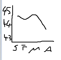
I'm trying to create a line graph to show the progression of time over the year that would look similar to the following highly technical image: (X axis scrawl is J F M A for months, Y is time in mins)
But for the life of me I can't figure out how to mirror this in Power BI. It will either count the number of times that the time appears in the dataset, or will count the total number of rows in the dataset. Can anyone assist please?
Thanks
Damien
Solved! Go to Solution.
- Mark as New
- Bookmark
- Subscribe
- Mute
- Subscribe to RSS Feed
- Permalink
- Report Inappropriate Content
Hi @DamienJ,
In a chart visual, only numeric values are allowed to be added to Y-axis. If we drag non-numerical fields into Y-axis, it will be counted automatically.
To achieve your requirement, you should first convert Time format filed to numerical type.
Time in minute = MINUTE('Date/Time'[Time])
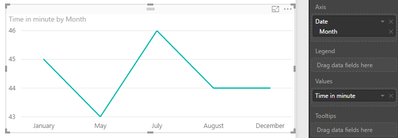
Then, create a line chart like below.
Best regards,
Yuliana Gu
If this post helps, then please consider Accept it as the solution to help the other members find it more quickly.
- Mark as New
- Bookmark
- Subscribe
- Mute
- Subscribe to RSS Feed
- Permalink
- Report Inappropriate Content
Hi @v-yulgu-msft and thanks for your reply. That approach had never crossed my mind - thanks very much! I did make a slight change to your suggestion as I needed the precision of seconds, and as the data is currently in Excel I used the following to convert the HH MM SS value to seconds:
=HOUR(A2)*3600 + MINUTE(A2)*60 + SECOND(A2)
(Other sites suggested multiplying the value by 86400 but this gave erroneous results in some cases)
Your screenshot suggests Power BI will be very happy with these new numbers. Thanks again!
Helpful resources

Microsoft Fabric Learn Together
Covering the world! 9:00-10:30 AM Sydney, 4:00-5:30 PM CET (Paris/Berlin), 7:00-8:30 PM Mexico City

Power BI Monthly Update - April 2024
Check out the April 2024 Power BI update to learn about new features.

| User | Count |
|---|---|
| 114 | |
| 100 | |
| 75 | |
| 73 | |
| 49 |
| User | Count |
|---|---|
| 145 | |
| 109 | |
| 109 | |
| 90 | |
| 64 |


