- Power BI forums
- Updates
- News & Announcements
- Get Help with Power BI
- Desktop
- Service
- Report Server
- Power Query
- Mobile Apps
- Developer
- DAX Commands and Tips
- Custom Visuals Development Discussion
- Health and Life Sciences
- Power BI Spanish forums
- Translated Spanish Desktop
- Power Platform Integration - Better Together!
- Power Platform Integrations (Read-only)
- Power Platform and Dynamics 365 Integrations (Read-only)
- Training and Consulting
- Instructor Led Training
- Dashboard in a Day for Women, by Women
- Galleries
- Community Connections & How-To Videos
- COVID-19 Data Stories Gallery
- Themes Gallery
- Data Stories Gallery
- R Script Showcase
- Webinars and Video Gallery
- Quick Measures Gallery
- 2021 MSBizAppsSummit Gallery
- 2020 MSBizAppsSummit Gallery
- 2019 MSBizAppsSummit Gallery
- Events
- Ideas
- Custom Visuals Ideas
- Issues
- Issues
- Events
- Upcoming Events
- Community Blog
- Power BI Community Blog
- Custom Visuals Community Blog
- Community Support
- Community Accounts & Registration
- Using the Community
- Community Feedback
Register now to learn Fabric in free live sessions led by the best Microsoft experts. From Apr 16 to May 9, in English and Spanish.
- Power BI forums
- Forums
- Get Help with Power BI
- Desktop
- Line Graph Conditional Formatting
- Subscribe to RSS Feed
- Mark Topic as New
- Mark Topic as Read
- Float this Topic for Current User
- Bookmark
- Subscribe
- Printer Friendly Page
- Mark as New
- Bookmark
- Subscribe
- Mute
- Subscribe to RSS Feed
- Permalink
- Report Inappropriate Content
Line Graph Conditional Formatting
Hi,
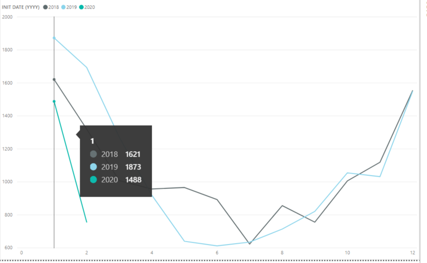
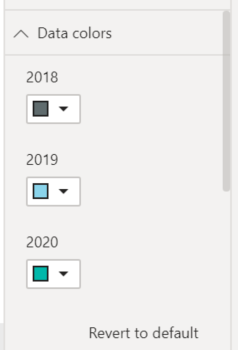
I was wondering if there was a way to color code a line graph. I looked it up, and on some versions of Power BI, there is either an advanced option on the Data colors editor, or 3 vertical dots to indicate the advanced option. On my version, there are neither even for the clustered column chart visualization.
I was wondering if there was a formula I could use to say, if total for 2020<2019 then green, else if 2020>2019 and 2020-2019>100 then red, else yellow or something along those lines...
Please let me know if this question is confusing
Thank you!
Sarah
- Mark as New
- Bookmark
- Subscribe
- Mute
- Subscribe to RSS Feed
- Permalink
- Report Inappropriate Content
I don't think there's anything like this, but maybe you could try to visualise your data in a different way and make a measure to show the year on year difference - drop that into a line chart, then you can use the constant lines feature to highlight the points where you'd want the formatting to change?
- Mark as New
- Bookmark
- Subscribe
- Mute
- Subscribe to RSS Feed
- Permalink
- Report Inappropriate Content
Hi @jthomson ,
Condittional formatting is not possible on line charts.
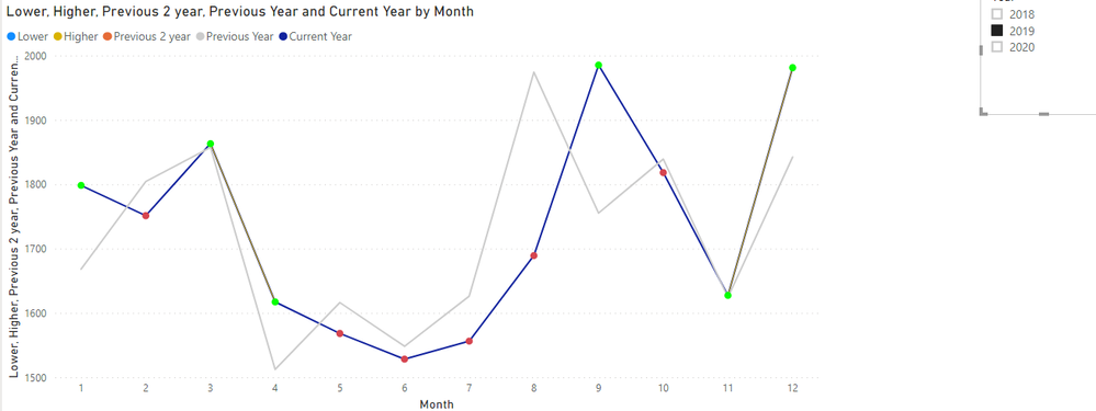
What you can do is use measure to calculate the higher and lower and then for those measure place markers with different colours and hide the line.
What I did was to create 5 measures:
Current Year = SUM('Table'[Value])


Previous Year = CALCULATE(SUM('Table'[Value]);DATEADD('Calendar'[Date];-1;YEAR))

Previous 2 year = CALCULATE(SUM('Table'[Value]);DATEADD('Calendar'[Date];-2;YEAR))

Higher = IF([Current Year]<[Previous Year];BLANK();[Current Year])

Lower = IF([Current Year] < [Previous Year];[Current Year];BLANK())
Then place the measures on the line chart and final result will be this one (colors are not the best ones):
I also used a calendar table and a slicer to select the year.
Check PBIX file attach.
Regards
Miguel Félix
Did I answer your question? Mark my post as a solution!
Proud to be a Super User!
Check out my blog: Power BI em Português- Mark as New
- Bookmark
- Subscribe
- Mute
- Subscribe to RSS Feed
- Permalink
- Report Inappropriate Content
I feel like I am close, but I am not sure how to encorperate the Red and Green dots if it is above or below last years totals...
- Mark as New
- Bookmark
- Subscribe
- Mute
- Subscribe to RSS Feed
- Permalink
- Report Inappropriate Content
Hi @Anonymous
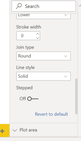
You need to go to the line chart options:
- Shapes
- Customized series
- Select the higher and lower
- Line size 0
- Show Marker on
- Select the marker and color to your liking
Regards
Miguel Félix
Did I answer your question? Mark my post as a solution!
Proud to be a Super User!
Check out my blog: Power BI em Português- Mark as New
- Bookmark
- Subscribe
- Mute
- Subscribe to RSS Feed
- Permalink
- Report Inappropriate Content
Helpful resources

Microsoft Fabric Learn Together
Covering the world! 9:00-10:30 AM Sydney, 4:00-5:30 PM CET (Paris/Berlin), 7:00-8:30 PM Mexico City

Power BI Monthly Update - April 2024
Check out the April 2024 Power BI update to learn about new features.

| User | Count |
|---|---|
| 114 | |
| 100 | |
| 74 | |
| 73 | |
| 49 |
| User | Count |
|---|---|
| 145 | |
| 109 | |
| 109 | |
| 90 | |
| 64 |
