- Power BI forums
- Updates
- News & Announcements
- Get Help with Power BI
- Desktop
- Service
- Report Server
- Power Query
- Mobile Apps
- Developer
- DAX Commands and Tips
- Custom Visuals Development Discussion
- Health and Life Sciences
- Power BI Spanish forums
- Translated Spanish Desktop
- Power Platform Integration - Better Together!
- Power Platform Integrations (Read-only)
- Power Platform and Dynamics 365 Integrations (Read-only)
- Training and Consulting
- Instructor Led Training
- Dashboard in a Day for Women, by Women
- Galleries
- Community Connections & How-To Videos
- COVID-19 Data Stories Gallery
- Themes Gallery
- Data Stories Gallery
- R Script Showcase
- Webinars and Video Gallery
- Quick Measures Gallery
- 2021 MSBizAppsSummit Gallery
- 2020 MSBizAppsSummit Gallery
- 2019 MSBizAppsSummit Gallery
- Events
- Ideas
- Custom Visuals Ideas
- Issues
- Issues
- Events
- Upcoming Events
- Community Blog
- Power BI Community Blog
- Custom Visuals Community Blog
- Community Support
- Community Accounts & Registration
- Using the Community
- Community Feedback
Register now to learn Fabric in free live sessions led by the best Microsoft experts. From Apr 16 to May 9, in English and Spanish.
- Power BI forums
- Forums
- Get Help with Power BI
- Desktop
- Line Chart with 5 Variables
- Subscribe to RSS Feed
- Mark Topic as New
- Mark Topic as Read
- Float this Topic for Current User
- Bookmark
- Subscribe
- Printer Friendly Page
- Mark as New
- Bookmark
- Subscribe
- Mute
- Subscribe to RSS Feed
- Permalink
- Report Inappropriate Content
Line Chart with 5 Variables
Does anyone know of a visualization that can display data with 5 variable fields? I'd like to display all the data in one chart and allow the user to use slicers to decide what data they would like to see.
Here is a simplified dataset. I'd like to be able to see all the lines at one time and then use slicers to adjust as necessary.
Thank you in advance!
| Location | Radius | Date | Occupation | Employees |
| Dallas | 10 Miles | 2020Q1 | Clerk | 8 |
| Seattle | 10 Miles | 2020Q1 | Clerk | 4 |
| Miami | 10 Miles | 2020Q1 | Clerk | 8 |
| Dallas | 10 Miles | 2020Q2 | Clerk | 3 |
| Seattle | 10 Miles | 2020Q2 | Clerk | 24 |
| Miami | 10 Miles | 2020Q2 | Clerk | 33 |
| Dallas | 20 Miles | 2020Q1 | Clerk | 47 |
| Seattle | 20 Miles | 2020Q1 | Clerk | 14 |
| Miami | 20 Miles | 2020Q1 | Clerk | 22 |
| Dallas | 20 Miles | 2020Q2 | Clerk | 36 |
| Seattle | 20 Miles | 2020Q2 | Clerk | 44 |
| Miami | 20 Miles | 2020Q2 | Clerk | 23 |
| Dallas | 10 Miles | 2020Q1 | Stocker | 12 |
| Seattle | 10 Miles | 2020Q1 | Stocker | 32 |
| Miami | 10 Miles | 2020Q1 | Stocker | 53 |
| Dallas | 10 Miles | 2020Q2 | Stocker | 52 |
| Seattle | 10 Miles | 2020Q2 | Stocker | 64 |
| Miami | 10 Miles | 2020Q2 | Stocker | 52 |
| Dallas | 20 Miles | 2020Q1 | Stocker | 41 |
| Seattle | 20 Miles | 2020Q1 | Stocker | 19 |
| Miami | 20 Miles | 2020Q1 | Stocker | 17 |
| Dallas | 20 Miles | 2020Q2 | Stocker | 11 |
| Seattle | 20 Miles | 2020Q2 | Stocker | 16 |
| Miami | 20 Miles | 2020Q2 | Stocker | 31 |
- Mark as New
- Bookmark
- Subscribe
- Mute
- Subscribe to RSS Feed
- Permalink
- Report Inappropriate Content
Hi, @Anonymous
It’s my pleasure to answer for you.
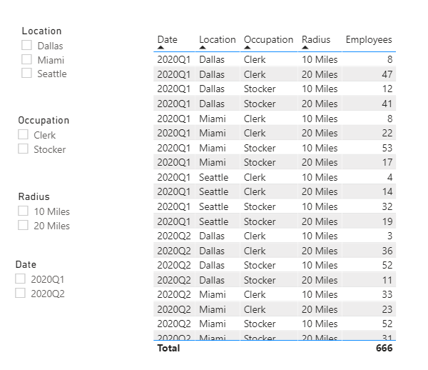
According to your description,I think you can use a table visual and four slicer to display and filter data.
Like this:
If it doesn’t solve your problem, please feel free to ask me.
Best Regards
Janey Guo
If this post helps, then please consider Accept it as the solution to help the other members find it more quickly.
- Mark as New
- Bookmark
- Subscribe
- Mute
- Subscribe to RSS Feed
- Permalink
- Report Inappropriate Content
Thank you Janey. That's what I have now, so the user can view how they want. I'd just like to have one graphic to portray it. Appreciate the help as I know it's not an easy question.
- Mark as New
- Bookmark
- Subscribe
- Mute
- Subscribe to RSS Feed
- Permalink
- Report Inappropriate Content
Hi @Anonymous
Have you considered a radar plot?
https://appsource.microsoft.com/en-us/product/power-bi-visuals/WA104380771
Phil
Did I answer your question? Then please mark my post as the solution.
If I helped you, click on the Thumbs Up to give Kudos.
Blog :: YouTube Channel :: Connect on Linkedin
Proud to be a Super User!
- Mark as New
- Bookmark
- Subscribe
- Mute
- Subscribe to RSS Feed
- Permalink
- Report Inappropriate Content
Thank you Phil, I'll try it today and see how it comes out.
Helpful resources

Microsoft Fabric Learn Together
Covering the world! 9:00-10:30 AM Sydney, 4:00-5:30 PM CET (Paris/Berlin), 7:00-8:30 PM Mexico City

Power BI Monthly Update - April 2024
Check out the April 2024 Power BI update to learn about new features.

| User | Count |
|---|---|
| 111 | |
| 100 | |
| 80 | |
| 64 | |
| 58 |
| User | Count |
|---|---|
| 146 | |
| 110 | |
| 93 | |
| 84 | |
| 67 |

