- Power BI forums
- Updates
- News & Announcements
- Get Help with Power BI
- Desktop
- Service
- Report Server
- Power Query
- Mobile Apps
- Developer
- DAX Commands and Tips
- Custom Visuals Development Discussion
- Health and Life Sciences
- Power BI Spanish forums
- Translated Spanish Desktop
- Power Platform Integration - Better Together!
- Power Platform Integrations (Read-only)
- Power Platform and Dynamics 365 Integrations (Read-only)
- Training and Consulting
- Instructor Led Training
- Dashboard in a Day for Women, by Women
- Galleries
- Community Connections & How-To Videos
- COVID-19 Data Stories Gallery
- Themes Gallery
- Data Stories Gallery
- R Script Showcase
- Webinars and Video Gallery
- Quick Measures Gallery
- 2021 MSBizAppsSummit Gallery
- 2020 MSBizAppsSummit Gallery
- 2019 MSBizAppsSummit Gallery
- Events
- Ideas
- Custom Visuals Ideas
- Issues
- Issues
- Events
- Upcoming Events
- Community Blog
- Power BI Community Blog
- Custom Visuals Community Blog
- Community Support
- Community Accounts & Registration
- Using the Community
- Community Feedback
Register now to learn Fabric in free live sessions led by the best Microsoft experts. From Apr 16 to May 9, in English and Spanish.
- Power BI forums
- Forums
- Get Help with Power BI
- Desktop
- Line Chart using COUNTROWS measure only returning ...
- Subscribe to RSS Feed
- Mark Topic as New
- Mark Topic as Read
- Float this Topic for Current User
- Bookmark
- Subscribe
- Printer Friendly Page
- Mark as New
- Bookmark
- Subscribe
- Mute
- Subscribe to RSS Feed
- Permalink
- Report Inappropriate Content
Line Chart using COUNTROWS measure only returning blank
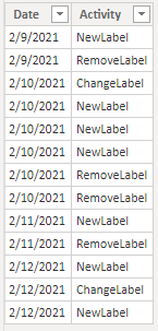
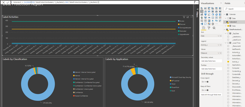
I am new to PowerBI so this is probably a novice question. I have a very simple table that I am trying to represent on a line chart but my COUNTROWS is returning a BLANK value, which is expected, but the suggestions from other posts to add 0 to the COUNTROWS return value or using the IF and ISBLANK combination do not seem to be working for me.
I created a measure as shown below.
LabelActivites = IF(ISBLANK(COUNTROWS('Table')), 0, COUNTROWS('Table'))
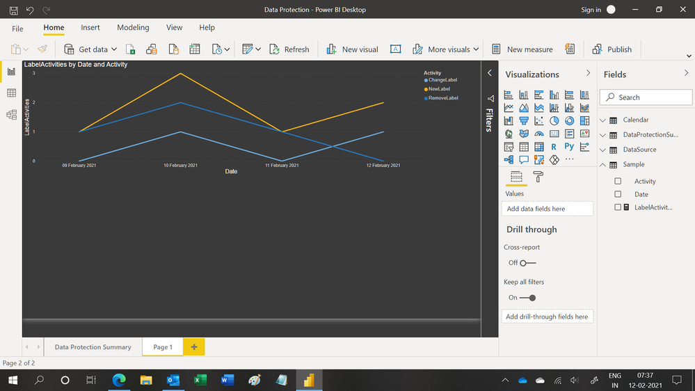
In my chart below, my settings are:
X Axis = Date
Values = LabelActivities
Legend = Activity
As can be seen, my measure is still returning blank values instead of '0'.
Any help in what I am overlooking would be greatly appreciated!
Solved! Go to Solution.
- Mark as New
- Bookmark
- Subscribe
- Mute
- Subscribe to RSS Feed
- Permalink
- Report Inappropriate Content
Hi,
You had not created a relationship between the tables. You may download my PBI file from here.
Hope this helps.
Regards,
Ashish Mathur
http://www.ashishmathur.com
https://www.linkedin.com/in/excelenthusiasts/
- Mark as New
- Bookmark
- Subscribe
- Mute
- Subscribe to RSS Feed
- Permalink
- Report Inappropriate Content
Hi @ImprovingCL
That measure shouldn't return Blank if your table contains the rows as shown in your image.
Have you used a Card visual to verify the value in the LabelActivities measure?
Can you please share your PBIX file?
Regards
Phil
Did I answer your question? Then please mark my post as the solution.
If I helped you, click on the Thumbs Up to give Kudos.
Blog :: YouTube Channel :: Connect on Linkedin
Proud to be a Super User!
- Mark as New
- Bookmark
- Subscribe
- Mute
- Subscribe to RSS Feed
- Permalink
- Report Inappropriate Content
Hi @PhilipTreacy,
I can see in a Card Visual that the value being returned looks correct. I have put my PBIX file in the link below.
In the PBIX, the first page contains the visual using the data I am actually trying to represent correctly, but my "Sample" table is in there as well.
Thanks,
Chris
- Mark as New
- Bookmark
- Subscribe
- Mute
- Subscribe to RSS Feed
- Permalink
- Report Inappropriate Content
Hi,
You may download my PBI file from here.
Hope this helps.
Regards,
Ashish Mathur
http://www.ashishmathur.com
https://www.linkedin.com/in/excelenthusiasts/
- Mark as New
- Bookmark
- Subscribe
- Mute
- Subscribe to RSS Feed
- Permalink
- Report Inappropriate Content
Thanks for the reply, that definitely looks like it fixes my sample chart, but when I try to apply that same approach using COALESCE to my production data 'DataProtectionSummary' on the first page, I do not get the same expected results.
I've also created a second Calendar based on my 'DataProtectionSummary' table as well just as you have done in the sample, but that seems to result in the line chart having constant values instead.
Could I be overlooking something?
Thanks,
Chris
- Mark as New
- Bookmark
- Subscribe
- Mute
- Subscribe to RSS Feed
- Permalink
- Report Inappropriate Content
You are welcome. If my previous reply helped, please mark it as Answer. As regards your second question, I cannot comment unless i see the file.
Regards,
Ashish Mathur
http://www.ashishmathur.com
https://www.linkedin.com/in/excelenthusiasts/
- Mark as New
- Bookmark
- Subscribe
- Mute
- Subscribe to RSS Feed
- Permalink
- Report Inappropriate Content
The same file has the table 'DataProtectionSummary' as well as that line chart on the first page.
Thanks,
Chris
- Mark as New
- Bookmark
- Subscribe
- Mute
- Subscribe to RSS Feed
- Permalink
- Report Inappropriate Content
You simply have not followed what i shared in my solution PBI file. Neither have you created the Calendar Table nor have you written the measure. Please study my solution carefully and replicate i on your file.
Regards,
Ashish Mathur
http://www.ashishmathur.com
https://www.linkedin.com/in/excelenthusiasts/
- Mark as New
- Bookmark
- Subscribe
- Mute
- Subscribe to RSS Feed
- Permalink
- Report Inappropriate Content
Hi @Ashish_Mathur ,
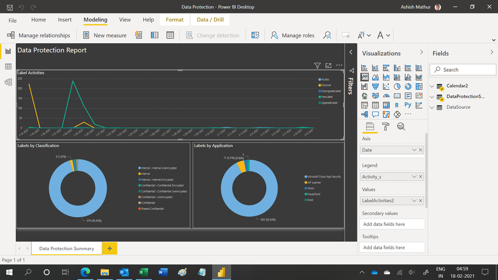
I've gone ahead and updated the file to apply your approach. I created a Calendar2 table and written a new measure in the DataProtectionSummary table as LabelActivities2 that mirrors what you had done with the sample data, but I am showing my results as just being a flat lines versus the expected values.
Thanks,
Chris
- Mark as New
- Bookmark
- Subscribe
- Mute
- Subscribe to RSS Feed
- Permalink
- Report Inappropriate Content
Hi,
You may download my PBI file from here.
Hope this helps.
Regards,
Ashish Mathur
http://www.ashishmathur.com
https://www.linkedin.com/in/excelenthusiasts/
- Mark as New
- Bookmark
- Subscribe
- Mute
- Subscribe to RSS Feed
- Permalink
- Report Inappropriate Content
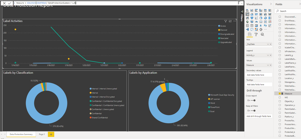
I may not be explaining my issue clearly. I've modified my PBIX file to remove the Sample data as that was just temporary to try to help me identify how to create the measure to show what I was looking for. Your first repsonse addressed that in the Sample data, but when trying to apply that to my real data, I do not get the expected results.
When I use this as my measure, my results are a flat lines in the line chart over my calendar versus showing data points for each date.
Measure = COALESCE(COUNTROWS('DataProtectionSummary'),0)
Thanks,
Chris
- Mark as New
- Bookmark
- Subscribe
- Mute
- Subscribe to RSS Feed
- Permalink
- Report Inappropriate Content
Hi,
You had not created a relationship between the tables. You may download my PBI file from here.
Hope this helps.
Regards,
Ashish Mathur
http://www.ashishmathur.com
https://www.linkedin.com/in/excelenthusiasts/
- Mark as New
- Bookmark
- Subscribe
- Mute
- Subscribe to RSS Feed
- Permalink
- Report Inappropriate Content
Helpful resources

Microsoft Fabric Learn Together
Covering the world! 9:00-10:30 AM Sydney, 4:00-5:30 PM CET (Paris/Berlin), 7:00-8:30 PM Mexico City

Power BI Monthly Update - April 2024
Check out the April 2024 Power BI update to learn about new features.

| User | Count |
|---|---|
| 107 | |
| 99 | |
| 76 | |
| 64 | |
| 58 |
| User | Count |
|---|---|
| 148 | |
| 113 | |
| 97 | |
| 84 | |
| 67 |
