- Power BI forums
- Updates
- News & Announcements
- Get Help with Power BI
- Desktop
- Service
- Report Server
- Power Query
- Mobile Apps
- Developer
- DAX Commands and Tips
- Custom Visuals Development Discussion
- Health and Life Sciences
- Power BI Spanish forums
- Translated Spanish Desktop
- Power Platform Integration - Better Together!
- Power Platform Integrations (Read-only)
- Power Platform and Dynamics 365 Integrations (Read-only)
- Training and Consulting
- Instructor Led Training
- Dashboard in a Day for Women, by Women
- Galleries
- Community Connections & How-To Videos
- COVID-19 Data Stories Gallery
- Themes Gallery
- Data Stories Gallery
- R Script Showcase
- Webinars and Video Gallery
- Quick Measures Gallery
- 2021 MSBizAppsSummit Gallery
- 2020 MSBizAppsSummit Gallery
- 2019 MSBizAppsSummit Gallery
- Events
- Ideas
- Custom Visuals Ideas
- Issues
- Issues
- Events
- Upcoming Events
- Community Blog
- Power BI Community Blog
- Custom Visuals Community Blog
- Community Support
- Community Accounts & Registration
- Using the Community
- Community Feedback
Register now to learn Fabric in free live sessions led by the best Microsoft experts. From Apr 16 to May 9, in English and Spanish.
- Power BI forums
- Forums
- Get Help with Power BI
- Desktop
- Line Chart until selected month
- Subscribe to RSS Feed
- Mark Topic as New
- Mark Topic as Read
- Float this Topic for Current User
- Bookmark
- Subscribe
- Printer Friendly Page
- Mark as New
- Bookmark
- Subscribe
- Mute
- Subscribe to RSS Feed
- Permalink
- Report Inappropriate Content
Line Chart until selected month
Hello everyone,
I have made a supplyers report where I'm showing how high has been the total purchase until the month selected. On my first version, I did the running total more "manually" in a way that I had to select month per month to get the running total.
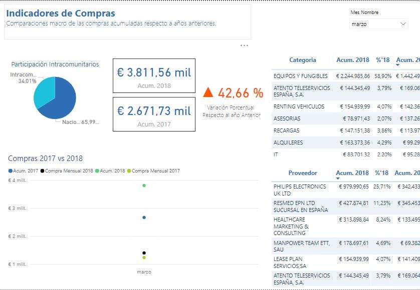
On this version, I created a running total with a quick measure so my idea was to being able to select the desire month in an easier an visual way:
The problem is that now I get just those dots instead of all the values until the selected month.
One option was to disable the link between the chart and the filter selection, but this "solution" just shows the whole year, while my intention is just to show until the selected month.
as you can see here, for "march" it shows the whole year
Do you have any idea of what should I do?
Thank you so much!
Regards from spain!
Solved! Go to Solution.
- Mark as New
- Bookmark
- Subscribe
- Mute
- Subscribe to RSS Feed
- Permalink
- Report Inappropriate Content
Hi @okusai3000
finally, add the month column from the new created table to a slcier, select an item in this slicer, the line chart only show values untill the selected month.
You only need one slicer, the column added to the slicer is the month column from your new created table, not your original table.
Measure 2 = SELECTEDVALUE(Table1[month])
This show the item when you select a item in the slicer, Table1 is the new created table.
Measure 3 = IF(MAX(your original table[month])<=[Measure 2],1,0)
- Mark as New
- Bookmark
- Subscribe
- Mute
- Subscribe to RSS Feed
- Permalink
- Report Inappropriate Content
Hi @okusai3000
Assume your running total is correct, to get all the values until the selected month,
first create a new table with a month column (note that don't create relationship between this new table and your data table)
then create a measure
Measure 2 = SELECTEDVALUE(Table1[month])
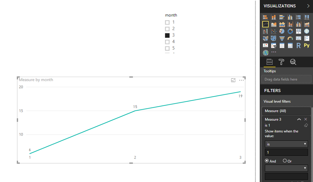
next create another measure, and add this measure to the visual level filer of the line chart, set 'show items when value is 1)
Measure 3 = IF(MAX([month])<=[Measure 2],1,0)
finally, add the month column from the new created table to a slcier, select an item in this slicer, the line chart only show values untill the selected month.
This is limited for the axis doesn't show other months except the months before selected month.
Best Regards
Maggie
- Mark as New
- Bookmark
- Subscribe
- Mute
- Subscribe to RSS Feed
- Permalink
- Report Inappropriate Content
Hi Maggie,
I cannot understand the thing about the filter. I mean, from what I understand you, in that way I would end up having 2 filters?
Thanks!
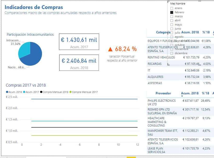
EDIT: I get something like this:
- Mark as New
- Bookmark
- Subscribe
- Mute
- Subscribe to RSS Feed
- Permalink
- Report Inappropriate Content
Hi @okusai3000
finally, add the month column from the new created table to a slcier, select an item in this slicer, the line chart only show values untill the selected month.
You only need one slicer, the column added to the slicer is the month column from your new created table, not your original table.
Measure 2 = SELECTEDVALUE(Table1[month])
This show the item when you select a item in the slicer, Table1 is the new created table.
Measure 3 = IF(MAX(your original table[month])<=[Measure 2],1,0)
- Mark as New
- Bookmark
- Subscribe
- Mute
- Subscribe to RSS Feed
- Permalink
- Report Inappropriate Content
- Mark as New
- Bookmark
- Subscribe
- Mute
- Subscribe to RSS Feed
- Permalink
- Report Inappropriate Content
Hi @okusai3000
I tested before, but i 'm afraid i am unable to solve this problem.
Maybe you could use diferent measures in these visuals, this is to say, in the line chart, put the measures i suggested in the previous post, and put your measures in the other visuals.
Best Regards
Maggie
- Mark as New
- Bookmark
- Subscribe
- Mute
- Subscribe to RSS Feed
- Permalink
- Report Inappropriate Content
Hi Maggie,
Would like to tell you that finally I managed to solved it. The key thing was to copy the whole database table; then create the same measures again (with the reference to this new table); and now use this table to create the graph, of course using the Measure 2 and measure 3 that you showed me.
In this way, as this table will be isolated from the rest (with no relations), there won't be any confusion on filters and everything will just work flawlessly!
Thank you so much!
- Mark as New
- Bookmark
- Subscribe
- Mute
- Subscribe to RSS Feed
- Permalink
- Report Inappropriate Content
Hi @v-juanli-msft,
I'm still having trouble....
Doing what you explained me, allows me to have a correct graph... BUT, that makes that the rest of the values from the matrix display the WHOLE purchases of the year. In other words, the filter it's broken on the rest of values.
I attacched you a picture and just in case the PBIX.
Thank you!!
- Mark as New
- Bookmark
- Subscribe
- Mute
- Subscribe to RSS Feed
- Permalink
- Report Inappropriate Content
You need to write your measure for your line chart such that you get the MAX of the Month in your slicer and then you would get ALL of your table and then filter it down accordingly.
You could use something like my Time Intelligence the Hard Way to get the job done. See if my Time Intelligence the Hard Way provides a different way of accomplishing what you are going for.
https://community.powerbi.com/t5/Quick-Measures-Gallery/Time-Intelligence-quot-The-Hard-Way-quot-TIT...
Should be some variation of:
Gross Margin YTD1 =
VAR __Month = MONTH(MAX(Sales[DateKey]))
VAR __Day = DAY(MAX(Sales[DateKey]))
VAR __Year = YEAR(MAX(Sales[DateKey]))
VAR __Today = DATE(__Year,__Month,__Day)
VAR __YearStart = DATE(__Year,1,1)
VAR __tmpTable = FILTER(ALLSELECTED(Sales),Sales[DateKey]>=__YearStart && Sales[DateKey]<=__Today)
RETURN
SUMX(FILTER(__tmpTable,MONTH([DateKey])<=__Month),[Gross Margin])
But, sample source data would help greatly. Please see this post regarding How to Get Your Question Answered Quickly: https://community.powerbi.com/t5/Community-Blog/How-to-Get-Your-Question-Answered-Quickly/ba-p/38490
@ me in replies or I'll lose your thread!!!
Instead of a Kudo, please vote for this idea
Become an expert!: Enterprise DNA
External Tools: MSHGQM
YouTube Channel!: Microsoft Hates Greg
Latest book!: The Definitive Guide to Power Query (M)
DAX is easy, CALCULATE makes DAX hard...
Helpful resources

Microsoft Fabric Learn Together
Covering the world! 9:00-10:30 AM Sydney, 4:00-5:30 PM CET (Paris/Berlin), 7:00-8:30 PM Mexico City

Power BI Monthly Update - April 2024
Check out the April 2024 Power BI update to learn about new features.

| User | Count |
|---|---|
| 105 | |
| 93 | |
| 75 | |
| 62 | |
| 50 |
| User | Count |
|---|---|
| 146 | |
| 109 | |
| 106 | |
| 88 | |
| 61 |


