- Power BI forums
- Updates
- News & Announcements
- Get Help with Power BI
- Desktop
- Service
- Report Server
- Power Query
- Mobile Apps
- Developer
- DAX Commands and Tips
- Custom Visuals Development Discussion
- Health and Life Sciences
- Power BI Spanish forums
- Translated Spanish Desktop
- Power Platform Integration - Better Together!
- Power Platform Integrations (Read-only)
- Power Platform and Dynamics 365 Integrations (Read-only)
- Training and Consulting
- Instructor Led Training
- Dashboard in a Day for Women, by Women
- Galleries
- Community Connections & How-To Videos
- COVID-19 Data Stories Gallery
- Themes Gallery
- Data Stories Gallery
- R Script Showcase
- Webinars and Video Gallery
- Quick Measures Gallery
- 2021 MSBizAppsSummit Gallery
- 2020 MSBizAppsSummit Gallery
- 2019 MSBizAppsSummit Gallery
- Events
- Ideas
- Custom Visuals Ideas
- Issues
- Issues
- Events
- Upcoming Events
- Community Blog
- Power BI Community Blog
- Custom Visuals Community Blog
- Community Support
- Community Accounts & Registration
- Using the Community
- Community Feedback
Register now to learn Fabric in free live sessions led by the best Microsoft experts. From Apr 16 to May 9, in English and Spanish.
- Power BI forums
- Forums
- Get Help with Power BI
- Desktop
- Re: Line Chart carrying out "SUM" function on valu...
- Subscribe to RSS Feed
- Mark Topic as New
- Mark Topic as Read
- Float this Topic for Current User
- Bookmark
- Subscribe
- Printer Friendly Page
- Mark as New
- Bookmark
- Subscribe
- Mute
- Subscribe to RSS Feed
- Permalink
- Report Inappropriate Content
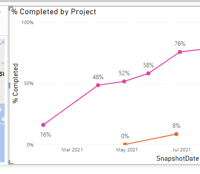
Line Chart carrying out "SUM" function on values!
I have a line chart that has the below values...
Axis: Snapshotdate {Date}
Legend: Project Name {Text}
Values: Completed (Decimal | Percentage | Dont Summarise)
The problem is the "Completed" values are being added together, where i want the individual completed percent values for each month showing, but it doesnt give me the option to "Dont Summerize" on the "Values" dropdown option. I hope that makes sense.
Solved! Go to Solution.
- Mark as New
- Bookmark
- Subscribe
- Mute
- Subscribe to RSS Feed
- Permalink
- Report Inappropriate Content
@StuartSmith let's assume the case here, if a project has two dates for the same month let's say 50% and then 99%, currently it is doing the sum of this ( correct? ), what would you like to see in this case 99% (I guess)
so add a measure :
Max % = MAX ( Table[Complete Percentage Column] )
and use this measure in the value, basically, it will show the maximum complete % of a project if there are multiple entries of the same project in a month. I hope it helps.
For date, on the formatting pane, under the x-axis choose continuous instead of categorical.
✨ Follow us on LinkedIn
Learn about conditional formatting at Microsoft Reactor
My latest blog post The Power of Using Calculation Groups with Inactive Relationships (Part 1) (perytus.com) I would ❤ Kudos if my solution helped. 👉 If you can spend time posting the question, you can also make efforts to give Kudos to whoever helped to solve your problem. It is a token of appreciation!
⚡ Visit us at https://perytus.com, your one-stop-shop for Power BI-related projects/training/consultancy.⚡
Subscribe to the @PowerBIHowTo YT channel for an upcoming video on List and Record functions in Power Query!!
Learn Power BI and Fabric - subscribe to our YT channel - Click here: @PowerBIHowTo
If my solution proved useful, I'd be delighted to receive Kudos. When you put effort into asking a question, it's equally thoughtful to acknowledge and give Kudos to the individual who helped you solve the problem. It's a small gesture that shows appreciation and encouragement! ❤
Did I answer your question? Mark my post as a solution. Proud to be a Super User! Appreciate your Kudos 🙂
Feel free to email me with any of your BI needs.
- Mark as New
- Bookmark
- Subscribe
- Mute
- Subscribe to RSS Feed
- Permalink
- Report Inappropriate Content
I have just found out that you can format a measure from the "Relationship" tab...
Anyway, thanks for your original measure fix, that started me on the path to a solution that I am happy with.
- Mark as New
- Bookmark
- Subscribe
- Mute
- Subscribe to RSS Feed
- Permalink
- Report Inappropriate Content
@StuartSmith let's assume the case here, if a project has two dates for the same month let's say 50% and then 99%, currently it is doing the sum of this ( correct? ), what would you like to see in this case 99% (I guess)
so add a measure :
Max % = MAX ( Table[Complete Percentage Column] )
and use this measure in the value, basically, it will show the maximum complete % of a project if there are multiple entries of the same project in a month. I hope it helps.
For date, on the formatting pane, under the x-axis choose continuous instead of categorical.
✨ Follow us on LinkedIn
Learn about conditional formatting at Microsoft Reactor
My latest blog post The Power of Using Calculation Groups with Inactive Relationships (Part 1) (perytus.com) I would ❤ Kudos if my solution helped. 👉 If you can spend time posting the question, you can also make efforts to give Kudos to whoever helped to solve your problem. It is a token of appreciation!
⚡ Visit us at https://perytus.com, your one-stop-shop for Power BI-related projects/training/consultancy.⚡
Subscribe to the @PowerBIHowTo YT channel for an upcoming video on List and Record functions in Power Query!!
Learn Power BI and Fabric - subscribe to our YT channel - Click here: @PowerBIHowTo
If my solution proved useful, I'd be delighted to receive Kudos. When you put effort into asking a question, it's equally thoughtful to acknowledge and give Kudos to the individual who helped you solve the problem. It's a small gesture that shows appreciation and encouragement! ❤
Did I answer your question? Mark my post as a solution. Proud to be a Super User! Appreciate your Kudos 🙂
Feel free to email me with any of your BI needs.
- Mark as New
- Bookmark
- Subscribe
- Mute
- Subscribe to RSS Feed
- Permalink
- Report Inappropriate Content
Thanks, and we are getting there. I did change your code from "Max" to "Avg" as say if one country was on 100% completed and another on 50% completed, the line chart would give the impression that all countries where 100% completed, where as changing to Avg, it will give a Avg for all Countries. Plus if only 1 country is selected, the values show correctly.
I will test, but its looking good. One thing I did nortice was that by adding the measure, its changed the formatting of the chart from 40% to 0.40 and the Axis range has gone from 0% > 100% to 0.0 > 1.0. Is there a way to format the measure output?
Before
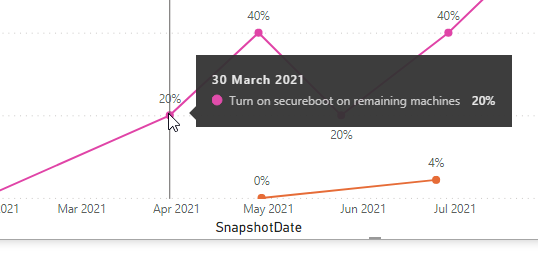
After
- Mark as New
- Bookmark
- Subscribe
- Mute
- Subscribe to RSS Feed
- Permalink
- Report Inappropriate Content
I presumed...
- Mark as New
- Bookmark
- Subscribe
- Mute
- Subscribe to RSS Feed
- Permalink
- Report Inappropriate Content
@StuartSmith You cannot do that, you have to have an aggregation on the value section. Are you saying, you have projects with the same snapshot date with percentage?
Subscribe to the @PowerBIHowTo YT channel for an upcoming video on List and Record functions in Power Query!!
Learn Power BI and Fabric - subscribe to our YT channel - Click here: @PowerBIHowTo
If my solution proved useful, I'd be delighted to receive Kudos. When you put effort into asking a question, it's equally thoughtful to acknowledge and give Kudos to the individual who helped you solve the problem. It's a small gesture that shows appreciation and encouragement! ❤
Did I answer your question? Mark my post as a solution. Proud to be a Super User! Appreciate your Kudos 🙂
Feel free to email me with any of your BI needs.
- Mark as New
- Bookmark
- Subscribe
- Mute
- Subscribe to RSS Feed
- Permalink
- Report Inappropriate Content
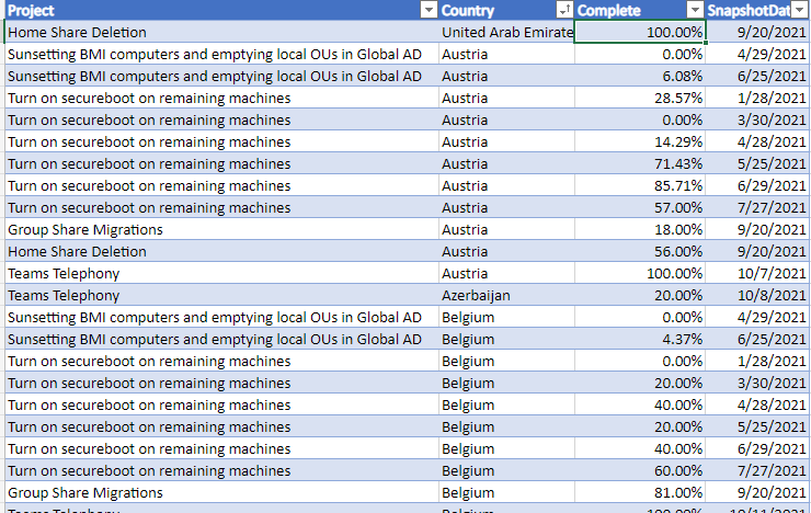
Thanks for replying. And yes, there will be multiple projects with the same "Snapshot Date" and varying % values. I was just reading up on "Aggregates" on the link https://docs.microsoft.com/en-us/power-bi/create-reports/service-aggregates and at the bottom is says about if the data is from Excel and a calculated value. The data is from an excel file, but not created via a formula.
I was just hoping to create a line chart of the progress of each project over the months. Here is an example of the data.
and I have also noticed if I select a data point, the "Month" is wrong (see below).
How can I get it so it just show a line for each project and the monthly % value? Thanks in advance.
Helpful resources

Microsoft Fabric Learn Together
Covering the world! 9:00-10:30 AM Sydney, 4:00-5:30 PM CET (Paris/Berlin), 7:00-8:30 PM Mexico City

Power BI Monthly Update - April 2024
Check out the April 2024 Power BI update to learn about new features.

| User | Count |
|---|---|
| 110 | |
| 99 | |
| 80 | |
| 64 | |
| 57 |
| User | Count |
|---|---|
| 145 | |
| 110 | |
| 91 | |
| 84 | |
| 66 |


