- Power BI forums
- Updates
- News & Announcements
- Get Help with Power BI
- Desktop
- Service
- Report Server
- Power Query
- Mobile Apps
- Developer
- DAX Commands and Tips
- Custom Visuals Development Discussion
- Health and Life Sciences
- Power BI Spanish forums
- Translated Spanish Desktop
- Power Platform Integration - Better Together!
- Power Platform Integrations (Read-only)
- Power Platform and Dynamics 365 Integrations (Read-only)
- Training and Consulting
- Instructor Led Training
- Dashboard in a Day for Women, by Women
- Galleries
- Community Connections & How-To Videos
- COVID-19 Data Stories Gallery
- Themes Gallery
- Data Stories Gallery
- R Script Showcase
- Webinars and Video Gallery
- Quick Measures Gallery
- 2021 MSBizAppsSummit Gallery
- 2020 MSBizAppsSummit Gallery
- 2019 MSBizAppsSummit Gallery
- Events
- Ideas
- Custom Visuals Ideas
- Issues
- Issues
- Events
- Upcoming Events
- Community Blog
- Power BI Community Blog
- Custom Visuals Community Blog
- Community Support
- Community Accounts & Registration
- Using the Community
- Community Feedback
Register now to learn Fabric in free live sessions led by the best Microsoft experts. From Apr 16 to May 9, in English and Spanish.
- Power BI forums
- Forums
- Get Help with Power BI
- Desktop
- Line Chart - With States or Change color with dire...
- Subscribe to RSS Feed
- Mark Topic as New
- Mark Topic as Read
- Float this Topic for Current User
- Bookmark
- Subscribe
- Printer Friendly Page
- Mark as New
- Bookmark
- Subscribe
- Mute
- Subscribe to RSS Feed
- Permalink
- Report Inappropriate Content
Line Chart - With States or Change color with direction of trend
Hello,
I am trying to create line chart with changing color - green(up) when the current data point value is greater than previous data point and red(down)
I have created the following measures in DAX:
1. [Total Sales]

2. [PM Sale] =
CALCULATE([TotalSales], PARALLELPERIOD('Date'[Date], -1, MONTH)) // Previous month Sales

3. [Indicator] = IF([TotalSales] - [PM Sale] >=0, 1, 0)

4. [IndicatorText] = IF([TotalSales] - [PM Sale] >=0, "UP", "DOWN")
I thought adding the [Indicator] or [IndicatorText] to "Legend" property of line chart would be possible and then be able to change the color, but it is not.
Any ideas?
Thanks, Shiv
Solved! Go to Solution.
- Mark as New
- Bookmark
- Subscribe
- Mute
- Subscribe to RSS Feed
- Permalink
- Report Inappropriate Content
Hi @shivkonar,
Based on my test, you can refer to below steps:
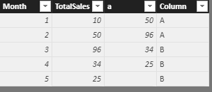
1.I have entered some sample data like the picture below and the column[a] and column[Legend] is calculated column:
a = var a=[Month]+1
return CALCULATE(SUM('Row Table'[TotalSales]),FILTER('Row Table','Row Table'[Month]=a))
Legend = IF([a]-[TotalSales]>=0,"A","B")
2.Create a new table and add a related column.
New table:
Table with change value = CALCULATETABLE('Row Table','Row Table'[Month]=3)
Calculated column:
ColumnA = IF('Table with change value'[Legend]="B","A")
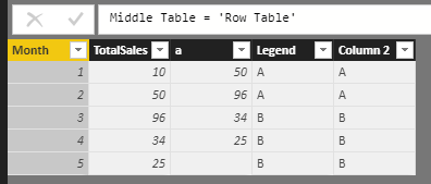
3.Create a new middle table and add a column
New table:
Middle Table = 'Row Table'
Calculated column:
Column 2 = 'Middle Table'[Legend]
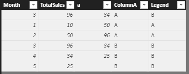
4.Union the ‘Middle’ table and the ‘Table with change value’ table.
Unio Table = UNION('Table with change value','Middle Table')
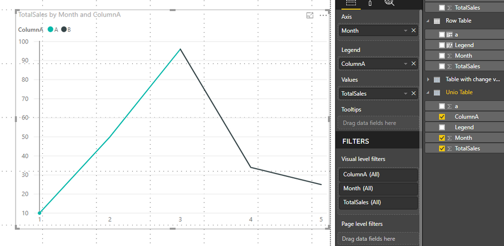
5.Create a Line chart and add the related fields, now you can see the result.
You can also download the PBIX file to have a view.
Regards,
Daniel He
If this post helps, then please consider Accept it as the solution to help the other members find it more quickly.
- Mark as New
- Bookmark
- Subscribe
- Mute
- Subscribe to RSS Feed
- Permalink
- Report Inappropriate Content
Hello @v-danhe-msft,
Thank you for your solution. Please see another solution from Stack Overflow community
https://stackoverflow.com/questions/51579341/power-bi-line-chart-with-changing-color-for-trend
- Mark as New
- Bookmark
- Subscribe
- Mute
- Subscribe to RSS Feed
- Permalink
- Report Inappropriate Content
Hi @shivkonar,
Thanks for your sharing, could you please mark my helpful replies as Answered?
Regards,
Daniel He
If this post helps, then please consider Accept it as the solution to help the other members find it more quickly.
Helpful resources

Microsoft Fabric Learn Together
Covering the world! 9:00-10:30 AM Sydney, 4:00-5:30 PM CET (Paris/Berlin), 7:00-8:30 PM Mexico City

Power BI Monthly Update - April 2024
Check out the April 2024 Power BI update to learn about new features.

| User | Count |
|---|---|
| 114 | |
| 99 | |
| 83 | |
| 70 | |
| 60 |
| User | Count |
|---|---|
| 150 | |
| 115 | |
| 104 | |
| 89 | |
| 65 |


