- Power BI forums
- Updates
- News & Announcements
- Get Help with Power BI
- Desktop
- Service
- Report Server
- Power Query
- Mobile Apps
- Developer
- DAX Commands and Tips
- Custom Visuals Development Discussion
- Health and Life Sciences
- Power BI Spanish forums
- Translated Spanish Desktop
- Power Platform Integration - Better Together!
- Power Platform Integrations (Read-only)
- Power Platform and Dynamics 365 Integrations (Read-only)
- Training and Consulting
- Instructor Led Training
- Dashboard in a Day for Women, by Women
- Galleries
- Community Connections & How-To Videos
- COVID-19 Data Stories Gallery
- Themes Gallery
- Data Stories Gallery
- R Script Showcase
- Webinars and Video Gallery
- Quick Measures Gallery
- 2021 MSBizAppsSummit Gallery
- 2020 MSBizAppsSummit Gallery
- 2019 MSBizAppsSummit Gallery
- Events
- Ideas
- Custom Visuals Ideas
- Issues
- Issues
- Events
- Upcoming Events
- Community Blog
- Power BI Community Blog
- Custom Visuals Community Blog
- Community Support
- Community Accounts & Registration
- Using the Community
- Community Feedback
Register now to learn Fabric in free live sessions led by the best Microsoft experts. From Apr 16 to May 9, in English and Spanish.
- Power BI forums
- Forums
- Get Help with Power BI
- Desktop
- Line Chart: Solid lines up to certain dates and th...
- Subscribe to RSS Feed
- Mark Topic as New
- Mark Topic as Read
- Float this Topic for Current User
- Bookmark
- Subscribe
- Printer Friendly Page
- Mark as New
- Bookmark
- Subscribe
- Mute
- Subscribe to RSS Feed
- Permalink
- Report Inappropriate Content
Line Chart: Solid lines up to certain dates and then Dotted line
Hello guys,
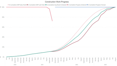
I have a line chart as follows and wondering if I can get solid green line (Achieved progress) up to a certain date (let's say November 30, 2021) and then followed by dotted green line (Forecast progress)?
Any help is appreciated.
Thanks,
Nilesh
Solved! Go to Solution.
- Mark as New
- Bookmark
- Subscribe
- Mute
- Subscribe to RSS Feed
- Permalink
- Report Inappropriate Content
Hi @jnnilesh29
Please correct me if I wrongly understand your question .
In your sample, use a certain date 2021-11-30 as the separation point , the value of Achieved progress display as a solid green line and the value of Forecast progress display as a dotted green line .You can realize the requirements by creating measures .I create a sample , you can make a reference .
(1)Create two measures to return the value of Achieved progress before the certain date and the value of Forecast progress after the certain date .
achieved progress before = CALCULATE(SUM('Table'[Achieved progress]),FILTER('Table','Table'[Date]<=DATE(2021,11,30)))forecast progress after = CALCULATE(SUM('Table'[Forecast progress]),FILTER('Table','Table'[Date]>=DATE(2021,11,30)))(2)Add a Line chart ,and put these two measures in Values and Secondary values ,date in Axis .
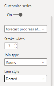
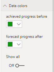
(3)In visual format , turn on Customize series in Shapes . Choose the measure [forecast progress after] and set the Line style to Dotted . Change the line color in Data colors .
The final result is as shown :
I have attached my pbix file , you can refer to it .
Best Regards
Community Support Team _ Ailsa Tao
- Mark as New
- Bookmark
- Subscribe
- Mute
- Subscribe to RSS Feed
- Permalink
- Report Inappropriate Content
You should create 2 measures per line (one for solid and one for dotted).
See link below:
- Mark as New
- Bookmark
- Subscribe
- Mute
- Subscribe to RSS Feed
- Permalink
- Report Inappropriate Content
Hi @themistoklis ,
I did create two measure per the link you shared. However, it is giving me some weird results. Please see the below graph and measures:
Please help.
Helpful resources

Microsoft Fabric Learn Together
Covering the world! 9:00-10:30 AM Sydney, 4:00-5:30 PM CET (Paris/Berlin), 7:00-8:30 PM Mexico City

Power BI Monthly Update - April 2024
Check out the April 2024 Power BI update to learn about new features.

| User | Count |
|---|---|
| 111 | |
| 94 | |
| 83 | |
| 66 | |
| 59 |
| User | Count |
|---|---|
| 151 | |
| 121 | |
| 104 | |
| 87 | |
| 67 |


