- Power BI forums
- Updates
- News & Announcements
- Get Help with Power BI
- Desktop
- Service
- Report Server
- Power Query
- Mobile Apps
- Developer
- DAX Commands and Tips
- Custom Visuals Development Discussion
- Health and Life Sciences
- Power BI Spanish forums
- Translated Spanish Desktop
- Power Platform Integration - Better Together!
- Power Platform Integrations (Read-only)
- Power Platform and Dynamics 365 Integrations (Read-only)
- Training and Consulting
- Instructor Led Training
- Dashboard in a Day for Women, by Women
- Galleries
- Community Connections & How-To Videos
- COVID-19 Data Stories Gallery
- Themes Gallery
- Data Stories Gallery
- R Script Showcase
- Webinars and Video Gallery
- Quick Measures Gallery
- 2021 MSBizAppsSummit Gallery
- 2020 MSBizAppsSummit Gallery
- 2019 MSBizAppsSummit Gallery
- Events
- Ideas
- Custom Visuals Ideas
- Issues
- Issues
- Events
- Upcoming Events
- Community Blog
- Power BI Community Blog
- Custom Visuals Community Blog
- Community Support
- Community Accounts & Registration
- Using the Community
- Community Feedback
Register now to learn Fabric in free live sessions led by the best Microsoft experts. From Apr 16 to May 9, in English and Spanish.
- Power BI forums
- Forums
- Get Help with Power BI
- Desktop
- Re: Line Chart - Multiple numeric values on the sa...
- Subscribe to RSS Feed
- Mark Topic as New
- Mark Topic as Read
- Float this Topic for Current User
- Bookmark
- Subscribe
- Printer Friendly Page
- Mark as New
- Bookmark
- Subscribe
- Mute
- Subscribe to RSS Feed
- Permalink
- Report Inappropriate Content
Line Chart - Multiple numeric values on the same X point
Hello community!
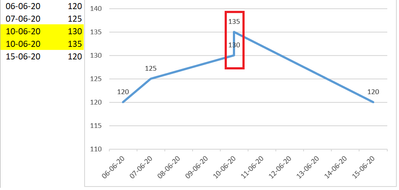
I'm trying to achieve the below (in Excel) using Power BI.
Where one date has multiple values.
The aim is to show these values as separate numbers on a vertical line.
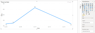
Using the same data in Power BI line chart summarizes the values by default, do not summarize option is not available.
Is there any way the above can be done within Power BI?
Thank you,
Sabine O.
- Mark as New
- Bookmark
- Subscribe
- Mute
- Subscribe to RSS Feed
- Permalink
- Report Inappropriate Content
Alright. If you consider the data you provided and specifically look at these four datapoints:
(07-06 / 125)
(10-06 / 130)
(10-06 / 135)
(15-06 / 120)
There is no natural way for these the system to know the path between these datapoints as it could be either:
(07-06 / 125) -> (10-06 / 130) -> (10-06 / 135) -> (15-06 / 120)
or:
(07-06 / 125) -> (10-06 / 135) -> (10-06 / 130) -> (15-06 / 120)
The line chart logic uses the X-axis values as the pathing between datapoints and as this is the same value you are going to have this issue.
Either way, to my knowledge there is no way to have more than one datapoint on the same X-axis value on a line-chart. I might be wrong here hut i've never seen it.
I have a potential solution in mind, but it's really complicated and messy. It involves combining columns with lines in a column/line chart and essentially making the increases as very thin columns and then using two lines to draw the changes between the days.
I'm not sure if it's possible but it might 🙂
Br,
J
Connect on LinkedIn
- Mark as New
- Bookmark
- Subscribe
- Mute
- Subscribe to RSS Feed
- Permalink
- Report Inappropriate Content
Hi, @SabineOussi
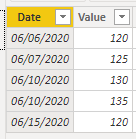
Based on your description, I create data to reproduce your scenario..
Table:
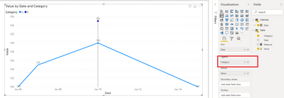
If there is no column put in the 'Legend' to classify the vlaue for each date. It will calculated the sum aggregation value of the date.
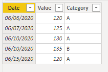
When you add a column 'Category' as below and put it in 'Legend', here is the result.
Best Regards
Allan
If this post helps, then please consider Accept it as the solution to help the other members find it more quickly.
- Mark as New
- Bookmark
- Subscribe
- Mute
- Subscribe to RSS Feed
- Permalink
- Report Inappropriate Content
Thank you for your help.
The request is to have one continuous vertical line showing the length/duration of that datapoint.
Unfortunately, the solutions provided do not answer that.
Thanks,
Sabine O.
- Mark as New
- Bookmark
- Subscribe
- Mute
- Subscribe to RSS Feed
- Permalink
- Report Inappropriate Content
Another more simple solution that should work is converting the date to datetime and adding a few hours to the (10-06 / 135) This will result in the datapoints not being on the same value on the X-axis but the result should look quite similar to what you're looking for.
Connect on LinkedIn
- Mark as New
- Bookmark
- Subscribe
- Mute
- Subscribe to RSS Feed
- Permalink
- Report Inappropriate Content
I'd say no, you will either need to add another level of detail to the date column or use some type of category to divide the two datapoints.
Br,
J
Connect on LinkedIn
- Mark as New
- Bookmark
- Subscribe
- Mute
- Subscribe to RSS Feed
- Permalink
- Report Inappropriate Content
Thank you.
Can you please elaborate?
These two numbers belong to records having same category and same attributes.
Consider it as a datapoint starting at 130 with a length or duration of 5 so it needs to end at 135.
Sounds pretty straightforward in Excel.
And a bar chart in Power BI wouldn't do it since my starting point is not zero.
Thanks again,
Sabine O.
Helpful resources

Microsoft Fabric Learn Together
Covering the world! 9:00-10:30 AM Sydney, 4:00-5:30 PM CET (Paris/Berlin), 7:00-8:30 PM Mexico City

Power BI Monthly Update - April 2024
Check out the April 2024 Power BI update to learn about new features.

| User | Count |
|---|---|
| 105 | |
| 93 | |
| 75 | |
| 62 | |
| 50 |
| User | Count |
|---|---|
| 146 | |
| 109 | |
| 106 | |
| 88 | |
| 61 |
