- Power BI forums
- Updates
- News & Announcements
- Get Help with Power BI
- Desktop
- Service
- Report Server
- Power Query
- Mobile Apps
- Developer
- DAX Commands and Tips
- Custom Visuals Development Discussion
- Health and Life Sciences
- Power BI Spanish forums
- Translated Spanish Desktop
- Power Platform Integration - Better Together!
- Power Platform Integrations (Read-only)
- Power Platform and Dynamics 365 Integrations (Read-only)
- Training and Consulting
- Instructor Led Training
- Dashboard in a Day for Women, by Women
- Galleries
- Community Connections & How-To Videos
- COVID-19 Data Stories Gallery
- Themes Gallery
- Data Stories Gallery
- R Script Showcase
- Webinars and Video Gallery
- Quick Measures Gallery
- 2021 MSBizAppsSummit Gallery
- 2020 MSBizAppsSummit Gallery
- 2019 MSBizAppsSummit Gallery
- Events
- Ideas
- Custom Visuals Ideas
- Issues
- Issues
- Events
- Upcoming Events
- Community Blog
- Power BI Community Blog
- Custom Visuals Community Blog
- Community Support
- Community Accounts & Registration
- Using the Community
- Community Feedback
Register now to learn Fabric in free live sessions led by the best Microsoft experts. From Apr 16 to May 9, in English and Spanish.
- Power BI forums
- Forums
- Get Help with Power BI
- Desktop
- Re: Line Chart: Conditional Formatting
- Subscribe to RSS Feed
- Mark Topic as New
- Mark Topic as Read
- Float this Topic for Current User
- Bookmark
- Subscribe
- Printer Friendly Page
- Mark as New
- Bookmark
- Subscribe
- Mute
- Subscribe to RSS Feed
- Permalink
- Report Inappropriate Content
Line Chart: Conditional Formatting
Hi All,
Im quite new to Power BI. Is there a way to use condtional formatting on a line chart...
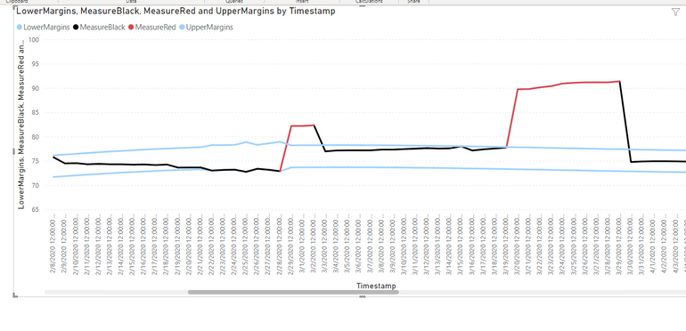
I have a line chart with 3 measures, 1 lower limit, 1 upper limit and 1 with the actual measure.
The line has to color red when it exceeds either the lower or upper limits.
Thanks for your help fam.
Regards,
POWERNOOB
Solved! Go to Solution.
- Mark as New
- Bookmark
- Subscribe
- Mute
- Subscribe to RSS Feed
- Permalink
- Report Inappropriate Content
Hi @Anonymous,
Currently, this feature is not supported in Power BI Desktop, you could vote this idea which has been submitted in Power BI ideas forum.
For the workaround, I have made a test that you could create two measures to get the result below.
sales1 = IF(SUM(Test[Sales])>40,BLANK(),SUM(Test[Sales]))
sales2 = IF(SUM(Test[Sales])>40,SUM(Test[Sales]),BLANK())
The line chart shows red which sales >40 and black which sales<=40.
Best Regards,
Cherry
If this post helps, then please consider Accept it as the solution to help the other members find it more quickly.
- Mark as New
- Bookmark
- Subscribe
- Mute
- Subscribe to RSS Feed
- Permalink
- Report Inappropriate Content
Sorry for late
let me join this discussion, I know I'm too late but, got the right solution for future reference.
Please check out this blog.
https://exceleratorbi.com.au/line-chart-conditional-formatting/
Thanks
- Mark as New
- Bookmark
- Subscribe
- Mute
- Subscribe to RSS Feed
- Permalink
- Report Inappropriate Content
Interesting solution !
Do you think that this can be adapted to change the line color point by point ? (instead of the entire line ?)
- Mark as New
- Bookmark
- Subscribe
- Mute
- Subscribe to RSS Feed
- Permalink
- Report Inappropriate Content
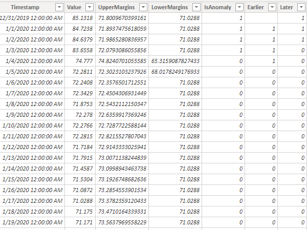
I was unable to get the single line with changing colors that PowerNoob showed in the screen shot following the steps described in the Solved answer. Thought I would share my workaround to make it work.
I have a table with date, value, Upper & lower bounds, and is this row an Anomaly.
I added two columns looking at the Anomaly for the prior day and for the next day (both are not needed but based on what you pick will determine the color of the line connecting).
The line chart has two measures
Black is filtering on all that are currently zero or that are one now but will be zero tomorrow .
Result below...
Hope this helps...
- Mark as New
- Bookmark
- Subscribe
- Mute
- Subscribe to RSS Feed
- Permalink
- Report Inappropriate Content
Hi @Anonymous,
Currently, this feature is not supported in Power BI Desktop, you could vote this idea which has been submitted in Power BI ideas forum.
For the workaround, I have made a test that you could create two measures to get the result below.
sales1 = IF(SUM(Test[Sales])>40,BLANK(),SUM(Test[Sales]))
sales2 = IF(SUM(Test[Sales])>40,SUM(Test[Sales]),BLANK())
The line chart shows red which sales >40 and black which sales<=40.
Best Regards,
Cherry
If this post helps, then please consider Accept it as the solution to help the other members find it more quickly.
- Mark as New
- Bookmark
- Subscribe
- Mute
- Subscribe to RSS Feed
- Permalink
- Report Inappropriate Content
For getting this to work you need the x axis to be cathegorical.
- Mark as New
- Bookmark
- Subscribe
- Mute
- Subscribe to RSS Feed
- Permalink
- Report Inappropriate Content
works like a charm. thanks mate!
- Mark as New
- Bookmark
- Subscribe
- Mute
- Subscribe to RSS Feed
- Permalink
- Report Inappropriate Content
How did you get the lines to join? Pls share file
- Mark as New
- Bookmark
- Subscribe
- Mute
- Subscribe to RSS Feed
- Permalink
- Report Inappropriate Content
How to achieve this? would you kindly to share, please. thank you
- Mark as New
- Bookmark
- Subscribe
- Mute
- Subscribe to RSS Feed
- Permalink
- Report Inappropriate Content
Let me join this thread if I may...
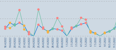
There is a "quick an dirty" way of using conditional format on a Line Chart which is a bit of a hack (a bug maybe), is not documented as far as I'm aware, and is limited in the formatting options available
The method is simple. Start with a bar chart and add your conditional formatting on this chart:
Now simply change the visual to a Line Chart by selecting the visual type in the visuals pane:
(I actually came across this by accident while playing around with visuals).
Unfortunately the line colour is unaffected, and you can't play around with the shapes etc... (not really surprising).
However, it is another option in our toolbox.
Did I answer your question? Mark my post as a solution!
In doing so, you are also helping me. Thank you!
Proud to be a Super User!
Paul on Linkedin.
- Mark as New
- Bookmark
- Subscribe
- Mute
- Subscribe to RSS Feed
- Permalink
- Report Inappropriate Content
Paul, thank you very much for this post! I've also created formatted dots in line chart by accident and spent a lot of time to find out how I've acchieved that. So you've explained here.
Just to add that line colour can be changed. Maybe it couldn't two years ago.
- Mark as New
- Bookmark
- Subscribe
- Mute
- Subscribe to RSS Feed
- Permalink
- Report Inappropriate Content
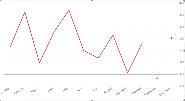
When trying to recreate this code, I cannot get the continous line to go below the specified target, does anyone have a solution?
- Mark as New
- Bookmark
- Subscribe
- Mute
- Subscribe to RSS Feed
- Permalink
- Report Inappropriate Content
Kindly help me how to join this line as shown above. I created 2 measures for this, but the lines are not joining.
- Mark as New
- Bookmark
- Subscribe
- Mute
- Subscribe to RSS Feed
- Permalink
- Report Inappropriate Content
hi,
i am new to Dax and power BI.
can share with me how this work? where do you enter the DAX code to make the two line appeared in the visual chart?
how can we create another table to record down all the points that are out of the boundary?
- Mark as New
- Bookmark
- Subscribe
- Mute
- Subscribe to RSS Feed
- Permalink
- Report Inappropriate Content
Hi,
If you created two measures one with greater than target & lesser than target, how were you able to achieve continous line with Color formating ?
Thanks in Advance,
Sai
- Mark as New
- Bookmark
- Subscribe
- Mute
- Subscribe to RSS Feed
- Permalink
- Report Inappropriate Content
Thanks Piga, will try it out!
Helpful resources

Microsoft Fabric Learn Together
Covering the world! 9:00-10:30 AM Sydney, 4:00-5:30 PM CET (Paris/Berlin), 7:00-8:30 PM Mexico City

Power BI Monthly Update - April 2024
Check out the April 2024 Power BI update to learn about new features.

| User | Count |
|---|---|
| 118 | |
| 107 | |
| 70 | |
| 70 | |
| 43 |
| User | Count |
|---|---|
| 148 | |
| 104 | |
| 104 | |
| 89 | |
| 66 |

