- Power BI forums
- Updates
- News & Announcements
- Get Help with Power BI
- Desktop
- Service
- Report Server
- Power Query
- Mobile Apps
- Developer
- DAX Commands and Tips
- Custom Visuals Development Discussion
- Health and Life Sciences
- Power BI Spanish forums
- Translated Spanish Desktop
- Power Platform Integration - Better Together!
- Power Platform Integrations (Read-only)
- Power Platform and Dynamics 365 Integrations (Read-only)
- Training and Consulting
- Instructor Led Training
- Dashboard in a Day for Women, by Women
- Galleries
- Community Connections & How-To Videos
- COVID-19 Data Stories Gallery
- Themes Gallery
- Data Stories Gallery
- R Script Showcase
- Webinars and Video Gallery
- Quick Measures Gallery
- 2021 MSBizAppsSummit Gallery
- 2020 MSBizAppsSummit Gallery
- 2019 MSBizAppsSummit Gallery
- Events
- Ideas
- Custom Visuals Ideas
- Issues
- Issues
- Events
- Upcoming Events
- Community Blog
- Power BI Community Blog
- Custom Visuals Community Blog
- Community Support
- Community Accounts & Registration
- Using the Community
- Community Feedback
Register now to learn Fabric in free live sessions led by the best Microsoft experts. From Apr 16 to May 9, in English and Spanish.
- Power BI forums
- Forums
- Get Help with Power BI
- Desktop
- Re: Line Chart Coloring based on slicer selection
- Subscribe to RSS Feed
- Mark Topic as New
- Mark Topic as Read
- Float this Topic for Current User
- Bookmark
- Subscribe
- Printer Friendly Page
- Mark as New
- Bookmark
- Subscribe
- Mute
- Subscribe to RSS Feed
- Permalink
- Report Inappropriate Content
Line Chart Coloring based on slicer selection
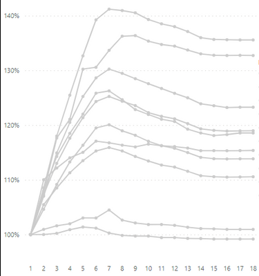
I have this line chart with values for different weeks. In the legend I've a department classification. I want to have slicer with Department values and I'd like the user to select a department and the chart only colors that department.
Line chart doesn't allow me to do conditional coloring. Does anyone have a work around? could we use Calculation Items in Tabular Editor?
Solved! Go to Solution.
- Mark as New
- Bookmark
- Subscribe
- Mute
- Subscribe to RSS Feed
- Permalink
- Report Inappropriate Content
Here is one way.
Create individual measures for each department. In my example they follow this pattern:
Classif A =
CALCULATE(SUM(fTable[Classification]), 'Department Table'[Department] ="A")
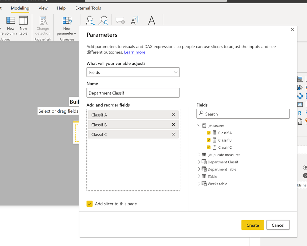
Next create a new Field parameter with all the individual measures:
Next duplicate the individual measures you created. In my example following this pattern (same measure; different name):
Points A = CALCULATE(SUM(fTable[Classification]), 'Department Table'[Department] ="A")
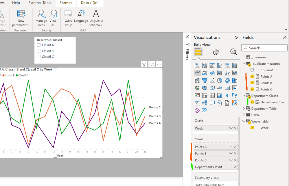
Next set up the line visual including the duplicate measures and the measure created by the field parameter (the order is important; the field parameter measure must be at the bottom of the bucket):
Now format the line colour so that only those included in the field parameter measure have a colour (I've made the colours different but you can use the same colour for these if you wish).
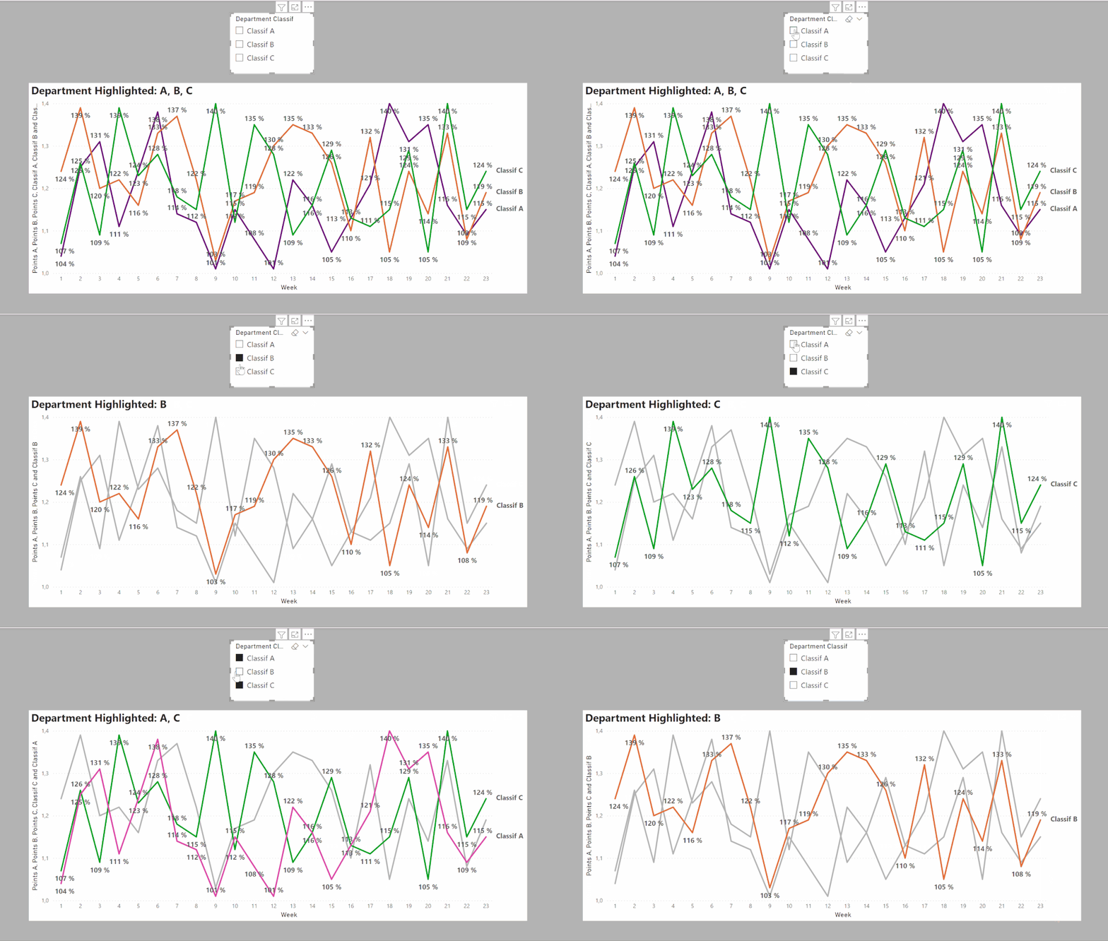
(I've also added selective labels for the FP parameter values)
And this is the result:
Did I answer your question? Mark my post as a solution!
In doing so, you are also helping me. Thank you!
Proud to be a Super User!
Paul on Linkedin.
- Mark as New
- Bookmark
- Subscribe
- Mute
- Subscribe to RSS Feed
- Permalink
- Report Inappropriate Content
Here is one way.
Create individual measures for each department. In my example they follow this pattern:
Classif A =
CALCULATE(SUM(fTable[Classification]), 'Department Table'[Department] ="A")
Next create a new Field parameter with all the individual measures:
Next duplicate the individual measures you created. In my example following this pattern (same measure; different name):
Points A = CALCULATE(SUM(fTable[Classification]), 'Department Table'[Department] ="A")
Next set up the line visual including the duplicate measures and the measure created by the field parameter (the order is important; the field parameter measure must be at the bottom of the bucket):
Now format the line colour so that only those included in the field parameter measure have a colour (I've made the colours different but you can use the same colour for these if you wish).
(I've also added selective labels for the FP parameter values)
And this is the result:

Did I answer your question? Mark my post as a solution!
In doing so, you are also helping me. Thank you!
Proud to be a Super User!
Paul on Linkedin.
- Mark as New
- Bookmark
- Subscribe
- Mute
- Subscribe to RSS Feed
- Permalink
- Report Inappropriate Content
This worked perfectly for me. I just have to tweek it to control my filters but everything else worked as I wanted it. Thanks so much Paul for taking the time to respond to my question. appreciate it.
Helpful resources

Microsoft Fabric Learn Together
Covering the world! 9:00-10:30 AM Sydney, 4:00-5:30 PM CET (Paris/Berlin), 7:00-8:30 PM Mexico City

Power BI Monthly Update - April 2024
Check out the April 2024 Power BI update to learn about new features.

| User | Count |
|---|---|
| 110 | |
| 94 | |
| 82 | |
| 66 | |
| 58 |
| User | Count |
|---|---|
| 151 | |
| 121 | |
| 104 | |
| 87 | |
| 67 |
