- Power BI forums
- Updates
- News & Announcements
- Get Help with Power BI
- Desktop
- Service
- Report Server
- Power Query
- Mobile Apps
- Developer
- DAX Commands and Tips
- Custom Visuals Development Discussion
- Health and Life Sciences
- Power BI Spanish forums
- Translated Spanish Desktop
- Power Platform Integration - Better Together!
- Power Platform Integrations (Read-only)
- Power Platform and Dynamics 365 Integrations (Read-only)
- Training and Consulting
- Instructor Led Training
- Dashboard in a Day for Women, by Women
- Galleries
- Community Connections & How-To Videos
- COVID-19 Data Stories Gallery
- Themes Gallery
- Data Stories Gallery
- R Script Showcase
- Webinars and Video Gallery
- Quick Measures Gallery
- 2021 MSBizAppsSummit Gallery
- 2020 MSBizAppsSummit Gallery
- 2019 MSBizAppsSummit Gallery
- Events
- Ideas
- Custom Visuals Ideas
- Issues
- Issues
- Events
- Upcoming Events
- Community Blog
- Power BI Community Blog
- Custom Visuals Community Blog
- Community Support
- Community Accounts & Registration
- Using the Community
- Community Feedback
Register now to learn Fabric in free live sessions led by the best Microsoft experts. From Apr 16 to May 9, in English and Spanish.
- Power BI forums
- Forums
- Get Help with Power BI
- Desktop
- Line Chart - 2 budgets 1 Node
- Subscribe to RSS Feed
- Mark Topic as New
- Mark Topic as Read
- Float this Topic for Current User
- Bookmark
- Subscribe
- Printer Friendly Page
- Mark as New
- Bookmark
- Subscribe
- Mute
- Subscribe to RSS Feed
- Permalink
- Report Inappropriate Content
Line Chart - 2 budgets 1 Node
Hi everyone,
I'm trying to create a line chart that change with according 2 slicers.
One slicers contains Nodes (1,2,3,4, etc...).
The other one contains Budgets (A, B, C, etc...)
The line chart shows me the added value of A+B when I select the Node (1). And shows me the behaviour of the budget once I select it, be it A or B or whatever.
But when I want to see Budget A and B at the same time, it only shows as 1 line, and I'd need them to show separately.
Is there a way to do that?
Thanks!
Solved! Go to Solution.
- Mark as New
- Bookmark
- Subscribe
- Mute
- Subscribe to RSS Feed
- Permalink
- Report Inappropriate Content
Hi @daledale,
check this out.
CATEGORY_NODE = 'Table'[Nodo] & ", " & 'Table'[SDO]
If I answered your question, please mark my post as solution, this will also help others.
Please give Kudos for support.
- Mark as New
- Bookmark
- Subscribe
- Mute
- Subscribe to RSS Feed
- Permalink
- Report Inappropriate Content
Hi @daledale
If I answered your question, please mark my post as solution, this will also help others.
Please give Kudos for support.
- Mark as New
- Bookmark
- Subscribe
- Mute
- Subscribe to RSS Feed
- Permalink
- Report Inappropriate Content
Hi @daledale,
did you solve your problem?
If I answered your question, please mark my post as solution, this will also help others.
Please give Kudos for support.
- Mark as New
- Bookmark
- Subscribe
- Mute
- Subscribe to RSS Feed
- Permalink
- Report Inappropriate Content
Sorry for the aweful delay!
YES! THIS IS IT! Thanks a lot!
- Mark as New
- Bookmark
- Subscribe
- Mute
- Subscribe to RSS Feed
- Permalink
- Report Inappropriate Content
If I answered your question, please mark my post as solution, this will also help others.
- Mark as New
- Bookmark
- Subscribe
- Mute
- Subscribe to RSS Feed
- Permalink
- Report Inappropriate Content
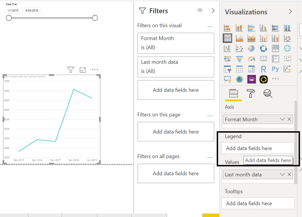
Not sure I got it completely. But if you put the budget in legend, then it should show two line.
Microsoft Power BI Learning Resources, 2023 !!
Learn Power BI - Full Course with Dec-2022, with Window, Index, Offset, 100+ Topics !!
Did I answer your question? Mark my post as a solution! Appreciate your Kudos !! Proud to be a Super User! !!
- Mark as New
- Bookmark
- Subscribe
- Mute
- Subscribe to RSS Feed
- Permalink
- Report Inappropriate Content
Sorry for my late reply, I'm really stucked with this PBI and need to solve many issues I cannot find solutions for..
This is the way I have my tables (it's actually an unpivotted table)
NODE - CATEGORY - COUNTRY - ATTRIBUTE - VALUE
1 A XX Q1 $$
1 B XX Q1 $$
2 A XXXX Q1 $$
2 B XXXX Q1 $$
And so on...
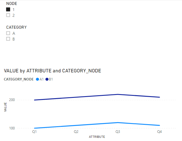
I have 2 slicers, which I use to filter my line charts.
1 is for NODEs, one is for CATEGORY.
If I filter by Category, I'm ok. Because I see a line for Category A, belonging to NODEs 1, 2, etc...
But if I filter by NODE, it shows me A+B as only one line in the chart.
Right now I have the NODEs in my legend and Attributes in my Axis.
- Mark as New
- Bookmark
- Subscribe
- Mute
- Subscribe to RSS Feed
- Permalink
- Report Inappropriate Content
Hi @daledale ,
maybe you could create a calculated column (Category & Node) and use it in the legend.
- Mark as New
- Bookmark
- Subscribe
- Mute
- Subscribe to RSS Feed
- Permalink
- Report Inappropriate Content
Thanks again, but what I need is to show them as 2 different lines when I filter by Node.
Meaning, I want to filter Node 1, and see a line for Category A, and a line for Category B.
- Mark as New
- Bookmark
- Subscribe
- Mute
- Subscribe to RSS Feed
- Permalink
- Report Inappropriate Content
So?
If I answered your question, please mark my post as solution, this will also help others.
Please give Kudos for support.
- Mark as New
- Bookmark
- Subscribe
- Mute
- Subscribe to RSS Feed
- Permalink
- Report Inappropriate Content
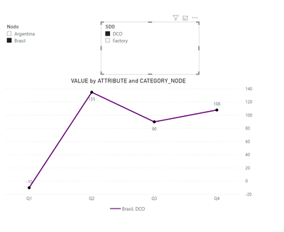
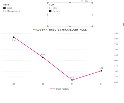
@mwegener sorry, I might not be expressing myself correctly.
Maybe with Screenshots it's easier:
Node = Nodo
Category = SDO
My Node of Brasil has both sub categories. But when I filter only by Node, it adds up both: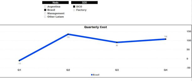
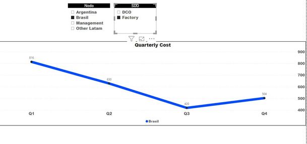

I hope this claryfies my issue, Thanks again for the support!
- Mark as New
- Bookmark
- Subscribe
- Mute
- Subscribe to RSS Feed
- Permalink
- Report Inappropriate Content
Hi @daledale,
check this out.
CATEGORY_NODE = 'Table'[Nodo] & ", " & 'Table'[SDO]
If I answered your question, please mark my post as solution, this will also help others.
Please give Kudos for support.
- Mark as New
- Bookmark
- Subscribe
- Mute
- Subscribe to RSS Feed
- Permalink
- Report Inappropriate Content
Helpful resources

Microsoft Fabric Learn Together
Covering the world! 9:00-10:30 AM Sydney, 4:00-5:30 PM CET (Paris/Berlin), 7:00-8:30 PM Mexico City

Power BI Monthly Update - April 2024
Check out the April 2024 Power BI update to learn about new features.

| User | Count |
|---|---|
| 109 | |
| 98 | |
| 80 | |
| 64 | |
| 57 |
| User | Count |
|---|---|
| 145 | |
| 111 | |
| 92 | |
| 84 | |
| 66 |
