- Power BI forums
- Updates
- News & Announcements
- Get Help with Power BI
- Desktop
- Service
- Report Server
- Power Query
- Mobile Apps
- Developer
- DAX Commands and Tips
- Custom Visuals Development Discussion
- Health and Life Sciences
- Power BI Spanish forums
- Translated Spanish Desktop
- Power Platform Integration - Better Together!
- Power Platform Integrations (Read-only)
- Power Platform and Dynamics 365 Integrations (Read-only)
- Training and Consulting
- Instructor Led Training
- Dashboard in a Day for Women, by Women
- Galleries
- Community Connections & How-To Videos
- COVID-19 Data Stories Gallery
- Themes Gallery
- Data Stories Gallery
- R Script Showcase
- Webinars and Video Gallery
- Quick Measures Gallery
- 2021 MSBizAppsSummit Gallery
- 2020 MSBizAppsSummit Gallery
- 2019 MSBizAppsSummit Gallery
- Events
- Ideas
- Custom Visuals Ideas
- Issues
- Issues
- Events
- Upcoming Events
- Community Blog
- Power BI Community Blog
- Custom Visuals Community Blog
- Community Support
- Community Accounts & Registration
- Using the Community
- Community Feedback
Register now to learn Fabric in free live sessions led by the best Microsoft experts. From Apr 16 to May 9, in English and Spanish.
- Power BI forums
- Forums
- Get Help with Power BI
- Desktop
- Re: Legend do not aggregate values
- Subscribe to RSS Feed
- Mark Topic as New
- Mark Topic as Read
- Float this Topic for Current User
- Bookmark
- Subscribe
- Printer Friendly Page
- Mark as New
- Bookmark
- Subscribe
- Mute
- Subscribe to RSS Feed
- Permalink
- Report Inappropriate Content
Legend do not aggregate values
I want to show stacked bar chart that colors values' category but does not aggregate the data.
The dataset in use:
| STR | Order | Cat | Id | Size |
| bird | 1 | a | 50002 | 1 |
| bird | 2 | b | 50006 | 1 |
| cat | 1 | a | 50001 | 1 |
| cat | 2 | b | 50004 | 1 |
| cat | 3 | b | 50005 | 1 |
| cat | 4 | b | 50009 | 1 |
| dog | 1 | b | 50003 | 1 |
| dog | 2 | a | 50007 | 1 |
| dog | 3 | a | 50008 | 1 |
I need to show each Size value in each STR colorized by Cat and order by Order.
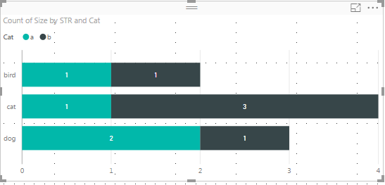
Here's my attempt using legend - cat
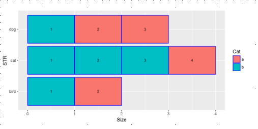
I want the final result be something like this:
The last graph was generated via Rscript:
library(ggplot2)
library(data.table)
library(plotly)
db<-data.table(dataset)
setorder(db, Order)
ggplot(db, aes(x=STR,label=Order, y=Size) )+
  geom_bar(aes(fill=Cat),stat="identity", color="blue")+coord_flip()+
  guides( color=FALSE)+  geom_text(size = 3, position = position_stack(vjust = 0.5))
The main problem is that R graphs are not interactive, so need to use powerBI visual option.
- Mark as New
- Bookmark
- Subscribe
- Mute
- Subscribe to RSS Feed
- Permalink
- Report Inappropriate Content
Hi @asayat,
You can create R visual in Power BI desktop.
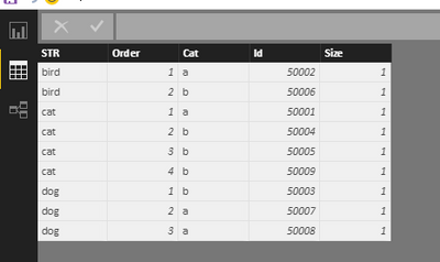
First, you need to get data, create a resource table, please see the following screenshot.
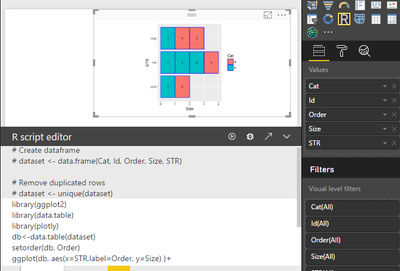
Second, select the R visual, select all the column as dataset. Type your R script and run it, you will get expexted result.
Please feel free to ask if you have any other problem.
Best Regards,
Angelia
- Mark as New
- Bookmark
- Subscribe
- Mute
- Subscribe to RSS Feed
- Permalink
- Report Inappropriate Content
Dear Angelia@v-huizhn-msft, thank you for your response!
The problem with R visual is that it's not interactive with other visuals. There is a need to have a plot as described above and click to any bar and get more specific information for that cell in other tabular visual. It can't be done by simply R visual.
- Mark as New
- Bookmark
- Subscribe
- Mute
- Subscribe to RSS Feed
- Permalink
- Report Inappropriate Content
Hi @asayat,
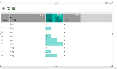
I understand your requirement now, while there is no such visual in Power BI desktop. After research, I find a custom visual (Table Sort), which is same with what you want but closer to. Please see the following screenshot. For same STR, cat a and b are shown in different colors.
Thanks,
Angelia
Helpful resources

Microsoft Fabric Learn Together
Covering the world! 9:00-10:30 AM Sydney, 4:00-5:30 PM CET (Paris/Berlin), 7:00-8:30 PM Mexico City

Power BI Monthly Update - April 2024
Check out the April 2024 Power BI update to learn about new features.

| User | Count |
|---|---|
| 109 | |
| 99 | |
| 77 | |
| 66 | |
| 54 |
| User | Count |
|---|---|
| 144 | |
| 104 | |
| 102 | |
| 87 | |
| 64 |
