- Power BI forums
- Updates
- News & Announcements
- Get Help with Power BI
- Desktop
- Service
- Report Server
- Power Query
- Mobile Apps
- Developer
- DAX Commands and Tips
- Custom Visuals Development Discussion
- Health and Life Sciences
- Power BI Spanish forums
- Translated Spanish Desktop
- Power Platform Integration - Better Together!
- Power Platform Integrations (Read-only)
- Power Platform and Dynamics 365 Integrations (Read-only)
- Training and Consulting
- Instructor Led Training
- Dashboard in a Day for Women, by Women
- Galleries
- Community Connections & How-To Videos
- COVID-19 Data Stories Gallery
- Themes Gallery
- Data Stories Gallery
- R Script Showcase
- Webinars and Video Gallery
- Quick Measures Gallery
- 2021 MSBizAppsSummit Gallery
- 2020 MSBizAppsSummit Gallery
- 2019 MSBizAppsSummit Gallery
- Events
- Ideas
- Custom Visuals Ideas
- Issues
- Issues
- Events
- Upcoming Events
- Community Blog
- Power BI Community Blog
- Custom Visuals Community Blog
- Community Support
- Community Accounts & Registration
- Using the Community
- Community Feedback
Register now to learn Fabric in free live sessions led by the best Microsoft experts. From Apr 16 to May 9, in English and Spanish.
- Power BI forums
- Forums
- Get Help with Power BI
- Desktop
- Re: League Ranking Position over time
- Subscribe to RSS Feed
- Mark Topic as New
- Mark Topic as Read
- Float this Topic for Current User
- Bookmark
- Subscribe
- Printer Friendly Page
- Mark as New
- Bookmark
- Subscribe
- Mute
- Subscribe to RSS Feed
- Permalink
- Report Inappropriate Content
League Ranking Position over time
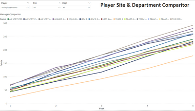
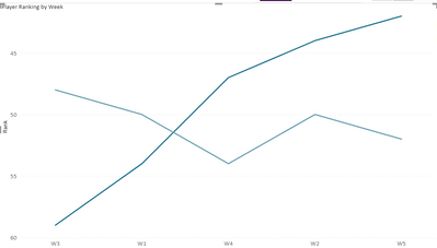
I have a Power BI report for our work Fantasy Football (Soccer, not Gridiron) league. I have various representations of the data including a league table and analysis of performance by site and department. I have one tab in the report that shows the relative performance of teams over time.
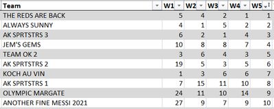
I would like to have a similar portrayal of the data but instead of the lines tracing cumulative points over the course of the season I would like to show the individual teams ranking week on week, as in the data shown in the first image above. Would that be possible and which Visualisation would be the best one to use to bring this data to life?
Solved! Go to Solution.
- Mark as New
- Bookmark
- Subscribe
- Mute
- Subscribe to RSS Feed
- Permalink
- Report Inappropriate Content
Assuming the data depicted is the actually weekly rank by team, first you will need to unpivot the columns for week and rank.
You can then set up your visuals with whatever preference you have. Here are a couple of options, albeit with some weaknesses.
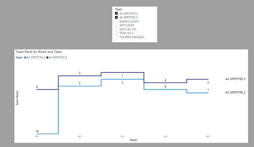
A stepped line chart with an inverted Y axis to show rank 1 the highest (which is what you would expect for a rank)
The problem is that if there is too much data it looks pretty messy
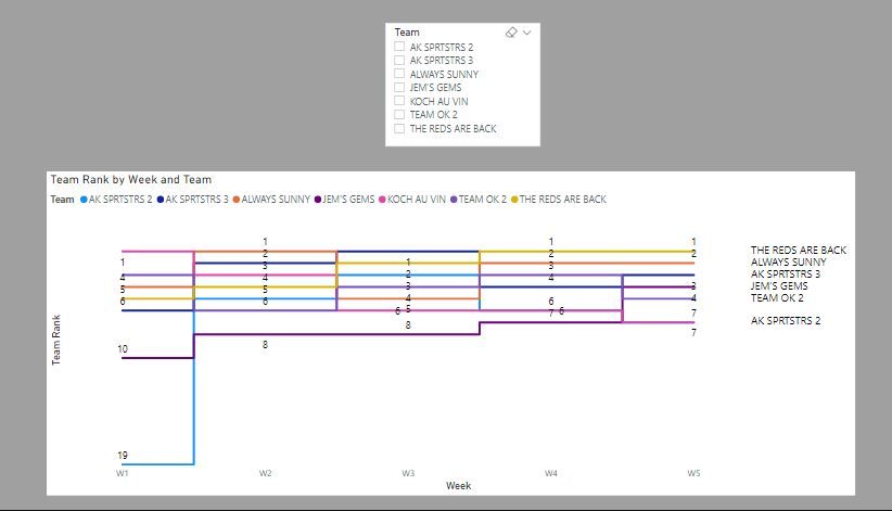
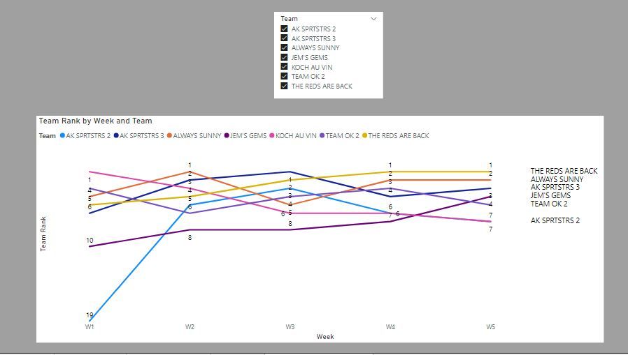
If you want to show a larger number of teams, maybe the same line chart but shown either in a non-stepped format
or shown as small multiples. Add conditional formatting to highlight each week's number 1 and you get:
I've attached the sample PBIX file
Edit: Just thought I'd showcase another option which has some dynamism. You can use a scatter chart with a play axis for the weeks to get this:
Did I answer your question? Mark my post as a solution!
In doing so, you are also helping me. Thank you!
Proud to be a Super User!
Paul on Linkedin.
- Mark as New
- Bookmark
- Subscribe
- Mute
- Subscribe to RSS Feed
- Permalink
- Report Inappropriate Content
Make sure the visual is sorted by Week in ascending order
Did I answer your question? Mark my post as a solution!
In doing so, you are also helping me. Thank you!
Proud to be a Super User!
Paul on Linkedin.
- Mark as New
- Bookmark
- Subscribe
- Mute
- Subscribe to RSS Feed
- Permalink
- Report Inappropriate Content
Assuming the data depicted is the actually weekly rank by team, first you will need to unpivot the columns for week and rank.
You can then set up your visuals with whatever preference you have. Here are a couple of options, albeit with some weaknesses.
A stepped line chart with an inverted Y axis to show rank 1 the highest (which is what you would expect for a rank)
The problem is that if there is too much data it looks pretty messy

If you want to show a larger number of teams, maybe the same line chart but shown either in a non-stepped format
or shown as small multiples. Add conditional formatting to highlight each week's number 1 and you get:
I've attached the sample PBIX file
Edit: Just thought I'd showcase another option which has some dynamism. You can use a scatter chart with a play axis for the weeks to get this:
Did I answer your question? Mark my post as a solution!
In doing so, you are also helping me. Thank you!
Proud to be a Super User!
Paul on Linkedin.
- Mark as New
- Bookmark
- Subscribe
- Mute
- Subscribe to RSS Feed
- Permalink
- Report Inappropriate Content
Paul - I used your solution and it is close to what I am looking to achieve. When all teams are included the Line Chart shows for the weeks in sequential order, however if I select a single player it results in the week order being subverted as per this example, this resolves if I select more than one player, any ideas why it should be doing this?
- Mark as New
- Bookmark
- Subscribe
- Mute
- Subscribe to RSS Feed
- Permalink
- Report Inappropriate Content
Paul - I am bowled over by the amount of time and effort you have put into answering my question, your suggestions look to be bang on the money and I am looking forward to implementing them. We have 65 teams in our league so I am going to include a couple of slicers to limit population by player, site, department.
- Mark as New
- Bookmark
- Subscribe
- Mute
- Subscribe to RSS Feed
- Permalink
- Report Inappropriate Content
@Anonymous
As a fellow Fantasy Footballer (American football though for me), let me present my solution.
First, I recommend putting your data into the following format. It will be much easier for PBI to work with your data.
| Team | Week | Points |
1 | 1 | 3 |
2 | 1 | 2 |
| 3 | 1 | 1 |
| 1 | 2 | 2 |
| 2 | 2 | 3 |
| 3 | 2 | 1 |
| 1 | 3 | 1 |
| 2 | 3 | 3 |
| 3 | 3 | 2 |
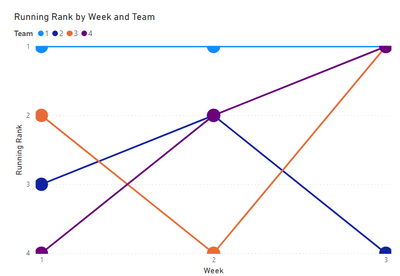
From there, you can create a "Bump Chart", I have included my example below. This is a great way to show rank. You can customize it to be fat lines with no circles, or use my example of fat circles at each week and skinny lines between. Totally up to you. Here is another good link to a website that discusses bump charts in PBI. https://www.syntelli.com/how-to-make-bump-charts-in-power-bi-tutorial
You need 2 easy functions for this visual with the data style I showed above:
A running total for the week, which you seem to already have.
Running Points Total =
VAR MaxWeek=
MAX('Table'[Week])
RETURN
CALCULATE(
    [Sum of Points],
    'Table'[Week] <= MaxWeek
)
And a RANKX to calculate the rank for each team. The visual will break it up by week for you.
Running Rank =
RANKX(
    ALLSELECTED('Table'[Team]),
    [Running Points Total]
)
Let me know if you need any further help and I hope this works for you and your fantasy league. Good luck to you!
-Caz
- Mark as New
- Bookmark
- Subscribe
- Mute
- Subscribe to RSS Feed
- Permalink
- Report Inappropriate Content
Hi @Anonymous
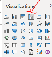
Clustered Column chart is good
Regards
Amine Jerbi
If I answered your question, please mark this thread as accepted
and you can follow me on
My Website, LinkedIn and Facebook
Helpful resources

Microsoft Fabric Learn Together
Covering the world! 9:00-10:30 AM Sydney, 4:00-5:30 PM CET (Paris/Berlin), 7:00-8:30 PM Mexico City

Power BI Monthly Update - April 2024
Check out the April 2024 Power BI update to learn about new features.

| User | Count |
|---|---|
| 117 | |
| 107 | |
| 70 | |
| 70 | |
| 43 |
| User | Count |
|---|---|
| 148 | |
| 106 | |
| 104 | |
| 89 | |
| 65 |
