- Power BI forums
- Updates
- News & Announcements
- Get Help with Power BI
- Desktop
- Service
- Report Server
- Power Query
- Mobile Apps
- Developer
- DAX Commands and Tips
- Custom Visuals Development Discussion
- Health and Life Sciences
- Power BI Spanish forums
- Translated Spanish Desktop
- Power Platform Integration - Better Together!
- Power Platform Integrations (Read-only)
- Power Platform and Dynamics 365 Integrations (Read-only)
- Training and Consulting
- Instructor Led Training
- Dashboard in a Day for Women, by Women
- Galleries
- Community Connections & How-To Videos
- COVID-19 Data Stories Gallery
- Themes Gallery
- Data Stories Gallery
- R Script Showcase
- Webinars and Video Gallery
- Quick Measures Gallery
- 2021 MSBizAppsSummit Gallery
- 2020 MSBizAppsSummit Gallery
- 2019 MSBizAppsSummit Gallery
- Events
- Ideas
- Custom Visuals Ideas
- Issues
- Issues
- Events
- Upcoming Events
- Community Blog
- Power BI Community Blog
- Custom Visuals Community Blog
- Community Support
- Community Accounts & Registration
- Using the Community
- Community Feedback
Register now to learn Fabric in free live sessions led by the best Microsoft experts. From Apr 16 to May 9, in English and Spanish.
- Power BI forums
- Forums
- Get Help with Power BI
- Desktop
- Re: League Position on line chart by Year with 1st...
- Subscribe to RSS Feed
- Mark Topic as New
- Mark Topic as Read
- Float this Topic for Current User
- Bookmark
- Subscribe
- Printer Friendly Page
- Mark as New
- Bookmark
- Subscribe
- Mute
- Subscribe to RSS Feed
- Permalink
- Report Inappropriate Content
League Position on line chart by Year with 1st as the top of the chart.
Hi all ,
I have a measure ranking teams per year which I can put in a line graph - however it shows 1st as bottom and 20th as top. I want it the other way round. Is there a way to swop this round, cant find it.
I did consider taking the position away from the number of teams in the league (+1) so 1 out of 20 becomes 20 - 1 = 19 + 1 = 20
and 20 becomes 20 - 20 = 0 becomes 20+1
So 1st woud show at the top. But I still need to get the position shown somehow on the graph?
Any ideas.
Thanks for your tips and time reading!
Solved! Go to Solution.
- Mark as New
- Bookmark
- Subscribe
- Mute
- Subscribe to RSS Feed
- Permalink
- Report Inappropriate Content
@Anonymous
Here is the simple process to "reverse" the y-axis in a Line chart:
1) create your [rank measure]
2) create a new measure which is simply multiplying your [rank measure] * -1
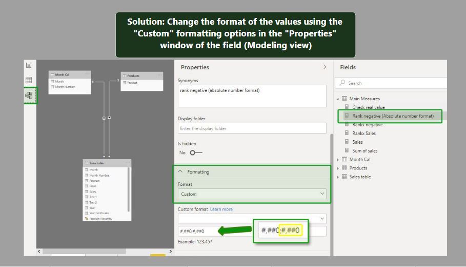
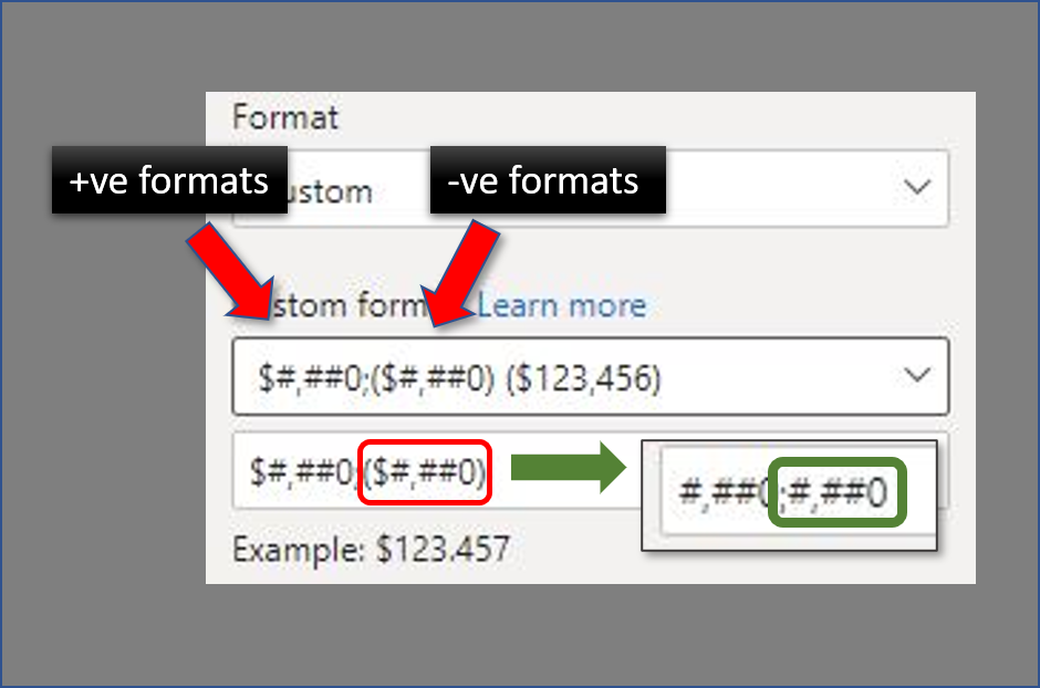
3) go into the modeling pane and select the new [rank measure] * -1. In the properties pane, select "Custom format" and format the output so that the expression for negative values is the same as positive values.
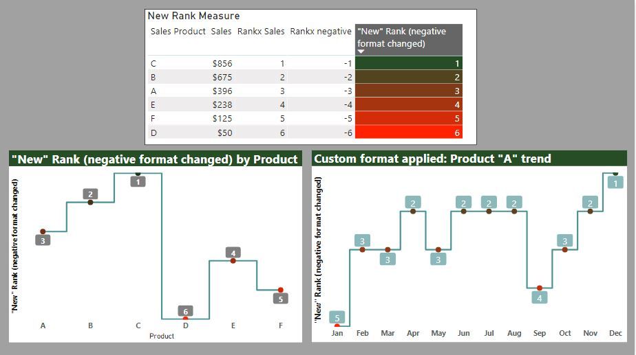
And you can now use this measure in the Line Chart visual to display the rank values as you would expect (including axis and point labels)
Hope this helps!
EDIT: The actual blog article is now online if you are interested in the "long-winded" explanation!
"Reversing" the Y-axis in a Line Chart visual
Did I answer your question? Mark my post as a solution!
In doing so, you are also helping me. Thank you!
Proud to be a Super User!
Paul on Linkedin.
- Mark as New
- Bookmark
- Subscribe
- Mute
- Subscribe to RSS Feed
- Permalink
- Report Inappropriate Content
@Anonymous
There is actually a (relatively simple ) way of doing this. I'm currently writing up a blog post to show the "how to...". If you can hang on for a couple days it will be (hopefully) published. If not, I can showcase the method for you here of course...(I just need to put the relevant images together to help with the explanation).
Did I answer your question? Mark my post as a solution!
In doing so, you are also helping me. Thank you!
Proud to be a Super User!
Paul on Linkedin.
- Mark as New
- Bookmark
- Subscribe
- Mute
- Subscribe to RSS Feed
- Permalink
- Report Inappropriate Content
Thanks , yep sure let me know when you blog about it. It seems like it should be easy - but I'm not spotting the trick to it! Thankyou
- Mark as New
- Bookmark
- Subscribe
- Mute
- Subscribe to RSS Feed
- Permalink
- Report Inappropriate Content
@Anonymous
Here is the simple process to "reverse" the y-axis in a Line chart:
1) create your [rank measure]
2) create a new measure which is simply multiplying your [rank measure] * -1
3) go into the modeling pane and select the new [rank measure] * -1. In the properties pane, select "Custom format" and format the output so that the expression for negative values is the same as positive values.
And you can now use this measure in the Line Chart visual to display the rank values as you would expect (including axis and point labels)
Hope this helps!
EDIT: The actual blog article is now online if you are interested in the "long-winded" explanation!
"Reversing" the Y-axis in a Line Chart visual
Did I answer your question? Mark my post as a solution!
In doing so, you are also helping me. Thank you!
Proud to be a Super User!
Paul on Linkedin.
- Mark as New
- Bookmark
- Subscribe
- Mute
- Subscribe to RSS Feed
- Permalink
- Report Inappropriate Content
@PaulDBrown thankyou very much! Perfect. I would never have worked it out myself.
- Mark as New
- Bookmark
- Subscribe
- Mute
- Subscribe to RSS Feed
- Permalink
- Report Inappropriate Content
@Anonymous
I've submitted it for approval, but will post the method here if the blog post isn't made public tomorrow (no point in waiting). Can't do it right now since I've logged off my pc for the day (it's 22:40 here...)
Did I answer your question? Mark my post as a solution!
In doing so, you are also helping me. Thank you!
Proud to be a Super User!
Paul on Linkedin.
- Mark as New
- Bookmark
- Subscribe
- Mute
- Subscribe to RSS Feed
- Permalink
- Report Inappropriate Content
Hi @Anonymous ,
It's impossible to achieve the idea in current version, because the 'End value' of Y axis must be greater than the 'Start value' of Y axis.
Please submit your idea .
Best regards,
Lionel Chen
If this post helps, then please consider Accept it as the solution to help the other members find it more quickly.
- Mark as New
- Bookmark
- Subscribe
- Mute
- Subscribe to RSS Feed
- Permalink
- Report Inappropriate Content
Thanks yes. Surely it something thats been done though graph a top ranking at the top of a visual and have it display as 1?
Thanks for your time though. Much appreciated.
- Mark as New
- Bookmark
- Subscribe
- Mute
- Subscribe to RSS Feed
- Permalink
- Report Inappropriate Content
@Anonymous , Not very clear. In rank you have option asc and desc. You can use that ?
example
Rank Discount % (Brand) = RANKX(all('Item'[Brand]),[Discount %],,DESC,Dense)
Rank Discount % (Brand) = RANKX(all('Item'[Brand]),[Discount %],,asc,Dense)
Microsoft Power BI Learning Resources, 2023 !!
Learn Power BI - Full Course with Dec-2022, with Window, Index, Offset, 100+ Topics !!
Did I answer your question? Mark my post as a solution! Appreciate your Kudos !! Proud to be a Super User! !!
- Mark as New
- Bookmark
- Subscribe
- Mute
- Subscribe to RSS Feed
- Permalink
- Report Inappropriate Content
Thanks that somewhat helps - in that I will rank my top perfoming team by points , so they will appear at the top of the line chart. ie best point will be rank 20 of 20 worst ranked 1 out of 20.
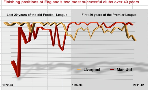
I still need to have data labels though and axis details if possible. Like the image below best perfoming is at the top, but i need labels too to show if possible. Thanks
Helpful resources

Microsoft Fabric Learn Together
Covering the world! 9:00-10:30 AM Sydney, 4:00-5:30 PM CET (Paris/Berlin), 7:00-8:30 PM Mexico City

Power BI Monthly Update - April 2024
Check out the April 2024 Power BI update to learn about new features.

| User | Count |
|---|---|
| 111 | |
| 100 | |
| 80 | |
| 64 | |
| 58 |
| User | Count |
|---|---|
| 146 | |
| 110 | |
| 93 | |
| 84 | |
| 67 |


