- Power BI forums
- Updates
- News & Announcements
- Get Help with Power BI
- Desktop
- Service
- Report Server
- Power Query
- Mobile Apps
- Developer
- DAX Commands and Tips
- Custom Visuals Development Discussion
- Health and Life Sciences
- Power BI Spanish forums
- Translated Spanish Desktop
- Power Platform Integration - Better Together!
- Power Platform Integrations (Read-only)
- Power Platform and Dynamics 365 Integrations (Read-only)
- Training and Consulting
- Instructor Led Training
- Dashboard in a Day for Women, by Women
- Galleries
- Community Connections & How-To Videos
- COVID-19 Data Stories Gallery
- Themes Gallery
- Data Stories Gallery
- R Script Showcase
- Webinars and Video Gallery
- Quick Measures Gallery
- 2021 MSBizAppsSummit Gallery
- 2020 MSBizAppsSummit Gallery
- 2019 MSBizAppsSummit Gallery
- Events
- Ideas
- Custom Visuals Ideas
- Issues
- Issues
- Events
- Upcoming Events
- Community Blog
- Power BI Community Blog
- Custom Visuals Community Blog
- Community Support
- Community Accounts & Registration
- Using the Community
- Community Feedback
Register now to learn Fabric in free live sessions led by the best Microsoft experts. From Apr 16 to May 9, in English and Spanish.
- Power BI forums
- Forums
- Get Help with Power BI
- Desktop
- Last year Dec month coming in this year Dec Month
- Subscribe to RSS Feed
- Mark Topic as New
- Mark Topic as Read
- Float this Topic for Current User
- Bookmark
- Subscribe
- Printer Friendly Page
- Mark as New
- Bookmark
- Subscribe
- Mute
- Subscribe to RSS Feed
- Permalink
- Report Inappropriate Content
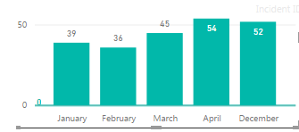
Last year Dec month coming in this year Dec Month
Hi,
I am trying to show data from last year dec month till April in report but while creating graph its is showing in this years data in axis.
Could you please help me in how i could show data like dec jan feb... in graph.
Solved! Go to Solution.
- Mark as New
- Bookmark
- Subscribe
- Mute
- Subscribe to RSS Feed
- Permalink
- Report Inappropriate Content
Assuming you have a year field and month number field, simply create a calculated column:
[Year] * 100 + [Month]
This will give values like 201612 etc.
Another option is to use the full date in your axis but use the automatic hierachy (or create your own) so that a user can drill down into year, quarter, month, etc. or expand all levels and see the order you have described. If you are using a normal calendar year then the auto hierarchy should be sufficient. Otherwise, you should create a date table that takes the full dates and has additional fields for year, quarter, month, etc. and then build your own hierarchy in the visual by simply dragging one field after another, in order, to the axis of the chart.
- Mark as New
- Bookmark
- Subscribe
- Mute
- Subscribe to RSS Feed
- Permalink
- Report Inappropriate Content
- Mark as New
- Bookmark
- Subscribe
- Mute
- Subscribe to RSS Feed
- Permalink
- Report Inappropriate Content
Can you please clarify what you are trying to do? You don't want to see December? You want December before January?
- Mark as New
- Bookmark
- Subscribe
- Mute
- Subscribe to RSS Feed
- Permalink
- Report Inappropriate Content
I want to see data like dec jan feb .
As dec is 2016 data and jan,feb is of 2017
- Mark as New
- Bookmark
- Subscribe
- Mute
- Subscribe to RSS Feed
- Permalink
- Report Inappropriate Content
I think you are going to need a fully qualified month-year type of field for your axis. Power BI will not know to put "December" before "January" if you are putting month name in the axis and you have a sort order for Jan = 1 ... December = 12.
You will need to create a concatenated value like 201612, 201701 etc. to get the order you want.
- Mark as New
- Bookmark
- Subscribe
- Mute
- Subscribe to RSS Feed
- Permalink
- Report Inappropriate Content
As i am new to power BI could you please help me in how i could achive it
- Mark as New
- Bookmark
- Subscribe
- Mute
- Subscribe to RSS Feed
- Permalink
- Report Inappropriate Content
Assuming you have a year field and month number field, simply create a calculated column:
[Year] * 100 + [Month]
This will give values like 201612 etc.
Another option is to use the full date in your axis but use the automatic hierachy (or create your own) so that a user can drill down into year, quarter, month, etc. or expand all levels and see the order you have described. If you are using a normal calendar year then the auto hierarchy should be sufficient. Otherwise, you should create a date table that takes the full dates and has additional fields for year, quarter, month, etc. and then build your own hierarchy in the visual by simply dragging one field after another, in order, to the axis of the chart.
Helpful resources

Microsoft Fabric Learn Together
Covering the world! 9:00-10:30 AM Sydney, 4:00-5:30 PM CET (Paris/Berlin), 7:00-8:30 PM Mexico City

Power BI Monthly Update - April 2024
Check out the April 2024 Power BI update to learn about new features.

| User | Count |
|---|---|
| 110 | |
| 94 | |
| 82 | |
| 66 | |
| 58 |
| User | Count |
|---|---|
| 151 | |
| 121 | |
| 104 | |
| 87 | |
| 67 |

