- Power BI forums
- Updates
- News & Announcements
- Get Help with Power BI
- Desktop
- Service
- Report Server
- Power Query
- Mobile Apps
- Developer
- DAX Commands and Tips
- Custom Visuals Development Discussion
- Health and Life Sciences
- Power BI Spanish forums
- Translated Spanish Desktop
- Power Platform Integration - Better Together!
- Power Platform Integrations (Read-only)
- Power Platform and Dynamics 365 Integrations (Read-only)
- Training and Consulting
- Instructor Led Training
- Dashboard in a Day for Women, by Women
- Galleries
- Community Connections & How-To Videos
- COVID-19 Data Stories Gallery
- Themes Gallery
- Data Stories Gallery
- R Script Showcase
- Webinars and Video Gallery
- Quick Measures Gallery
- 2021 MSBizAppsSummit Gallery
- 2020 MSBizAppsSummit Gallery
- 2019 MSBizAppsSummit Gallery
- Events
- Ideas
- Custom Visuals Ideas
- Issues
- Issues
- Events
- Upcoming Events
- Community Blog
- Power BI Community Blog
- Custom Visuals Community Blog
- Community Support
- Community Accounts & Registration
- Using the Community
- Community Feedback
Register now to learn Fabric in free live sessions led by the best Microsoft experts. From Apr 16 to May 9, in English and Spanish.
- Power BI forums
- Forums
- Get Help with Power BI
- Desktop
- Last 30 days vs previous 30 days on a single chart
- Subscribe to RSS Feed
- Mark Topic as New
- Mark Topic as Read
- Float this Topic for Current User
- Bookmark
- Subscribe
- Printer Friendly Page
- Mark as New
- Bookmark
- Subscribe
- Mute
- Subscribe to RSS Feed
- Permalink
- Report Inappropriate Content
Last 30 days vs previous 30 days on a single chart
Hi,
I've got a dataset from Google Analytics that has a date, a grouping variable and a numeric value in each row. I'd like to create a chart that shows the sum of the values grouped by the variables. The chart should show data from the last 30 days and the previous 30 days. I'd like the bars next to each other so it's easy to see what kind of development there has been. Power BI's clustered column chart looks good for my taste.
It would be nice to be able to slice it by different time intervals, for example last 7 days, 30 days or 90 days. I've already got a variable for this based on instructions I found from this community.
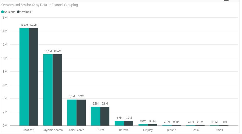
How can I make the chart I want from the data I have? Looking at the picture, I would like to have last 30 days in lighter green and the previous time interval in darker green. I would like to be able to change the interval between 7, 30, 90, and overall with the basic slicer. I've created the logic for different intervals based in the instructions here.
Thanks for your help!
-Sami
- Mark as New
- Bookmark
- Subscribe
- Mute
- Subscribe to RSS Feed
- Permalink
- Report Inappropriate Content
I'm still not clear about your requirement. In this scenario, you suppose to have a date/datetime column in your dataset already. What you have applied on X-axis is Grouping, your "last X days" should be based on Today. And the time period slicer solution in your mentioned link is also based on Today(). So in that case, it seems no difference between "Last 30 days" and "Previous 30 days".
Can you clarify your logic and share expected result with sample data?
Regards,
Simon Hou
- Mark as New
- Bookmark
- Subscribe
- Mute
- Subscribe to RSS Feed
- Permalink
- Report Inappropriate Content
I modified the logic a little bit so that "Last 30 days" is based on Today() and "Previous 30 days" is based on Today()-30.
DatePeriod2 =
UNION (
   ADDCOLUMNS( SUMMARIZE( CALCULATETABLE('Date' ; DATESBETWEEN('Date'[Date];today()-30-07+1;today()-30) ); 'Date'[Date]);"Period";"Previous 07 Days")  ;
   ADDCOLUMNS( SUMMARIZE( CALCULATETABLE('Date' ; DATESBETWEEN('Date'[Date];today()-30-14+1;today()-30) ); 'Date'[Date]);"Period";"Previous 14 Days") ;
   ADDCOLUMNS( SUMMARIZE( CALCULATETABLE('Date' ; DATESBETWEEN('Date'[Date];today()-30-30+1;today()-30) ); 'Date'[Date]);"Period";"Previous 30 Days") ;
   ADDCOLUMNS( SUMMARIZE( CALCULATETABLE('Date' ; DATESBETWEEN('Date'[Date];today()-30-90+1;today()-30) ); 'Date'[Date]);"Period";"Previous 90 Days") ;
   ADDCOLUMNS( SUMMARIZE( CALCULATETABLE('Date'); 'Date'[Date]);"Period";"Overall")
)
What I need is this:
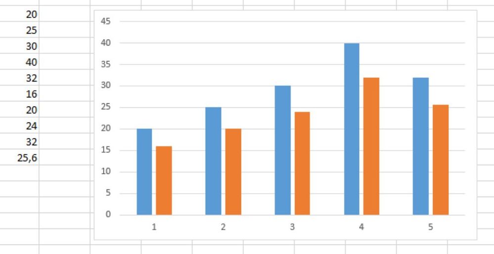
The grouping needs to be on the X-axis. There should be two bars for each group next to each other. The other bar needs to be the last 30 days, so in this case from December 12th to November 13th. The bar next to it should be from November 12th to October 14th. I want to be able to see development for each group and I think it would be easiest if the bars are next to each other and not in different tables 🙂
I created an example with Excel so you and others can get an idea what I mean. So from a single column I want to create two data series that are filtered based on the date. On the X-axis of the example picture are numbers 1-5 and on Power BI they should be the groups.
I hope this clarifies what I need.
-Sami
- Mark as New
- Bookmark
- Subscribe
- Mute
- Subscribe to RSS Feed
- Permalink
- Report Inappropriate Content
Hi Sami,
Now I'm clear about your requirement. I think you can just follow your provided link to create a similar "Previous X Days" calculated table. And union this table into your "Last X Days" table. Now you have both "Last X Days" and "Previous X Days" in the Period column. Then you can create a the calculated column for grouping each "X Days" together.
X Days= SWITCH([Period],"Last 30 Days", "30 Days", "Previous 30 Days", "30 Days","Last 90 Days", "90 Days", "Previous 90 Days", "90 Days",.....)
Then you can use above caculated column on your X axis.
Regards,
Helpful resources

Microsoft Fabric Learn Together
Covering the world! 9:00-10:30 AM Sydney, 4:00-5:30 PM CET (Paris/Berlin), 7:00-8:30 PM Mexico City

Power BI Monthly Update - April 2024
Check out the April 2024 Power BI update to learn about new features.

| User | Count |
|---|---|
| 115 | |
| 100 | |
| 88 | |
| 68 | |
| 61 |
| User | Count |
|---|---|
| 152 | |
| 120 | |
| 102 | |
| 87 | |
| 68 |


