- Power BI forums
- Updates
- News & Announcements
- Get Help with Power BI
- Desktop
- Service
- Report Server
- Power Query
- Mobile Apps
- Developer
- DAX Commands and Tips
- Custom Visuals Development Discussion
- Health and Life Sciences
- Power BI Spanish forums
- Translated Spanish Desktop
- Power Platform Integration - Better Together!
- Power Platform Integrations (Read-only)
- Power Platform and Dynamics 365 Integrations (Read-only)
- Training and Consulting
- Instructor Led Training
- Dashboard in a Day for Women, by Women
- Galleries
- Community Connections & How-To Videos
- COVID-19 Data Stories Gallery
- Themes Gallery
- Data Stories Gallery
- R Script Showcase
- Webinars and Video Gallery
- Quick Measures Gallery
- 2021 MSBizAppsSummit Gallery
- 2020 MSBizAppsSummit Gallery
- 2019 MSBizAppsSummit Gallery
- Events
- Ideas
- Custom Visuals Ideas
- Issues
- Issues
- Events
- Upcoming Events
- Community Blog
- Power BI Community Blog
- Custom Visuals Community Blog
- Community Support
- Community Accounts & Registration
- Using the Community
- Community Feedback
Register now to learn Fabric in free live sessions led by the best Microsoft experts. From Apr 16 to May 9, in English and Spanish.
- Power BI forums
- Forums
- Get Help with Power BI
- Desktop
- Keeping a clustered bar chart's axes constant when...
- Subscribe to RSS Feed
- Mark Topic as New
- Mark Topic as Read
- Float this Topic for Current User
- Bookmark
- Subscribe
- Printer Friendly Page
- Mark as New
- Bookmark
- Subscribe
- Mute
- Subscribe to RSS Feed
- Permalink
- Report Inappropriate Content
Keeping a clustered bar chart's axes constant when there's no data
I have a clustered bar chart that changes itself when there's no data present. There are two things happening, and if I fix the first, I think that would resolve the second.
1 - When I update filters and no data ends up being displayed, all the y-axis labels disappear. I've already set the option to "Show items with no data" but that doesn't appear to resolve the issue. Do I need to make another reference/dimension table that would store my y-axis labels and display them at all times?
2 - When no data for any of the labels is displayed, the visual adjusts itself since there aren't any labels to display either. So my x-axis becomes larger and adds in more granular tick marks, which I don't want. I've tried setting the x-axis' "Value decimal places" settings to 0, but that makes it look weirder with 11223344. If I can resolve issue #1, this probably won't be an issue either, but in the event that I can't figure out how to do #1, how do I resolve this on its own?
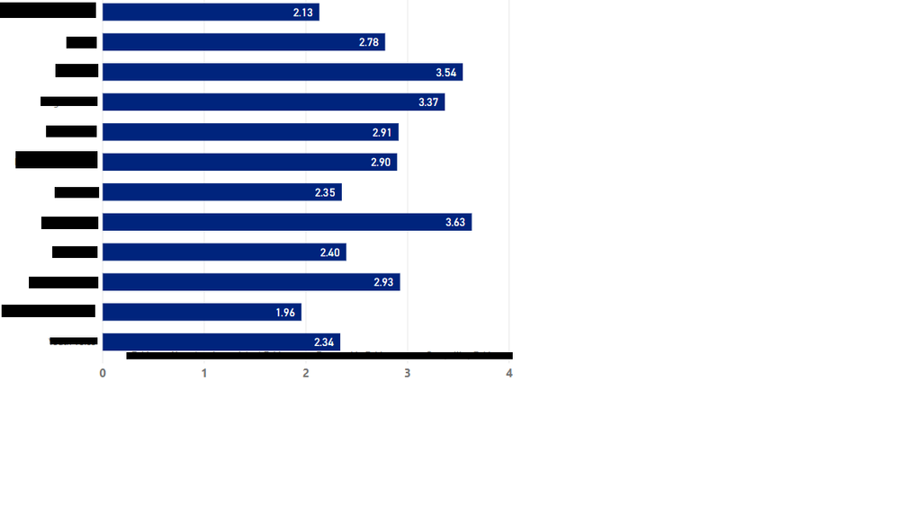
Visual with data before any filtering:
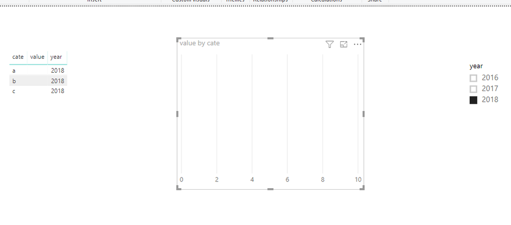
And this is what the visual looks like with filters so that no data ends up being displayed:
Solved! Go to Solution.
- Mark as New
- Bookmark
- Subscribe
- Mute
- Subscribe to RSS Feed
- Permalink
- Report Inappropriate Content
Hi @kimchizal
I can reproduce your problem.
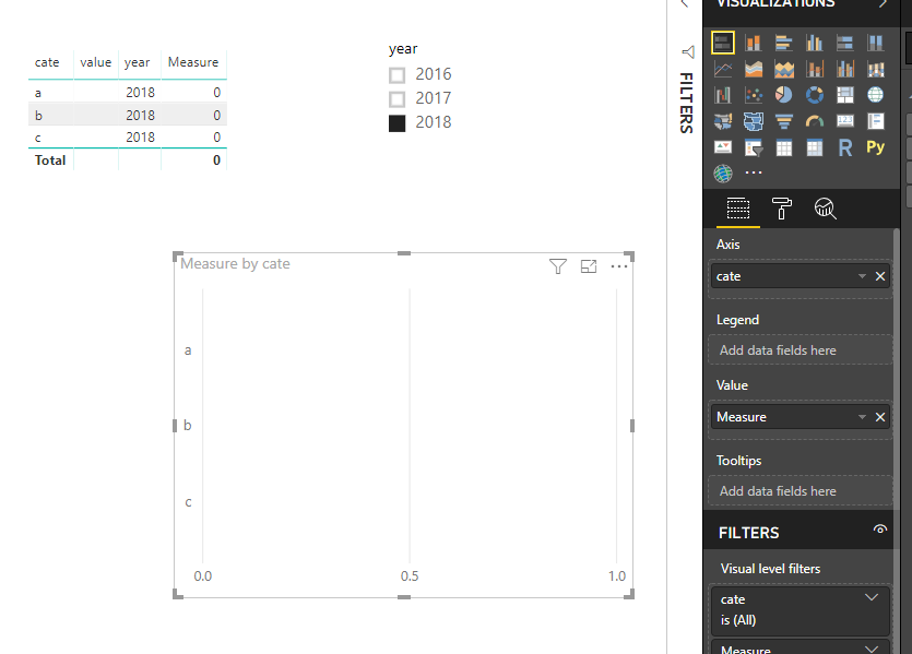
To solve this, i create a measure
Measure = IF(MAX(Sheet2[value])=BLANK(),0,MAX(Sheet2[value]))
It this is not your expected output, please let me know.
Best Regards
Maggie
Community Support Team _ Maggie Li
If this post helps, then please consider Accept it as the solution to help the other members find it more quickly.
- Mark as New
- Bookmark
- Subscribe
- Mute
- Subscribe to RSS Feed
- Permalink
- Report Inappropriate Content
Hmm I'm getting odd results. The field is supposed to be averaged across each category, and the MAX function is throwing off the calculation. Changing your formula to use AVG instead of MAX doesn't seem to work:
- Mark as New
- Bookmark
- Subscribe
- Mute
- Subscribe to RSS Feed
- Permalink
- Report Inappropriate Content
Nevermind, looks like AVG isn't a DAX function.... Using Average fixes it. Thanks Maggie!
- Mark as New
- Bookmark
- Subscribe
- Mute
- Subscribe to RSS Feed
- Permalink
- Report Inappropriate Content
Hi @kimchizal
Could you show an sample dataset?
no data refers to values in X-axis or values in Y-axis?
Best Regards
Maggie
- Mark as New
- Bookmark
- Subscribe
- Mute
- Subscribe to RSS Feed
- Permalink
- Report Inappropriate Content
I'll work on getting a sample dataset. By no data, I mean no records. So after filtering, there aren't any records to show
Helpful resources

Microsoft Fabric Learn Together
Covering the world! 9:00-10:30 AM Sydney, 4:00-5:30 PM CET (Paris/Berlin), 7:00-8:30 PM Mexico City

Power BI Monthly Update - April 2024
Check out the April 2024 Power BI update to learn about new features.

| User | Count |
|---|---|
| 113 | |
| 97 | |
| 85 | |
| 70 | |
| 61 |
| User | Count |
|---|---|
| 151 | |
| 121 | |
| 104 | |
| 87 | |
| 67 |


