- Power BI forums
- Updates
- News & Announcements
- Get Help with Power BI
- Desktop
- Service
- Report Server
- Power Query
- Mobile Apps
- Developer
- DAX Commands and Tips
- Custom Visuals Development Discussion
- Health and Life Sciences
- Power BI Spanish forums
- Translated Spanish Desktop
- Power Platform Integration - Better Together!
- Power Platform Integrations (Read-only)
- Power Platform and Dynamics 365 Integrations (Read-only)
- Training and Consulting
- Instructor Led Training
- Dashboard in a Day for Women, by Women
- Galleries
- Community Connections & How-To Videos
- COVID-19 Data Stories Gallery
- Themes Gallery
- Data Stories Gallery
- R Script Showcase
- Webinars and Video Gallery
- Quick Measures Gallery
- 2021 MSBizAppsSummit Gallery
- 2020 MSBizAppsSummit Gallery
- 2019 MSBizAppsSummit Gallery
- Events
- Ideas
- Custom Visuals Ideas
- Issues
- Issues
- Events
- Upcoming Events
- Community Blog
- Power BI Community Blog
- Custom Visuals Community Blog
- Community Support
- Community Accounts & Registration
- Using the Community
- Community Feedback
Register now to learn Fabric in free live sessions led by the best Microsoft experts. From Apr 16 to May 9, in English and Spanish.
- Power BI forums
- Forums
- Get Help with Power BI
- Desktop
- Re: Keep Slicer filter in a "0 instead of Blank" M...
- Subscribe to RSS Feed
- Mark Topic as New
- Mark Topic as Read
- Float this Topic for Current User
- Bookmark
- Subscribe
- Printer Friendly Page
- Mark as New
- Bookmark
- Subscribe
- Mute
- Subscribe to RSS Feed
- Permalink
- Report Inappropriate Content
Keep Slicer filter in a "0 instead of Blank" Measure
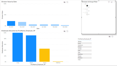
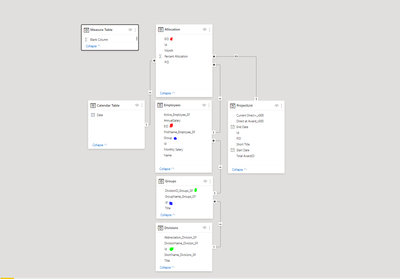
I have a Dashboard that I'm using to show if an employee's time is fully allocated for the next six months. You can see my relationships below. I am filtering down from the Division (highest level), to the Groups, to the Employees. My visualizations are designed for the user to select a bar for the desired month in the top graph (which is the sum of the Employees in the selected Division), and have it populate with the individual employees breakdown for the selected month.
The Issue: I want to be able to see employees that are not allocated (have a sum of 0 for the selected month). If I use the "+0" trick on the end of my SUM() calculation, I see all of the employees, not just the ones in the Division/Group selected in the slicer.
This result is your expected result, the slicer is filtering the "Employee Allocation by First_Name...." and it is showing that there are 3 employees in Division 1, Group 1, and what their allocations are. However, there are others in Group 1 who are not allocated for that month ( you can see all the names in Group 1 in the Table on the right). I would like for their names to be along the X-axis.
So I tried the +0 tactic, where when I SUM(Allocation[PercentAllocation])+0, I get ALL names along the X Axis, including those NOT in Group 1. See below, the highlighted names are NOT in Group 1 (they are in Groups 3 and 4 respectively, and are not listed in my example table). The action of the Table on the right is still correct, so I know my filter theory is correct.
My expected result: What is below, except the two highlighted names (and in general, names from other groups) are not included in the graph.
So my two measures are:
Employee Allocation =
IF([Calendar Filter Conditional] = TRUE(),
CALCULATE(
    SUM(Allocation[Percent Allocation])
))
and
Employee Allocation =
IF([Calendar Filter Conditional] = TRUE(),
CALCULATE(
    SUM(Allocation[Percent Allocation])+0
))
The measure with the conditional just checks to make sure the top table (Division Value by Date) is filtered. If it isnt, the bottom graph is blank.
Data Structure/Relationships
Thanks in advance.
-Caz
Solved! Go to Solution.
- Mark as New
- Bookmark
- Subscribe
- Mute
- Subscribe to RSS Feed
- Permalink
- Report Inappropriate Content
This may be a problem with the relational model. What is the relationship between the slicer you use and the fields in the bar chart? If you use the first formula and select the "show items with no data" option in the x-axis field, will it meet your expected results?
- Mark as New
- Bookmark
- Subscribe
- Mute
- Subscribe to RSS Feed
- Permalink
- Report Inappropriate Content
Thank you! I could not find that option when I originally made the graph. Turns out I had to have the graph showing data and not be blank in order for that option to become available. Thank you for your help!
-Caz
Helpful resources

Microsoft Fabric Learn Together
Covering the world! 9:00-10:30 AM Sydney, 4:00-5:30 PM CET (Paris/Berlin), 7:00-8:30 PM Mexico City

Power BI Monthly Update - April 2024
Check out the April 2024 Power BI update to learn about new features.

| User | Count |
|---|---|
| 112 | |
| 97 | |
| 85 | |
| 67 | |
| 59 |
| User | Count |
|---|---|
| 150 | |
| 120 | |
| 100 | |
| 87 | |
| 68 |


