- Power BI forums
- Updates
- News & Announcements
- Get Help with Power BI
- Desktop
- Service
- Report Server
- Power Query
- Mobile Apps
- Developer
- DAX Commands and Tips
- Custom Visuals Development Discussion
- Health and Life Sciences
- Power BI Spanish forums
- Translated Spanish Desktop
- Power Platform Integration - Better Together!
- Power Platform Integrations (Read-only)
- Power Platform and Dynamics 365 Integrations (Read-only)
- Training and Consulting
- Instructor Led Training
- Dashboard in a Day for Women, by Women
- Galleries
- Community Connections & How-To Videos
- COVID-19 Data Stories Gallery
- Themes Gallery
- Data Stories Gallery
- R Script Showcase
- Webinars and Video Gallery
- Quick Measures Gallery
- 2021 MSBizAppsSummit Gallery
- 2020 MSBizAppsSummit Gallery
- 2019 MSBizAppsSummit Gallery
- Events
- Ideas
- Custom Visuals Ideas
- Issues
- Issues
- Events
- Upcoming Events
- Community Blog
- Power BI Community Blog
- Custom Visuals Community Blog
- Community Support
- Community Accounts & Registration
- Using the Community
- Community Feedback
Register now to learn Fabric in free live sessions led by the best Microsoft experts. From Apr 16 to May 9, in English and Spanish.
- Power BI forums
- Forums
- Get Help with Power BI
- Desktop
- KPI trending axis
- Subscribe to RSS Feed
- Mark Topic as New
- Mark Topic as Read
- Float this Topic for Current User
- Bookmark
- Subscribe
- Printer Friendly Page
- Mark as New
- Bookmark
- Subscribe
- Mute
- Subscribe to RSS Feed
- Permalink
- Report Inappropriate Content
KPI trending axis
Hi,
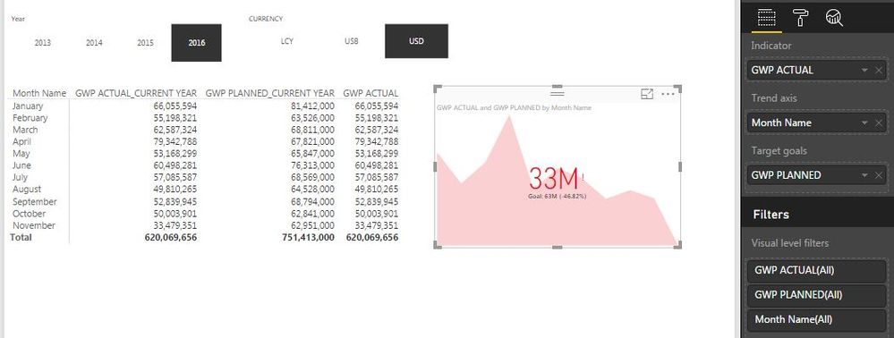
How can I show the YTD value as indicator with Monthly trend axis? I have an example below but the indicator shows the value for November (last item in the table, not the total).
Solved! Go to Solution.
- Mark as New
- Bookmark
- Subscribe
- Mute
- Subscribe to RSS Feed
- Permalink
- Report Inappropriate Content
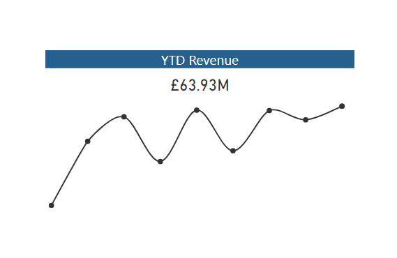
I believe you have to select one or the other. You could use 2 visuals - a sparkline and a card, similar to what I have done here
http://exceleratorbi.com.au/power-bi-public-story-telling/
- Mark as New
- Bookmark
- Subscribe
- Mute
- Subscribe to RSS Feed
- Permalink
- Report Inappropriate Content
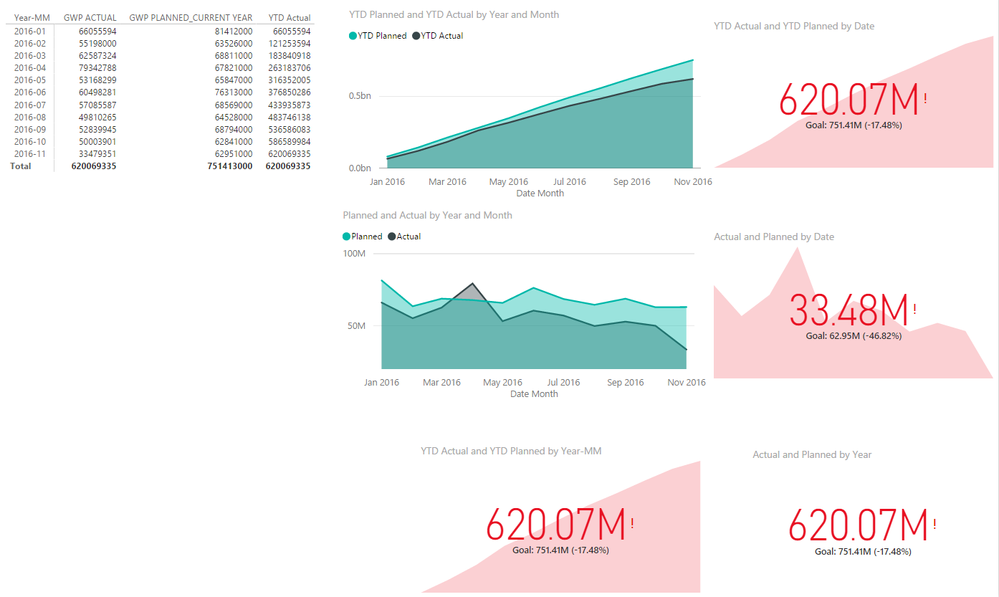
Yes if your the trend axis is monthly it won't show you YTD totals even if you write YTD Measures!
You may have to use a combination of a chart and the KPI Visual...
- Mark as New
- Bookmark
- Subscribe
- Mute
- Subscribe to RSS Feed
- Permalink
- Report Inappropriate Content
Little late....
But incase anyone else is looking for an answer to this, you can use the 'Cards With States' custom visual to do this.
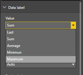
Add your measure, add your dimension to the trend axis (I've used month), then go to the format pane and select the data label drop down. Here under 'value', you can select first, last, total etc.
The callout value is now the total YTD, while my trend line shows month intervals.
- Mark as New
- Bookmark
- Subscribe
- Mute
- Subscribe to RSS Feed
- Permalink
- Report Inappropriate Content
Yes if your the trend axis is monthly it won't show you YTD totals even if you write YTD Measures!
You may have to use a combination of a chart and the KPI Visual...
- Mark as New
- Bookmark
- Subscribe
- Mute
- Subscribe to RSS Feed
- Permalink
- Report Inappropriate Content
I believe you have to select one or the other. You could use 2 visuals - a sparkline and a card, similar to what I have done here
http://exceleratorbi.com.au/power-bi-public-story-telling/
- Mark as New
- Bookmark
- Subscribe
- Mute
- Subscribe to RSS Feed
- Permalink
- Report Inappropriate Content
Hi Matt,
Awesome blog. Can you tell me how you did the Growth and Decline visual? It's like KPI visual without tick marks. Thanks!
- Mark as New
- Bookmark
- Subscribe
- Mute
- Subscribe to RSS Feed
- Permalink
- Report Inappropriate Content
Each teal box is 5 objects
1 the box itself
2 the kpi item
3 a picture icon
4 the pct change, which is a card object rendering a pact chg vs last year measure
5 the line, which is a spark line custom visual from the visuals gallery
Does that help?
- Mark as New
- Bookmark
- Subscribe
- Mute
- Subscribe to RSS Feed
- Permalink
- Report Inappropriate Content
Thanks @MattAllington! I'm actually interested in the pct change. How does it change colour if it's a card object? And also the Decline/Growth below the figure?
- Mark as New
- Bookmark
- Subscribe
- Mute
- Subscribe to RSS Feed
- Permalink
- Report Inappropriate Content
mmmm, my bad - sorry. It is actually the card with states from the visuals gallery https://app.powerbi.com/visuals/show/CardWithStatesBySQLBI1445315565700
- Mark as New
- Bookmark
- Subscribe
- Mute
- Subscribe to RSS Feed
- Permalink
- Report Inappropriate Content
Helpful resources

Microsoft Fabric Learn Together
Covering the world! 9:00-10:30 AM Sydney, 4:00-5:30 PM CET (Paris/Berlin), 7:00-8:30 PM Mexico City

Power BI Monthly Update - April 2024
Check out the April 2024 Power BI update to learn about new features.

| User | Count |
|---|---|
| 112 | |
| 99 | |
| 73 | |
| 72 | |
| 49 |
| User | Count |
|---|---|
| 145 | |
| 109 | |
| 109 | |
| 90 | |
| 64 |


