- Power BI forums
- Updates
- News & Announcements
- Get Help with Power BI
- Desktop
- Service
- Report Server
- Power Query
- Mobile Apps
- Developer
- DAX Commands and Tips
- Custom Visuals Development Discussion
- Health and Life Sciences
- Power BI Spanish forums
- Translated Spanish Desktop
- Power Platform Integration - Better Together!
- Power Platform Integrations (Read-only)
- Power Platform and Dynamics 365 Integrations (Read-only)
- Training and Consulting
- Instructor Led Training
- Dashboard in a Day for Women, by Women
- Galleries
- Community Connections & How-To Videos
- COVID-19 Data Stories Gallery
- Themes Gallery
- Data Stories Gallery
- R Script Showcase
- Webinars and Video Gallery
- Quick Measures Gallery
- 2021 MSBizAppsSummit Gallery
- 2020 MSBizAppsSummit Gallery
- 2019 MSBizAppsSummit Gallery
- Events
- Ideas
- Custom Visuals Ideas
- Issues
- Issues
- Events
- Upcoming Events
- Community Blog
- Power BI Community Blog
- Custom Visuals Community Blog
- Community Support
- Community Accounts & Registration
- Using the Community
- Community Feedback
Register now to learn Fabric in free live sessions led by the best Microsoft experts. From Apr 16 to May 9, in English and Spanish.
- Power BI forums
- Forums
- Get Help with Power BI
- Desktop
- Re: KPI Visualisation query
- Subscribe to RSS Feed
- Mark Topic as New
- Mark Topic as Read
- Float this Topic for Current User
- Bookmark
- Subscribe
- Printer Friendly Page
- Mark as New
- Bookmark
- Subscribe
- Mute
- Subscribe to RSS Feed
- Permalink
- Report Inappropriate Content
KPI Visualisation query
Hi - would like some help on the KPI visualisation, please.
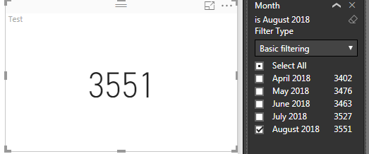
I have a report that uses report level filters to filter by month, so you can view current month data or select a prior month filter to look at prior status.
I am adding a KPI visualisation which also has months on the trend axis. This means that when a single month is selected on the report level filter I lose the trend axis information.
What can I do to allow the KPI to retain the trend in the background, whilst still selecting the relevant report level filter.
Thank you!


- Mark as New
- Bookmark
- Subscribe
- Mute
- Subscribe to RSS Feed
- Permalink
- Report Inappropriate Content
Hi @gempar
In the KPI visual it is not possible to do so.
The workaround is
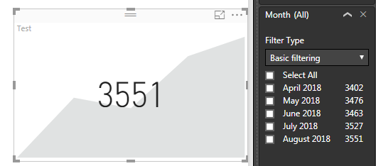
1. Create your KPI Visual with trend axis off. With this it will not show the background area chart for the trend.
2. Create another Area chart with the axis and values same as KPI visual.
3. Make the width and height of the two charts of same size.
4. Place the Area chart over the KPI. Using the format tab make this to Send Backward and Send to back.
5. If you have slicers for Year and Months separately, using the Edit Interactios in the format tab, ensure that when the month is selected the Area Chart is not affected.
Try it out and if it works accept this as solution and also give KUDOS.
Cheers
CheenuSing
Proud to be a Datanaut!
- Mark as New
- Bookmark
- Subscribe
- Mute
- Subscribe to RSS Feed
- Permalink
- Report Inappropriate Content
Hi @CheenuSing
Thank you very much for the solution, however I'm left with the same issue. I'm not using slicers on the report, I'm using report level filters. Do you know how I can make the area chart not link to the report level filters? (Obviously using slicers would be a great option to use, however it's not the desired way our consumers want their reports.)
Thanks!
- Mark as New
- Bookmark
- Subscribe
- Mute
- Subscribe to RSS Feed
- Permalink
- Report Inappropriate Content
Hi @gempar
Please upload the pbix in one drive / google drive and share the link here to explore.
Cheers
CheenuSing
Proud to be a Datanaut!
- Mark as New
- Bookmark
- Subscribe
- Mute
- Subscribe to RSS Feed
- Permalink
- Report Inappropriate Content
Thanks CheenuSing for offering but unfortunately I can't share my content.
I've used your suggestion above with the area chart, but prepared the visualisation with a duplicate of the data set that isn't linked to the report level filter as a work around.
Thanks for your help and area chart suggestion!
- Mark as New
- Bookmark
- Subscribe
- Mute
- Subscribe to RSS Feed
- Permalink
- Report Inappropriate Content
Hi @gempar,
I would suggest you try the custom visual "KPI Indicator". We can use a measure to remove the filter of Report Level Filter.
actualTrend =
CALCULATE ( COUNT ( FactSales[SalesQuantity] ), ALL ( 'DimDate' ) )
Best Regards,
Dale
If this post helps, then please consider Accept it as the solution to help the other members find it more quickly.
Helpful resources

Microsoft Fabric Learn Together
Covering the world! 9:00-10:30 AM Sydney, 4:00-5:30 PM CET (Paris/Berlin), 7:00-8:30 PM Mexico City

Power BI Monthly Update - April 2024
Check out the April 2024 Power BI update to learn about new features.

| User | Count |
|---|---|
| 107 | |
| 97 | |
| 75 | |
| 65 | |
| 53 |
| User | Count |
|---|---|
| 144 | |
| 103 | |
| 98 | |
| 85 | |
| 64 |
