- Power BI forums
- Updates
- News & Announcements
- Get Help with Power BI
- Desktop
- Service
- Report Server
- Power Query
- Mobile Apps
- Developer
- DAX Commands and Tips
- Custom Visuals Development Discussion
- Health and Life Sciences
- Power BI Spanish forums
- Translated Spanish Desktop
- Power Platform Integration - Better Together!
- Power Platform Integrations (Read-only)
- Power Platform and Dynamics 365 Integrations (Read-only)
- Training and Consulting
- Instructor Led Training
- Dashboard in a Day for Women, by Women
- Galleries
- Community Connections & How-To Videos
- COVID-19 Data Stories Gallery
- Themes Gallery
- Data Stories Gallery
- R Script Showcase
- Webinars and Video Gallery
- Quick Measures Gallery
- 2021 MSBizAppsSummit Gallery
- 2020 MSBizAppsSummit Gallery
- 2019 MSBizAppsSummit Gallery
- Events
- Ideas
- Custom Visuals Ideas
- Issues
- Issues
- Events
- Upcoming Events
- Community Blog
- Power BI Community Blog
- Custom Visuals Community Blog
- Community Support
- Community Accounts & Registration
- Using the Community
- Community Feedback
Register now to learn Fabric in free live sessions led by the best Microsoft experts. From Apr 16 to May 9, in English and Spanish.
- Power BI forums
- Forums
- Get Help with Power BI
- Desktop
- Re: Join 3 sliced visuals into one combo chart
- Subscribe to RSS Feed
- Mark Topic as New
- Mark Topic as Read
- Float this Topic for Current User
- Bookmark
- Subscribe
- Printer Friendly Page
- Mark as New
- Bookmark
- Subscribe
- Mute
- Subscribe to RSS Feed
- Permalink
- Report Inappropriate Content
Join 3 sliced visuals into one combo chart
I have a dataset of dates and amounts which are classified by 1) location, 2) market and 3) brand. A given location may belong to 1+ markets and 1+ brands.
I have one slicer on the location field; when user selects a location, I want a combo chart to display 1) the average location amount per month as bars, and also to display 2) the average market amount per month as a line, and 3) the average brand amount per month as a second line.
I can only have a location slicer - it is not possible to have a location slicer, a market slicer and a brand slicer as I would normally prefer.
I've gotten partway there using the following steps:
1) Renamed the dataset as Data - Location, and copied it over to Data - Market and also Data - Brand using DAX
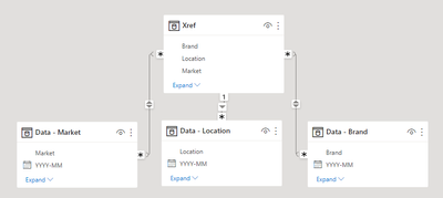
2) Added dataset Xref containing the distinct list of Location, Market and Brand fields
3) In data model I connected Xref to Data - Location (using the Location field), and to Data - Market (using the Market field), and to Data - Brand (using the Brand field)
4) Added a slicer with field Xref[Location]
5) Added a bar chart using the date and amount from Data - Location
6) Added a line chart using the date and amount from Data - Market
7) Added a line chart using the date and amount from Data - Brand
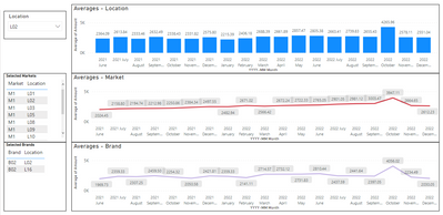
Now when I select a location from the slicer, all 3 charts automatically update accordingly - this is close to what I want.
However, I want all 3 amounts to show up in one combo chart with a bar and 2 lines - and nothing I do seems to work. In the above scenario, everything is aggregated by date (x axis) and amount (y axis), so it looks like it should be doable, but as far as I know you can't build off of visuals, so I need to find a way to do this with creative table relationships and DAX statements.
Please let me know how I can accomplish this.
Fig 1 - Data Model:
Fig 2 - What I've accomplished so far:
Fig 3 - What I'm trying to accomplish:
-sme12345
- Mark as New
- Bookmark
- Subscribe
- Mute
- Subscribe to RSS Feed
- Permalink
- Report Inappropriate Content
Also, super imposing the 3 charts over one another is not an option here - all 3 amounts (location, market and brand) must appear in the same combo chart.
- Mark as New
- Bookmark
- Subscribe
- Mute
- Subscribe to RSS Feed
- Permalink
- Report Inappropriate Content
Hi @sme12345 ,
As your third picture shows, isn't this exactly the result you were hoping for? It seems you have achieved it.
Best regards,
Community Support Team_Binbin Yu
- Mark as New
- Bookmark
- Subscribe
- Mute
- Subscribe to RSS Feed
- Permalink
- Report Inappropriate Content
No, the third picture is a mock-up showing how i *want* it to look:
"Now when I select a location from the slicer, all 3 charts automatically update accordingly - this is close to what I want.
However, I want all 3 amounts to show up in one combo chart with a bar and 2 lines - and nothing I do seems to work. "
Apologies if this was unclear.
Helpful resources

Microsoft Fabric Learn Together
Covering the world! 9:00-10:30 AM Sydney, 4:00-5:30 PM CET (Paris/Berlin), 7:00-8:30 PM Mexico City

Power BI Monthly Update - April 2024
Check out the April 2024 Power BI update to learn about new features.

| User | Count |
|---|---|
| 112 | |
| 97 | |
| 85 | |
| 67 | |
| 59 |
| User | Count |
|---|---|
| 150 | |
| 120 | |
| 99 | |
| 87 | |
| 68 |


