- Power BI forums
- Updates
- News & Announcements
- Get Help with Power BI
- Desktop
- Service
- Report Server
- Power Query
- Mobile Apps
- Developer
- DAX Commands and Tips
- Custom Visuals Development Discussion
- Health and Life Sciences
- Power BI Spanish forums
- Translated Spanish Desktop
- Power Platform Integration - Better Together!
- Power Platform Integrations (Read-only)
- Power Platform and Dynamics 365 Integrations (Read-only)
- Training and Consulting
- Instructor Led Training
- Dashboard in a Day for Women, by Women
- Galleries
- Community Connections & How-To Videos
- COVID-19 Data Stories Gallery
- Themes Gallery
- Data Stories Gallery
- R Script Showcase
- Webinars and Video Gallery
- Quick Measures Gallery
- 2021 MSBizAppsSummit Gallery
- 2020 MSBizAppsSummit Gallery
- 2019 MSBizAppsSummit Gallery
- Events
- Ideas
- Custom Visuals Ideas
- Issues
- Issues
- Events
- Upcoming Events
- Community Blog
- Power BI Community Blog
- Custom Visuals Community Blog
- Community Support
- Community Accounts & Registration
- Using the Community
- Community Feedback
Register now to learn Fabric in free live sessions led by the best Microsoft experts. From Apr 16 to May 9, in English and Spanish.
- Power BI forums
- Forums
- Get Help with Power BI
- Desktop
- Re: Issues on customizing tooltips in an stacked a...
- Subscribe to RSS Feed
- Mark Topic as New
- Mark Topic as Read
- Float this Topic for Current User
- Bookmark
- Subscribe
- Printer Friendly Page
- Mark as New
- Bookmark
- Subscribe
- Mute
- Subscribe to RSS Feed
- Permalink
- Report Inappropriate Content
Issues on customizing tooltips in an stacked area chart and line chart
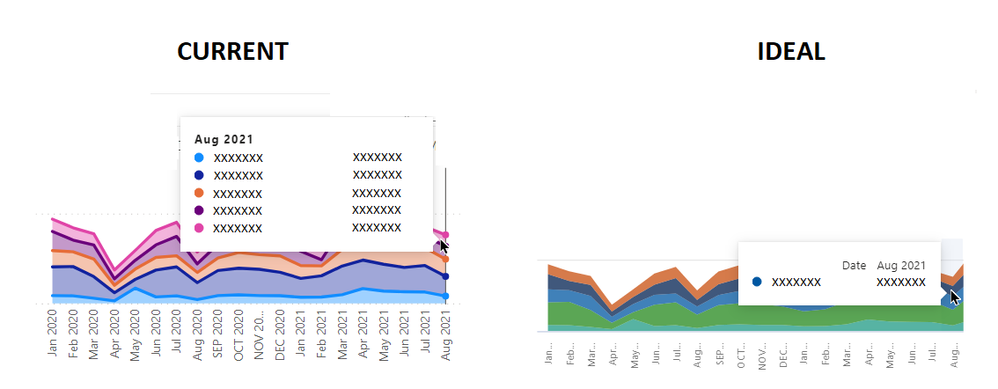
I wish to build an stacked area chart and line chart, with the display of tooltips like the following
I want to show the data details that are hovered on ONLY. By default, the stacked column chart can do the trick, but not for stacked area chart and line chart.
Is there any way to achieve this without using any paid version of customized visuals?
Appreciate your Kudos !!
Solved! Go to Solution.
- Mark as New
- Bookmark
- Subscribe
- Mute
- Subscribe to RSS Feed
- Permalink
- Report Inappropriate Content
Hi @johnyip ,
here is Stacked area chart with custom tooltip which will help you to get the tooltip with data details that are hovered only.
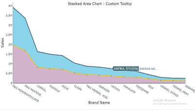
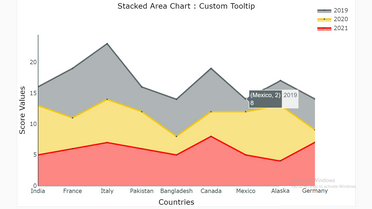
Download link for the custom visual file in this page,
https://pbivizedit.com/gallery/stacked-area-with-custom-tooltip
This was made with our Custom Visual creator tool PBIVizEdit.com. With this tool,
- anyone, irrespective of technical skills, can create their own visuals
- 15 minutes to create a visual from scratch
- opens up many additional attributes to edit (for e.g. labels, tooltips, legends position, etc)
Give this a shot and let us know if you face any problem/errors.
You can use the editor to modify your visual further (some modifications cannot be done in Power BI window and have to be in editor).
Thanks,
Team PBIVizEdit
- Mark as New
- Bookmark
- Subscribe
- Mute
- Subscribe to RSS Feed
- Permalink
- Report Inappropriate Content
After some considerations and trials, I make a concession to turn myself into using Ribbon chart intrinsic to PowerBI. I think this can serve my purpose well also.
Appreciate your Kudos !!
- Mark as New
- Bookmark
- Subscribe
- Mute
- Subscribe to RSS Feed
- Permalink
- Report Inappropriate Content
After some considerations and trials, I make a concession to turn myself into using Ribbon chart intrinsic to PowerBI. I think this can serve my purpose well also.
Appreciate your Kudos !!
- Mark as New
- Bookmark
- Subscribe
- Mute
- Subscribe to RSS Feed
- Permalink
- Report Inappropriate Content
Hi @johnyip ,
here is Stacked area chart with custom tooltip which will help you to get the tooltip with data details that are hovered only.


Download link for the custom visual file in this page,
https://pbivizedit.com/gallery/stacked-area-with-custom-tooltip
This was made with our Custom Visual creator tool PBIVizEdit.com. With this tool,
- anyone, irrespective of technical skills, can create their own visuals
- 15 minutes to create a visual from scratch
- opens up many additional attributes to edit (for e.g. labels, tooltips, legends position, etc)
Give this a shot and let us know if you face any problem/errors.
You can use the editor to modify your visual further (some modifications cannot be done in Power BI window and have to be in editor).
Thanks,
Team PBIVizEdit
- Mark as New
- Bookmark
- Subscribe
- Mute
- Subscribe to RSS Feed
- Permalink
- Report Inappropriate Content
Thanks, that one is a good custom vis, but that vis lacks the "legend" feature that is available in the stacked area vis intrinsic to PowerBI.
I may use that in case I need it in the future, and thanks for the sharing.
Appreciate your Kudos !!
- Mark as New
- Bookmark
- Subscribe
- Mute
- Subscribe to RSS Feed
- Permalink
- Report Inappropriate Content
Hi @johnyip,
I think this should be a limitation of the chart usages. (the hover event picked the category/axis value to apply the filter effect)
For this scenario, you will find all related data records instead of the record that the mouse accurately hovered. In my opinion, I'd like to suggest you submit an idea for more accurate hover filters on the visual tooltip.
Regards,
Xiaoxin Sheng
If this post helps, please consider accept as solution to help other members find it more quickly.
Helpful resources

Microsoft Fabric Learn Together
Covering the world! 9:00-10:30 AM Sydney, 4:00-5:30 PM CET (Paris/Berlin), 7:00-8:30 PM Mexico City

Power BI Monthly Update - April 2024
Check out the April 2024 Power BI update to learn about new features.

| User | Count |
|---|---|
| 110 | |
| 97 | |
| 78 | |
| 64 | |
| 55 |
| User | Count |
|---|---|
| 143 | |
| 109 | |
| 89 | |
| 84 | |
| 66 |
