- Power BI forums
- Updates
- News & Announcements
- Get Help with Power BI
- Desktop
- Service
- Report Server
- Power Query
- Mobile Apps
- Developer
- DAX Commands and Tips
- Custom Visuals Development Discussion
- Health and Life Sciences
- Power BI Spanish forums
- Translated Spanish Desktop
- Power Platform Integration - Better Together!
- Power Platform Integrations (Read-only)
- Power Platform and Dynamics 365 Integrations (Read-only)
- Training and Consulting
- Instructor Led Training
- Dashboard in a Day for Women, by Women
- Galleries
- Community Connections & How-To Videos
- COVID-19 Data Stories Gallery
- Themes Gallery
- Data Stories Gallery
- R Script Showcase
- Webinars and Video Gallery
- Quick Measures Gallery
- 2021 MSBizAppsSummit Gallery
- 2020 MSBizAppsSummit Gallery
- 2019 MSBizAppsSummit Gallery
- Events
- Ideas
- Custom Visuals Ideas
- Issues
- Issues
- Events
- Upcoming Events
- Community Blog
- Power BI Community Blog
- Custom Visuals Community Blog
- Community Support
- Community Accounts & Registration
- Using the Community
- Community Feedback
Register now to learn Fabric in free live sessions led by the best Microsoft experts. From Apr 16 to May 9, in English and Spanish.
- Power BI forums
- Forums
- Get Help with Power BI
- Desktop
- Issue with a measure using Power KPI Matrix
- Subscribe to RSS Feed
- Mark Topic as New
- Mark Topic as Read
- Float this Topic for Current User
- Bookmark
- Subscribe
- Printer Friendly Page
- Mark as New
- Bookmark
- Subscribe
- Mute
- Subscribe to RSS Feed
- Permalink
- Report Inappropriate Content
Issue with a measure using Power KPI Matrix
Hi everyone, I'm having troubles understanding how to create a dynamic measure that works in a Power KPI Matrix visualization.
My table contains Persons (4), Fruits (3), quantity per day (0 or 1) and dates (daily from Jan to May)
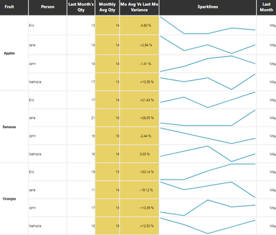
I'm usign a Power KPI Matrix visualization because I'd like to show (for each person) the trend of each fruit consumption per month, which is done with the Sparkline, but I'd also like to show the variance between last month values and the average value (columns highlighted in yellow):
The results shown above for the yellow columns are my desired outcome, but the only way I've managed to obtain it is by using the number "5" (5 months from Jan to May) in my denominator's measure "Mo Avg Qty". I have also created the measure "Distinct Month" (commented in the formula below) to calculate the number of months, but it doesn't work.
Mo Avg Qty = CALCULATE(SUM('Data Table'[Qty]), ALLEXCEPT('Data Table', 'Data Table'[Person],'Data Table'[Fruit])) / 5 --([Distinct Month])I'm sure I'm missing something (as always with DAX) but I can't find a way to make it work.
Can someone please help me?
Here's a copy of the Pbix file: https://www.dropbox.com/s/w3psii7s46mmm43/MockBi2.pbix?dl=0
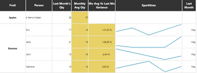
Secondarily ... does anybody know if there are other visualizations allowing the representation for a category and a subcategory? The other ones I've found (Sparkline by OKViz or Smart KPI List) only work with one category. I'm asking because Power KPI Matrix shows the result for subcategories but doesn't seem to work for category (unless I'm wrong):
Thank you very much,
Fabio
Solved! Go to Solution.
- Mark as New
- Bookmark
- Subscribe
- Mute
- Subscribe to RSS Feed
- Permalink
- Report Inappropriate Content
Hi @Fabio74 ,
The measure you have written gives you the incorrect value you need to redo it to:
Mo Avg Qty =
DIVIDE (
    CALCULATE (
        SUM ( 'Data Table'[Qty] ),
         ALLSELECTED(Dates)
    ),
    CALCULATE ( DISTINCTCOUNT ( Dates[EndOfMonth] ), ALLSELECTED ( Dates ) )
)
Check result attach.
Regards
Miguel Félix
Did I answer your question? Mark my post as a solution!
Proud to be a Super User!
Check out my blog: Power BI em Português- Mark as New
- Bookmark
- Subscribe
- Mute
- Subscribe to RSS Feed
- Permalink
- Report Inappropriate Content
Hi @Fabio74 ,
Try to change your measure to:
Mo Avg Qty =
DIVIDE (
    CALCULATE (
        SUM ( 'Data Table'[Qty] ),
        ALLEXCEPT ( 'Data Table', 'Data Table'[Person], 'Data Table'[Item] )
    ),
    CALCULATE ( DISTINCTCOUNT ( Dates[EndOfMonth] ), ALLSELECTED ( Dates ) )
)
The last part of the calculate picks up all the selected values that and count the distinct of the values result varies with slicer selection.
Regarding the second question what do you want to show precisely? Do not understand what is the expected end result you are trying to achieve.
Regards
Miguel Félix
Did I answer your question? Mark my post as a solution!
Proud to be a Super User!
Check out my blog: Power BI em Português- Mark as New
- Bookmark
- Subscribe
- Mute
- Subscribe to RSS Feed
- Permalink
- Report Inappropriate Content
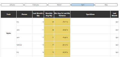
Dear @MFelix , thank you for your reply. I've modified the measure as you've explained and it works, but when I use the Months filter/slicer ... it doesn't seem to work anymore:
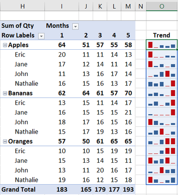
As for the other question, I'd like to replicate this visualization made in an Excel file. As you can see, the Trend is shown for each category and subcategory
whereas in my PowerBi visualization, the trend is shown only for the subcategory. When I click on the "arrow" to collapse the category, no trend is shown (but maybe the visualization doesn't support this feature).
Hope is clearer now. Thanks!
- Mark as New
- Bookmark
- Subscribe
- Mute
- Subscribe to RSS Feed
- Permalink
- Report Inappropriate Content
Hi @Fabio74 ,
I just did the change of the month calculations instead of having hard coded 5 it counts the number of months so when you select 1 the values is the same has the total.
Do you want to calculate the average for the selected months and fruits for that person?
Regarding the second part try the following custom visual:
https://appsource.microsoft.com/en/product/power-bi-visuals/wa200002816?tab=overview
Regards
Miguel Félix
Did I answer your question? Mark my post as a solution!
Proud to be a Super User!
Check out my blog: Power BI em Português- Mark as New
- Bookmark
- Subscribe
- Mute
- Subscribe to RSS Feed
- Permalink
- Report Inappropriate Content
Do you want to calculate the average for the selected months and fruits for that person?
Yes please, sorry if it wasn't clear 🙂
As for the visual, I've also taken a quick look at the Multiple Sparklines one, but it seemed to me that it worked only at the category level. But maybe I was wrong. I'll take a second look. Thanks!
- Mark as New
- Bookmark
- Subscribe
- Mute
- Subscribe to RSS Feed
- Permalink
- Report Inappropriate Content
Hi @Fabio74 ,
The measure you have written gives you the incorrect value you need to redo it to:
Mo Avg Qty =
DIVIDE (
    CALCULATE (
        SUM ( 'Data Table'[Qty] ),
         ALLSELECTED(Dates)
    ),
    CALCULATE ( DISTINCTCOUNT ( Dates[EndOfMonth] ), ALLSELECTED ( Dates ) )
)
Check result attach.
Regards
Miguel Félix
Did I answer your question? Mark my post as a solution!
Proud to be a Super User!
Check out my blog: Power BI em Português- Mark as New
- Bookmark
- Subscribe
- Mute
- Subscribe to RSS Feed
- Permalink
- Report Inappropriate Content
Thank you very much @MFelix , it works. As I have a moment I'll try and read again what you wrote to understand the "how" (which is the most difficult part for me).
Thanks again!
Helpful resources

Microsoft Fabric Learn Together
Covering the world! 9:00-10:30 AM Sydney, 4:00-5:30 PM CET (Paris/Berlin), 7:00-8:30 PM Mexico City

Power BI Monthly Update - April 2024
Check out the April 2024 Power BI update to learn about new features.

| User | Count |
|---|---|
| 110 | |
| 99 | |
| 80 | |
| 64 | |
| 57 |
| User | Count |
|---|---|
| 145 | |
| 110 | |
| 91 | |
| 84 | |
| 66 |


