- Power BI forums
- Updates
- News & Announcements
- Get Help with Power BI
- Desktop
- Service
- Report Server
- Power Query
- Mobile Apps
- Developer
- DAX Commands and Tips
- Custom Visuals Development Discussion
- Health and Life Sciences
- Power BI Spanish forums
- Translated Spanish Desktop
- Power Platform Integration - Better Together!
- Power Platform Integrations (Read-only)
- Power Platform and Dynamics 365 Integrations (Read-only)
- Training and Consulting
- Instructor Led Training
- Dashboard in a Day for Women, by Women
- Galleries
- Community Connections & How-To Videos
- COVID-19 Data Stories Gallery
- Themes Gallery
- Data Stories Gallery
- R Script Showcase
- Webinars and Video Gallery
- Quick Measures Gallery
- 2021 MSBizAppsSummit Gallery
- 2020 MSBizAppsSummit Gallery
- 2019 MSBizAppsSummit Gallery
- Events
- Ideas
- Custom Visuals Ideas
- Issues
- Issues
- Events
- Upcoming Events
- Community Blog
- Power BI Community Blog
- Custom Visuals Community Blog
- Community Support
- Community Accounts & Registration
- Using the Community
- Community Feedback
Register now to learn Fabric in free live sessions led by the best Microsoft experts. From Apr 16 to May 9, in English and Spanish.
- Power BI forums
- Forums
- Get Help with Power BI
- Desktop
- Issue with Radar chart
- Subscribe to RSS Feed
- Mark Topic as New
- Mark Topic as Read
- Float this Topic for Current User
- Bookmark
- Subscribe
- Printer Friendly Page
- Mark as New
- Bookmark
- Subscribe
- Mute
- Subscribe to RSS Feed
- Permalink
- Report Inappropriate Content
Issue with Radar chart
Hello,
I have a question about using the radar chart visualization.
I am not able to overlay data on a radar chart by using the slicer visualization. It is not showing any overlay but only the "first", "last" or count result.
My data looks like this:
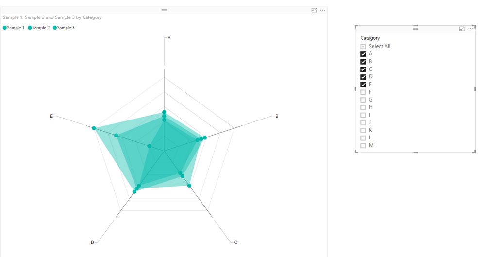
I would like to overlay sample 1 or 2 or 3 or ..., depending on which I would like to see with category A till M as the "category".
| Category | Sample 1 | Sample 2 | Sample 3 |
| A | 1 | 0.9 | 0.8 |
| B | 1.1 | 1 | 0.9 |
| C | 0.8 | 1.1 | 0.7 |
| D | 1.3 | 1.2 | 1.1 |
| E | 1.9 | 1.3 | 0.4 |
| F | 1.5 | 1.4 | 1.3 |
| G | 0.5 | 1.5 | 0.6 |
| H | 0.9 | 1.6 | 1.1 |
| I | 1 | 1.5 | 1.6 |
| J | 1.4 | 1.8 | 1 |
| K | 2 | 1.9 | 1.8 |
| L | 2.1 | 0.8 | 1.9 |
| M | 1.3 | 0.8 | 0.7 |
Can somenody help me solve this?
Thanks
Evert
Solved! Go to Solution.
- Mark as New
- Bookmark
- Subscribe
- Mute
- Subscribe to RSS Feed
- Permalink
- Report Inappropriate Content
Hi @evertfeyaerts,
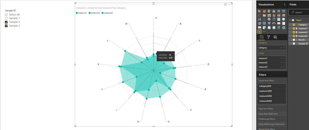
In your scenario, you may need to create different measures to calculate results for each Sample ID separately, then show all the measures as Y Axis on the Radar chart.
measure1 = CALCULATE(SUM(Table1[Results]),FILTER(Table1,Table1[Sample ID]="Sample 1"))
measure2 = CALCULATE(SUM(Table1[Results]),FILTER(Table1,Table1[Sample ID]="Sample 2"))
measure3 = CALCULATE(SUM(Table1[Results]),FILTER(Table1,Table1[Sample ID]="Sample 3"))
Here is the sample pbix file for your reference. ![]()
Regards
- Mark as New
- Bookmark
- Subscribe
- Mute
- Subscribe to RSS Feed
- Permalink
- Report Inappropriate Content
Hi @evertfeyaerts,
What column are you using as Slicer on your report?
Could you be more precisely with your issue by post some screenshots?
Regards
- Mark as New
- Bookmark
- Subscribe
- Mute
- Subscribe to RSS Feed
- Permalink
- Report Inappropriate Content
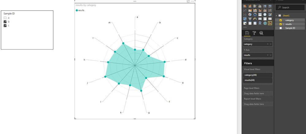
I am sorry, I added the wrong data. see below the correct data with some illustrations. The first picture of de radar chart gives me the data of 1 sample and the 2nd picture shows me a "count" of both data and not illustrated separately.
Thanks
- Mark as New
- Bookmark
- Subscribe
- Mute
- Subscribe to RSS Feed
- Permalink
- Report Inappropriate Content
Hi @evertfeyaerts,
In your scenario, you may need to create different measures to calculate results for each Sample ID separately, then show all the measures as Y Axis on the Radar chart.
measure1 = CALCULATE(SUM(Table1[Results]),FILTER(Table1,Table1[Sample ID]="Sample 1"))
measure2 = CALCULATE(SUM(Table1[Results]),FILTER(Table1,Table1[Sample ID]="Sample 2"))
measure3 = CALCULATE(SUM(Table1[Results]),FILTER(Table1,Table1[Sample ID]="Sample 3"))
Here is the sample pbix file for your reference. ![]()
Regards
- Mark as New
- Bookmark
- Subscribe
- Mute
- Subscribe to RSS Feed
- Permalink
- Report Inappropriate Content
Helpful resources

Microsoft Fabric Learn Together
Covering the world! 9:00-10:30 AM Sydney, 4:00-5:30 PM CET (Paris/Berlin), 7:00-8:30 PM Mexico City

Power BI Monthly Update - April 2024
Check out the April 2024 Power BI update to learn about new features.

| User | Count |
|---|---|
| 113 | |
| 99 | |
| 80 | |
| 70 | |
| 60 |
| User | Count |
|---|---|
| 149 | |
| 114 | |
| 107 | |
| 89 | |
| 67 |


