- Power BI forums
- Updates
- News & Announcements
- Get Help with Power BI
- Desktop
- Service
- Report Server
- Power Query
- Mobile Apps
- Developer
- DAX Commands and Tips
- Custom Visuals Development Discussion
- Health and Life Sciences
- Power BI Spanish forums
- Translated Spanish Desktop
- Power Platform Integration - Better Together!
- Power Platform Integrations (Read-only)
- Power Platform and Dynamics 365 Integrations (Read-only)
- Training and Consulting
- Instructor Led Training
- Dashboard in a Day for Women, by Women
- Galleries
- Community Connections & How-To Videos
- COVID-19 Data Stories Gallery
- Themes Gallery
- Data Stories Gallery
- R Script Showcase
- Webinars and Video Gallery
- Quick Measures Gallery
- 2021 MSBizAppsSummit Gallery
- 2020 MSBizAppsSummit Gallery
- 2019 MSBizAppsSummit Gallery
- Events
- Ideas
- Custom Visuals Ideas
- Issues
- Issues
- Events
- Upcoming Events
- Community Blog
- Power BI Community Blog
- Custom Visuals Community Blog
- Community Support
- Community Accounts & Registration
- Using the Community
- Community Feedback
Register now to learn Fabric in free live sessions led by the best Microsoft experts. From Apr 16 to May 9, in English and Spanish.
- Power BI forums
- Forums
- Get Help with Power BI
- Desktop
- Re: Is there a way to have a visual show 24 months...
- Subscribe to RSS Feed
- Mark Topic as New
- Mark Topic as Read
- Float this Topic for Current User
- Bookmark
- Subscribe
- Printer Friendly Page
- Mark as New
- Bookmark
- Subscribe
- Mute
- Subscribe to RSS Feed
- Permalink
- Report Inappropriate Content
Is there a way to have a visual show 24 months on the x axis
I have a line chart which show 3 lines...actual numbers, a fixed forecast number and an adjusted forecast number. Currently it plots just the current year. Is there a way to plot this visual with 24 months, so you would see jan - dec for 2016 and after december see jan-dec for 2017. I've tried it but it buckets both years into the months so just 12 months show with a combined total of both years.
Emma
Solved! Go to Solution.
- Mark as New
- Bookmark
- Subscribe
- Mute
- Subscribe to RSS Feed
- Permalink
- Report Inappropriate Content
Hi @emma313823,
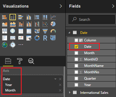
According to your description above, you should be able to follow steps below to show months with different years on the x axis.
1. Set X-Axis field with a Date Hierarchy of Year and Month.
2. Click "Expand all down one leve in the hierarchy" on the left top of the Chart.
3. You can turn Concatenation On/Off to get your most expected result.
In addition, if you have too many years' data shown on the Chart, you can use a Slicer of Year to choose the years you want to show on the Chart.
Here is the sample pbix file for your reference.![]()
Regards
- Mark as New
- Bookmark
- Subscribe
- Mute
- Subscribe to RSS Feed
- Permalink
- Report Inappropriate Content
Hi Emma,
add a calc. column to your date table "Year-Month" with something like "2017-Jan" - put this on the x-axis and it should work fine 🙂
HTH,
Frank
- Mark as New
- Bookmark
- Subscribe
- Mute
- Subscribe to RSS Feed
- Permalink
- Report Inappropriate Content
sorry had to rethink this...when i pulled my data into BI desktop - i created two columns - one to pull out the month in a number format and the other to pull out the year by itself. based on what you are suggesting...would concatenation work. I'm not sure how to do a calculated column and pull in what you are suggesting. Can you advise further?
emma
- Mark as New
- Bookmark
- Subscribe
- Mute
- Subscribe to RSS Feed
- Permalink
- Report Inappropriate Content
Hi @emma313823,
According to your description above, you should be able to follow steps below to show months with different years on the x axis.
1. Set X-Axis field with a Date Hierarchy of Year and Month.
2. Click "Expand all down one leve in the hierarchy" on the left top of the Chart.
3. You can turn Concatenation On/Off to get your most expected result.
In addition, if you have too many years' data shown on the Chart, you can use a Slicer of Year to choose the years you want to show on the Chart.
Here is the sample pbix file for your reference.![]()
Regards
- Mark as New
- Bookmark
- Subscribe
- Mute
- Subscribe to RSS Feed
- Permalink
- Report Inappropriate Content
so are you saying add a column and perhaps concatenate the year and month and then use that to plot on the x axis?
Emma
- Mark as New
- Bookmark
- Subscribe
- Mute
- Subscribe to RSS Feed
- Permalink
- Report Inappropriate Content
so are you saying add a column and perhaps concatenate the year and month and then use that to plot on the x axis?
Emma
Helpful resources

Microsoft Fabric Learn Together
Covering the world! 9:00-10:30 AM Sydney, 4:00-5:30 PM CET (Paris/Berlin), 7:00-8:30 PM Mexico City

Power BI Monthly Update - April 2024
Check out the April 2024 Power BI update to learn about new features.

| User | Count |
|---|---|
| 111 | |
| 100 | |
| 80 | |
| 64 | |
| 58 |
| User | Count |
|---|---|
| 148 | |
| 111 | |
| 93 | |
| 84 | |
| 66 |


