- Power BI forums
- Updates
- News & Announcements
- Get Help with Power BI
- Desktop
- Service
- Report Server
- Power Query
- Mobile Apps
- Developer
- DAX Commands and Tips
- Custom Visuals Development Discussion
- Health and Life Sciences
- Power BI Spanish forums
- Translated Spanish Desktop
- Power Platform Integration - Better Together!
- Power Platform Integrations (Read-only)
- Power Platform and Dynamics 365 Integrations (Read-only)
- Training and Consulting
- Instructor Led Training
- Dashboard in a Day for Women, by Women
- Galleries
- Community Connections & How-To Videos
- COVID-19 Data Stories Gallery
- Themes Gallery
- Data Stories Gallery
- R Script Showcase
- Webinars and Video Gallery
- Quick Measures Gallery
- 2021 MSBizAppsSummit Gallery
- 2020 MSBizAppsSummit Gallery
- 2019 MSBizAppsSummit Gallery
- Events
- Ideas
- Custom Visuals Ideas
- Issues
- Issues
- Events
- Upcoming Events
- Community Blog
- Power BI Community Blog
- Custom Visuals Community Blog
- Community Support
- Community Accounts & Registration
- Using the Community
- Community Feedback
Register now to learn Fabric in free live sessions led by the best Microsoft experts. From Apr 16 to May 9, in English and Spanish.
- Power BI forums
- Forums
- Get Help with Power BI
- Desktop
- Interactive chart after selecting one value in tab...
- Subscribe to RSS Feed
- Mark Topic as New
- Mark Topic as Read
- Float this Topic for Current User
- Bookmark
- Subscribe
- Printer Friendly Page
- Mark as New
- Bookmark
- Subscribe
- Mute
- Subscribe to RSS Feed
- Permalink
- Report Inappropriate Content
Interactive chart after selecting one value in table
Hi all,
I have a question regarding the interactive display of the graph.
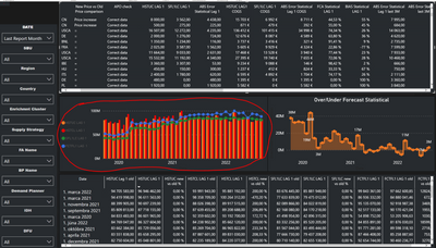
The Screenshot 1 shows the graph without the use of filters and it looks like this
Screenshot 1
In the Screenshot 2 we can see that after selecting one "DFU" in the table, my graph changes. This is how the graph looks when I filter out one specific "DFU" in the table, which is not correct.
Screenshot 2
In screenshot 3, we can see that after filtering the same "DFU" in the slicer, the graph looks completely different than in Screenshot 2 and is correct.
Screenshot 3
my question is. Is it possible that after clicking on one specific "DFU" in the table, it will show me the correct graph, as it does when I filter out a specific "DFU" in the slicer ?
Thank you
Solved! Go to Solution.
- Mark as New
- Bookmark
- Subscribe
- Mute
- Subscribe to RSS Feed
- Permalink
- Report Inappropriate Content
Hi, @Anonymous
There seems to be a difference in the interaction behavior of the visual objects in the two images.
The line and clustered column chart in the second screenshot is cross-highlighted by a table visual while tThe line and clustered column chart in the third screenshot is filtered by a slicer.
Please check whether you can edit Visual interactions to change how visualizations on a report page impact each other.
Change the interaction behavior
Best Regards,
Community Support Team _ Eason
Helpful resources

Microsoft Fabric Learn Together
Covering the world! 9:00-10:30 AM Sydney, 4:00-5:30 PM CET (Paris/Berlin), 7:00-8:30 PM Mexico City

Power BI Monthly Update - April 2024
Check out the April 2024 Power BI update to learn about new features.

| User | Count |
|---|---|
| 111 | |
| 97 | |
| 82 | |
| 67 | |
| 61 |
| User | Count |
|---|---|
| 148 | |
| 113 | |
| 97 | |
| 84 | |
| 67 |


