- Power BI forums
- Updates
- News & Announcements
- Get Help with Power BI
- Desktop
- Service
- Report Server
- Power Query
- Mobile Apps
- Developer
- DAX Commands and Tips
- Custom Visuals Development Discussion
- Health and Life Sciences
- Power BI Spanish forums
- Translated Spanish Desktop
- Power Platform Integration - Better Together!
- Power Platform Integrations (Read-only)
- Power Platform and Dynamics 365 Integrations (Read-only)
- Training and Consulting
- Instructor Led Training
- Dashboard in a Day for Women, by Women
- Galleries
- Community Connections & How-To Videos
- COVID-19 Data Stories Gallery
- Themes Gallery
- Data Stories Gallery
- R Script Showcase
- Webinars and Video Gallery
- Quick Measures Gallery
- 2021 MSBizAppsSummit Gallery
- 2020 MSBizAppsSummit Gallery
- 2019 MSBizAppsSummit Gallery
- Events
- Ideas
- Custom Visuals Ideas
- Issues
- Issues
- Events
- Upcoming Events
- Community Blog
- Power BI Community Blog
- Custom Visuals Community Blog
- Community Support
- Community Accounts & Registration
- Using the Community
- Community Feedback
Register now to learn Fabric in free live sessions led by the best Microsoft experts. From Apr 16 to May 9, in English and Spanish.
- Power BI forums
- Forums
- Get Help with Power BI
- Desktop
- Re: Indicate where a selection from a slicer would...
- Subscribe to RSS Feed
- Mark Topic as New
- Mark Topic as Read
- Float this Topic for Current User
- Bookmark
- Subscribe
- Printer Friendly Page
- Mark as New
- Bookmark
- Subscribe
- Mute
- Subscribe to RSS Feed
- Permalink
- Report Inappropriate Content
Indicate where a selection from a slicer would fall on a static chart
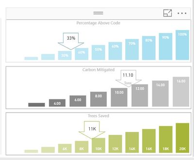
I am attempting to create a scorecard that can show where a filtered value lands within the range of an otherwise static chart. Here is an example of what I am trying to create:
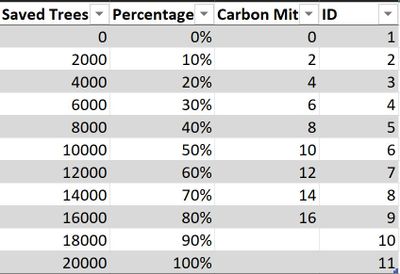
I was able to create the static range by using the following table
In a Stacked Column chart, the ID column is used for the X-axis and the value (saved trees, percentage, carbon mitigated) is used to create the columns.
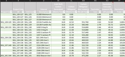
Each of the values inside of the arrow is a small card that is sliced from a seperate data source in which each row represents data from different projects.
Currently, I have to move the value to it's appropriate location on the static chart. Is it possible to automate this based on my slicer selection (Unit Code in the table to the right)? From my research, it doesn't look like there is an out of the box solution but it seems like I may be able to hack together a solution from two seperate visuals. One idea I had was to copy and paste the static chart on top of it's self and in the second chart, change the value to the associated column in my project data source. Then the data colors and data labels could be manipulated to show my singular value over the static range. My issue is trying to determine how I can slide that value along the x and y axis so that it displays in the appropriate position, in relation to the static range. I feel like it may have something to do with creating a relationship between the value in the table for the static range and the value in the project data source but since they values aren't exact matches, I'm unsure how to make that work.
I'm open to any method for how I can get a sliced value to appear within the static graph
- Mark as New
- Bookmark
- Subscribe
- Mute
- Subscribe to RSS Feed
- Permalink
- Report Inappropriate Content
You may check if the following post helps.
https://community.powerbi.com/t5/Desktop/Create-a-bar-graph-with-measures-as-axis/td-p/455900
If this post helps, then please consider Accept it as the solution to help the other members find it more quickly.
Helpful resources

Microsoft Fabric Learn Together
Covering the world! 9:00-10:30 AM Sydney, 4:00-5:30 PM CET (Paris/Berlin), 7:00-8:30 PM Mexico City

Power BI Monthly Update - April 2024
Check out the April 2024 Power BI update to learn about new features.

| User | Count |
|---|---|
| 113 | |
| 100 | |
| 78 | |
| 76 | |
| 52 |
| User | Count |
|---|---|
| 144 | |
| 109 | |
| 108 | |
| 88 | |
| 61 |


