- Power BI forums
- Updates
- News & Announcements
- Get Help with Power BI
- Desktop
- Service
- Report Server
- Power Query
- Mobile Apps
- Developer
- DAX Commands and Tips
- Custom Visuals Development Discussion
- Health and Life Sciences
- Power BI Spanish forums
- Translated Spanish Desktop
- Power Platform Integration - Better Together!
- Power Platform Integrations (Read-only)
- Power Platform and Dynamics 365 Integrations (Read-only)
- Training and Consulting
- Instructor Led Training
- Dashboard in a Day for Women, by Women
- Galleries
- Community Connections & How-To Videos
- COVID-19 Data Stories Gallery
- Themes Gallery
- Data Stories Gallery
- R Script Showcase
- Webinars and Video Gallery
- Quick Measures Gallery
- 2021 MSBizAppsSummit Gallery
- 2020 MSBizAppsSummit Gallery
- 2019 MSBizAppsSummit Gallery
- Events
- Ideas
- Custom Visuals Ideas
- Issues
- Issues
- Events
- Upcoming Events
- Community Blog
- Power BI Community Blog
- Custom Visuals Community Blog
- Community Support
- Community Accounts & Registration
- Using the Community
- Community Feedback
Register now to learn Fabric in free live sessions led by the best Microsoft experts. From Apr 16 to May 9, in English and Spanish.
- Power BI forums
- Forums
- Get Help with Power BI
- Desktop
- Independent slicers on each line in line chart
- Subscribe to RSS Feed
- Mark Topic as New
- Mark Topic as Read
- Float this Topic for Current User
- Bookmark
- Subscribe
- Printer Friendly Page
- Mark as New
- Bookmark
- Subscribe
- Mute
- Subscribe to RSS Feed
- Permalink
- Report Inappropriate Content
Independent slicers on each line in line chart
Hi,
I need help or answer how to achieve this simple goal:
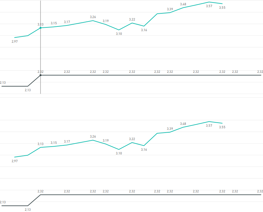
I have 1 simple data table(applies to both line charts)
I have 2 line charts and 2 sets of slicers(same for both charts)
Ecah line chart consists of 1 static line (same on both(exact values, column))
And one line cotrolled by slicers(same on both(exact values, column))
Question:
How to merge these line charts to get 2 dynamic lines controled by 2 sets of slicers.
Goal: to compare same data set with different selections on 1 chart
I am new to PBI i know how to do it with pivot table in excel but not here..
View when slicers applied(goal to get both lines on 1 chart..):
Solved! Go to Solution.
- Mark as New
- Bookmark
- Subscribe
- Mute
- Subscribe to RSS Feed
- Permalink
- Report Inappropriate Content
HI @wsuphappyhour,
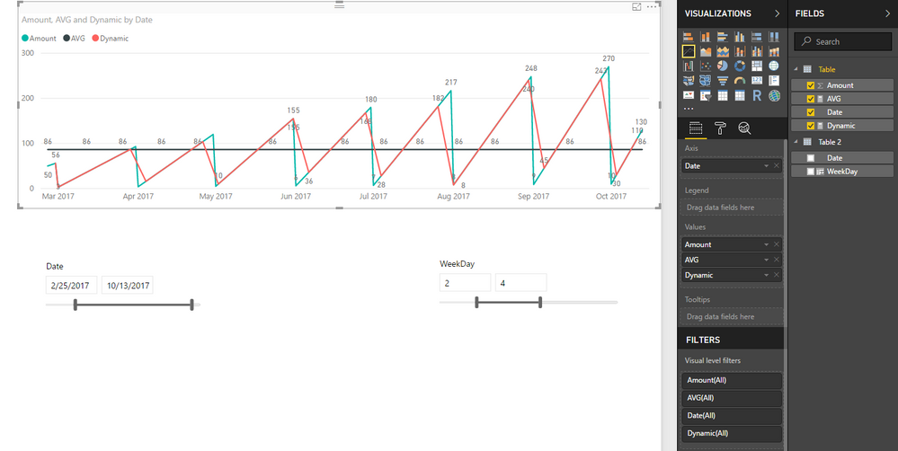
If you want line chart shows different values by two slicers, you need to create a new table as source of one slicer. (It is impossible to use same table as source of two slicers to filter on same column)
Sample:
AVG measure is static value which not effect by slicers.
Red line controlled by table 2 'weekday'; another line controlled by current date column.
Formula:
AVG =
AVERAGEX ( ALL ( 'Table' ), [Amount] )

Dynamic =
CALCULATE (
    SUM ( 'Table'[Amount] ),
    FILTER (
        'Table',
        'Table'[Date]
            IN CALCULATETABLE ( VALUES ( 'Table 2'[Date] ), ALLSELECTED ( 'Table 2' ) )
    )
)
Notice: these tables not have relationship.
Regards,
Xiaoxin Sheng
If this post helps, please consider accept as solution to help other members find it more quickly.
- Mark as New
- Bookmark
- Subscribe
- Mute
- Subscribe to RSS Feed
- Permalink
- Report Inappropriate Content
Great it works! I thought that I am over complicating things 🙂 Thanks Again
Helpful resources

Microsoft Fabric Learn Together
Covering the world! 9:00-10:30 AM Sydney, 4:00-5:30 PM CET (Paris/Berlin), 7:00-8:30 PM Mexico City

Power BI Monthly Update - April 2024
Check out the April 2024 Power BI update to learn about new features.

| User | Count |
|---|---|
| 109 | |
| 98 | |
| 80 | |
| 64 | |
| 57 |
| User | Count |
|---|---|
| 145 | |
| 111 | |
| 92 | |
| 84 | |
| 66 |


