- Power BI forums
- Updates
- News & Announcements
- Get Help with Power BI
- Desktop
- Service
- Report Server
- Power Query
- Mobile Apps
- Developer
- DAX Commands and Tips
- Custom Visuals Development Discussion
- Health and Life Sciences
- Power BI Spanish forums
- Translated Spanish Desktop
- Power Platform Integration - Better Together!
- Power Platform Integrations (Read-only)
- Power Platform and Dynamics 365 Integrations (Read-only)
- Training and Consulting
- Instructor Led Training
- Dashboard in a Day for Women, by Women
- Galleries
- Community Connections & How-To Videos
- COVID-19 Data Stories Gallery
- Themes Gallery
- Data Stories Gallery
- R Script Showcase
- Webinars and Video Gallery
- Quick Measures Gallery
- 2021 MSBizAppsSummit Gallery
- 2020 MSBizAppsSummit Gallery
- 2019 MSBizAppsSummit Gallery
- Events
- Ideas
- Custom Visuals Ideas
- Issues
- Issues
- Events
- Upcoming Events
- Community Blog
- Power BI Community Blog
- Custom Visuals Community Blog
- Community Support
- Community Accounts & Registration
- Using the Community
- Community Feedback
Register now to learn Fabric in free live sessions led by the best Microsoft experts. From Apr 16 to May 9, in English and Spanish.
- Power BI forums
- Forums
- Get Help with Power BI
- Desktop
- Re: Incremental dateI
- Subscribe to RSS Feed
- Mark Topic as New
- Mark Topic as Read
- Float this Topic for Current User
- Bookmark
- Subscribe
- Printer Friendly Page
- Mark as New
- Bookmark
- Subscribe
- Mute
- Subscribe to RSS Feed
- Permalink
- Report Inappropriate Content
Incremental dateI
Hello Community,
I have a date column(Lab Date) and I want to show Count of samples by 10 day increment
which will look like this ->
How can I achieve that? Please help
Solved! Go to Solution.
- Mark as New
- Bookmark
- Subscribe
- Mute
- Subscribe to RSS Feed
- Permalink
- Report Inappropriate Content
Hi @subho220 ,
According to my understand, you want to set a segment for Date and then use it as X-axis in chart,right?
You could use the following formula to create a column not a measure.
Type =
VAR _max =
    CALCULATE ( MAX ( 'Table'[Date] ), ALL ( 'Table'[Date] ) )
VAR _diff =
    DATEDIFF ( _max, MAX ( 'Table'[Date] ), DAY )
RETURN
    IF (
        _diff <= 10,
        "<10 days",
        IF (
            _diff > 10
                && _diff <= 20,
            "11-20 days",
            IF (
                _diff > 20
                    && _diff <= 30,
                "21-30 days",
                IF (
                    _diff > 30
                        && _diff <= 40,
                    "31-40 days",
                    IF ( _diff > 40 && _diff <= 50, "41-50 days", IF ( _diff > 50, ">50 days" ) )
                )
            )
        )
    )
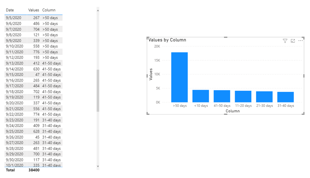
My visualization looks like this:
Did I answer your question ? Please mark my reply as solution. Thank you very much.
If not, please upload some insensitive data samples and expected output.
Best Regards,
Eyelyn Qin
- Mark as New
- Bookmark
- Subscribe
- Mute
- Subscribe to RSS Feed
- Permalink
- Report Inappropriate Content
Hi @subho220 ,
Could you tell me if your problem has been solved? If it is, kindly Accept it as the solution. More people will benefit from it. Or you are still confused about it, please provide me with more details about your table and your problem or share me with your pbix file from your Onedrive for Business.
Best Regards,
Eyelyn Qin
- Mark as New
- Bookmark
- Subscribe
- Mute
- Subscribe to RSS Feed
- Permalink
- Report Inappropriate Content
Hi @subho220 ,
According to my understand, you want to set a segment for Date and then use it as X-axis in chart,right?
You could use the following formula to create a column not a measure.
Type =
VAR _max =
    CALCULATE ( MAX ( 'Table'[Date] ), ALL ( 'Table'[Date] ) )
VAR _diff =
    DATEDIFF ( _max, MAX ( 'Table'[Date] ), DAY )
RETURN
    IF (
        _diff <= 10,
        "<10 days",
        IF (
            _diff > 10
                && _diff <= 20,
            "11-20 days",
            IF (
                _diff > 20
                    && _diff <= 30,
                "21-30 days",
                IF (
                    _diff > 30
                        && _diff <= 40,
                    "31-40 days",
                    IF ( _diff > 40 && _diff <= 50, "41-50 days", IF ( _diff > 50, ">50 days" ) )
                )
            )
        )
    )
My visualization looks like this:
Did I answer your question ? Please mark my reply as solution. Thank you very much.
If not, please upload some insensitive data samples and expected output.
Best Regards,
Eyelyn Qin
- Mark as New
- Bookmark
- Subscribe
- Mute
- Subscribe to RSS Feed
- Permalink
- Report Inappropriate Content
@subho220 , Create a new column like
new column =
var _diff = datediff([Lab Date], today(),day)
return
switch(true(),
_diff<10 , " Less than 10 days",
_diff<20 , " 11 to 20 Days ",
//add other
)
Microsoft Power BI Learning Resources, 2023 !!
Learn Power BI - Full Course with Dec-2022, with Window, Index, Offset, 100+ Topics !!
Did I answer your question? Mark my post as a solution! Appreciate your Kudos !! Proud to be a Super User! !!
Helpful resources

Microsoft Fabric Learn Together
Covering the world! 9:00-10:30 AM Sydney, 4:00-5:30 PM CET (Paris/Berlin), 7:00-8:30 PM Mexico City

Power BI Monthly Update - April 2024
Check out the April 2024 Power BI update to learn about new features.

| User | Count |
|---|---|
| 110 | |
| 94 | |
| 81 | |
| 66 | |
| 58 |
| User | Count |
|---|---|
| 150 | |
| 119 | |
| 104 | |
| 87 | |
| 67 |


