- Power BI forums
- Updates
- News & Announcements
- Get Help with Power BI
- Desktop
- Service
- Report Server
- Power Query
- Mobile Apps
- Developer
- DAX Commands and Tips
- Custom Visuals Development Discussion
- Health and Life Sciences
- Power BI Spanish forums
- Translated Spanish Desktop
- Power Platform Integration - Better Together!
- Power Platform Integrations (Read-only)
- Power Platform and Dynamics 365 Integrations (Read-only)
- Training and Consulting
- Instructor Led Training
- Dashboard in a Day for Women, by Women
- Galleries
- Community Connections & How-To Videos
- COVID-19 Data Stories Gallery
- Themes Gallery
- Data Stories Gallery
- R Script Showcase
- Webinars and Video Gallery
- Quick Measures Gallery
- 2021 MSBizAppsSummit Gallery
- 2020 MSBizAppsSummit Gallery
- 2019 MSBizAppsSummit Gallery
- Events
- Ideas
- Custom Visuals Ideas
- Issues
- Issues
- Events
- Upcoming Events
- Community Blog
- Power BI Community Blog
- Custom Visuals Community Blog
- Community Support
- Community Accounts & Registration
- Using the Community
- Community Feedback
Register now to learn Fabric in free live sessions led by the best Microsoft experts. From Apr 16 to May 9, in English and Spanish.
- Power BI forums
- Forums
- Get Help with Power BI
- Desktop
- Re: Incorrect Average Location Unit Margin
- Subscribe to RSS Feed
- Mark Topic as New
- Mark Topic as Read
- Float this Topic for Current User
- Bookmark
- Subscribe
- Printer Friendly Page
- Mark as New
- Bookmark
- Subscribe
- Mute
- Subscribe to RSS Feed
- Permalink
- Report Inappropriate Content
Incorrect Average Location Unit Margin
Hello,
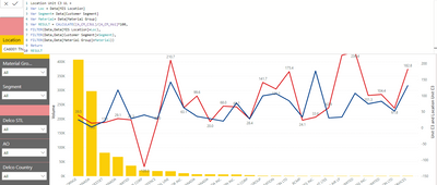
I am trying to bring a visual of comparison between Volume (Measure), Unit Margin (Measure) & Location Unit Margin (Column).
This location unit margin should automatically change based upon the location I select, or the Product/Material type & Segment.
If my formula worked properly, my blue line (Loc Unit Margin) should ideally be a straight line as it is an Average. However if i do not select any material or Segment in the slicer as below, then the line goes "Wacky". However if i need a straight line, i need to select both Material & Segment to make the line straight.
Requirement/Help needed:
How should the formula look like if there is no filter of material/segment selected to ensure i get that line straight?
I hope i was able to explain my problem & requirement correctly. Please help me out as I have been breaking my head for 2 weeks now! Thank you!
No Filter selections:
With Material/Segment Filter selected:
With Both filters selected:
Solved! Go to Solution.
- Mark as New
- Bookmark
- Subscribe
- Mute
- Subscribe to RSS Feed
- Permalink
- Report Inappropriate Content
Hi @Anonymous ,
Do you want to display the dark blue line or orange line?
If you want to show the dark blue line, please refer the following measure,
Measure 1 =
VAR loc =
    MAX ( Data[MIS Location] )
VAR segment =
    MAX ( Data[Customer Segment] )
VAR Ma =
    MAX ( Data[Material Group] )
RETURN
    DIVIDE (
        CALCULATE (
            SUM ( 'Data'[Actual] ),
            FILTER (
                'Data',
                'Data'[Category] = "Margin"
                    && Data[MIS Location] = loc
                    && Data[Customer Segment] = segment
                    && Data[Material Group] = Ma
            )
        ),
        CALCULATE (
            SUM ( 'Data'[Actual] ),
            FILTER (
                'Data',
                'Data'[Category] = "Volume"
                    && Data[MIS Location] = loc
                    && Data[Customer Segment] = segment
                    && Data[Material Group] = Ma
            )
        )
    ) * 100
If you want to show the orange line, please refer the following measure.
Measure 2 =
VAR loc =
    MAX ( Data[MIS Location] )
VAR segment =
    MAX ( Data[Customer Segment] )
VAR Ma =
    MAX ( Data[Material Group] )
RETURN
    DIVIDE (
        CALCULATE (
            SUM ( 'Data'[Actual] ),
            FILTER ( ALLSELECTED ( 'Data' ), 'Data'[Category] = "Margin" )
        ),
        CALCULATE (
            SUM ( 'Data'[Actual] ),
            FILTER ( ALLSELECTED ( 'Data' ), 'Data'[Category] = "Volume" )
        )
    ) * 100
If it doesn’t meet your requirement, could you please show us the exact expected result based on the table that you have shared?
Best regards,
Community Support Team _ zhenbw
If this post helps, then please consider Accept it as the solution to help the other members find it more quickly.
BTW, pbix as attached.
- Mark as New
- Bookmark
- Subscribe
- Mute
- Subscribe to RSS Feed
- Permalink
- Report Inappropriate Content
Hi @Anonymous ,
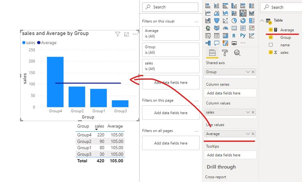
Do you want to display a horizontal average?
If yes, we can use average line or create a measure to meet your requirement.
1. Create a clustered column chart, then add an average line.
2. Create a measure, then create a line and column chart and put the measure in line values.
Average =
DIVIDE(
    CALCULATE(SUM('Table'[sales]),ALL('Table')),
    CALCULATE(DISTINCTCOUNT('Table'[Group]),ALL('Table')))
If it doesn’t meet your requirement, could you please provide a mockup sample based on fake data or describe the fields of each tables and the relations between tables simply?
It will be helpful if you can show us the exact expected result based on the tables.
Please upload your files to OneDrive For Business and share the link here. Please don't contain any Confidential Information or Real data in your reply.
Best regards,
Community Support Team _ zhenbw
If this post helps, then please consider Accept it as the solution to help the other members find it more quickly.
BTW, pbix as attached.
- Mark as New
- Bookmark
- Subscribe
- Mute
- Subscribe to RSS Feed
- Permalink
- Report Inappropriate Content
Hello,
Thanks for replying quickly. I have attached a sample data in Onedrive via Excel, please use that. I tried the formula you mentione which didnt work for me. I have also put a simple pivot of the data which mentions the different Avg Unit Margin.
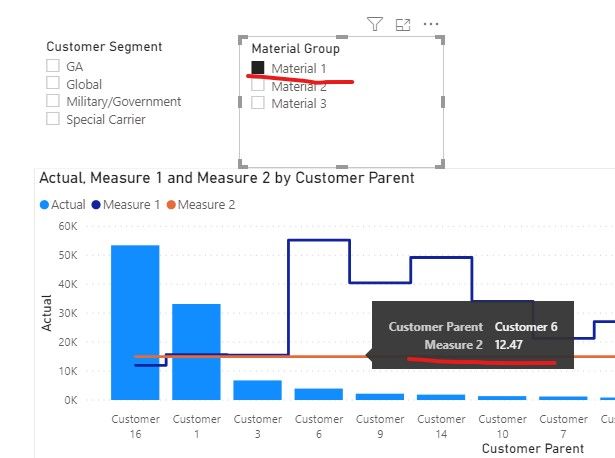
For Eg: If i filter for Customer Segment as GA, then my Average line should be 24.56 and I should be able to compare it with other customers in the same location. Or if i filter only for Material 1, the Avg Unit Margin is 12.47. And i should be able to compare it with other customers buying the same material in that location.
- Mark as New
- Bookmark
- Subscribe
- Mute
- Subscribe to RSS Feed
- Permalink
- Report Inappropriate Content
Hi @Anonymous ,
Do you want to display the dark blue line or orange line?
If you want to show the dark blue line, please refer the following measure,
Measure 1 =
VAR loc =
    MAX ( Data[MIS Location] )
VAR segment =
    MAX ( Data[Customer Segment] )
VAR Ma =
    MAX ( Data[Material Group] )
RETURN
    DIVIDE (
        CALCULATE (
            SUM ( 'Data'[Actual] ),
            FILTER (
                'Data',
                'Data'[Category] = "Margin"
                    && Data[MIS Location] = loc
                    && Data[Customer Segment] = segment
                    && Data[Material Group] = Ma
            )
        ),
        CALCULATE (
            SUM ( 'Data'[Actual] ),
            FILTER (
                'Data',
                'Data'[Category] = "Volume"
                    && Data[MIS Location] = loc
                    && Data[Customer Segment] = segment
                    && Data[Material Group] = Ma
            )
        )
    ) * 100
If you want to show the orange line, please refer the following measure.
Measure 2 =
VAR loc =
    MAX ( Data[MIS Location] )
VAR segment =
    MAX ( Data[Customer Segment] )
VAR Ma =
    MAX ( Data[Material Group] )
RETURN
    DIVIDE (
        CALCULATE (
            SUM ( 'Data'[Actual] ),
            FILTER ( ALLSELECTED ( 'Data' ), 'Data'[Category] = "Margin" )
        ),
        CALCULATE (
            SUM ( 'Data'[Actual] ),
            FILTER ( ALLSELECTED ( 'Data' ), 'Data'[Category] = "Volume" )
        )
    ) * 100
If it doesn’t meet your requirement, could you please show us the exact expected result based on the table that you have shared?
Best regards,
Community Support Team _ zhenbw
If this post helps, then please consider Accept it as the solution to help the other members find it more quickly.
BTW, pbix as attached.
- Mark as New
- Bookmark
- Subscribe
- Mute
- Subscribe to RSS Feed
- Permalink
- Report Inappropriate Content
Helpful resources

Microsoft Fabric Learn Together
Covering the world! 9:00-10:30 AM Sydney, 4:00-5:30 PM CET (Paris/Berlin), 7:00-8:30 PM Mexico City

Power BI Monthly Update - April 2024
Check out the April 2024 Power BI update to learn about new features.

| User | Count |
|---|---|
| 109 | |
| 99 | |
| 77 | |
| 66 | |
| 54 |
| User | Count |
|---|---|
| 144 | |
| 104 | |
| 101 | |
| 86 | |
| 64 |


