- Power BI forums
- Updates
- News & Announcements
- Get Help with Power BI
- Desktop
- Service
- Report Server
- Power Query
- Mobile Apps
- Developer
- DAX Commands and Tips
- Custom Visuals Development Discussion
- Health and Life Sciences
- Power BI Spanish forums
- Translated Spanish Desktop
- Power Platform Integration - Better Together!
- Power Platform Integrations (Read-only)
- Power Platform and Dynamics 365 Integrations (Read-only)
- Training and Consulting
- Instructor Led Training
- Dashboard in a Day for Women, by Women
- Galleries
- Community Connections & How-To Videos
- COVID-19 Data Stories Gallery
- Themes Gallery
- Data Stories Gallery
- R Script Showcase
- Webinars and Video Gallery
- Quick Measures Gallery
- 2021 MSBizAppsSummit Gallery
- 2020 MSBizAppsSummit Gallery
- 2019 MSBizAppsSummit Gallery
- Events
- Ideas
- Custom Visuals Ideas
- Issues
- Issues
- Events
- Upcoming Events
- Community Blog
- Power BI Community Blog
- Custom Visuals Community Blog
- Community Support
- Community Accounts & Registration
- Using the Community
- Community Feedback
Register now to learn Fabric in free live sessions led by the best Microsoft experts. From Apr 16 to May 9, in English and Spanish.
- Power BI forums
- Forums
- Get Help with Power BI
- Desktop
- Incomplete Donut Chart / Partial Donut Chart // Co...
- Subscribe to RSS Feed
- Mark Topic as New
- Mark Topic as Read
- Float this Topic for Current User
- Bookmark
- Subscribe
- Printer Friendly Page
- Mark as New
- Bookmark
- Subscribe
- Mute
- Subscribe to RSS Feed
- Permalink
- Report Inappropriate Content
Incomplete Donut Chart / Partial Donut Chart // Cool Donut Chart Desing
Dears; ![]()
Sorry for the long subject, but I wasn't sure about how classify this thread.
I really love those Dashboards where you can see incomplete donut charts, just showing a number/area, or highlighting one key value for the users.
Now in a time a lot of experts are mocking Pie and Donut chart in favour of bar charts, specially when more than 2-3 slices area available, I would like to give them a try.
People tend to say a picture worth more than 10.000 words, so let's take this old-saying into account.
Here my problem:
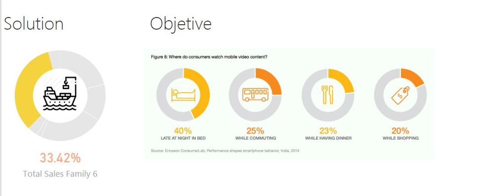
- On the right a picture of what I am looking for.
- On the left my proposed solution which uses a Image + Donut Chart + Card.
How I did it? : I've created a donut chart adding family on "Legend Field" and "% Total Sales Family 6 over Total Sales" on Values. Changing the color to the rest of families I got this apperance.
Problems:
- Powerbi always uses 100% Donut Chart, so this method is more for statics views
- If you select another family on a table, other visual or slicer, the current apperance breaks.
- This is, therefore, more oriented to Main Page or Overview Pages where you may move to other pages or by DrillingThrought.
- This is not a OOP language like Visual Basic is, so there is no way to program a function to change the "property: color" for the selectedvalue.
- I was considering to use this approach on Dasboards, which is a makeup of statics frames, but there is no way to group the three elements in one and then pin-up on a Dashboard.
- Here to cut the number of elements, I was thinking to use a picture as background, but only Scatter chart allows to use pictures on the background, rest are only plane colors.
This is really a easy thing, but I would like to share with you this doubt to find out alternative ways to face the problem.
Thanks for sharing your proposals. ![]()
Here my dummy file for anyone who wants to test or go through it.
https://www.dropbox.com/s/88dtadb0s7m1hpd/Dummy%20Model.pbix?dl=0
Regards,
Solved! Go to Solution.
- Mark as New
- Bookmark
- Subscribe
- Mute
- Subscribe to RSS Feed
- Permalink
- Report Inappropriate Content
Hi @Ciria,
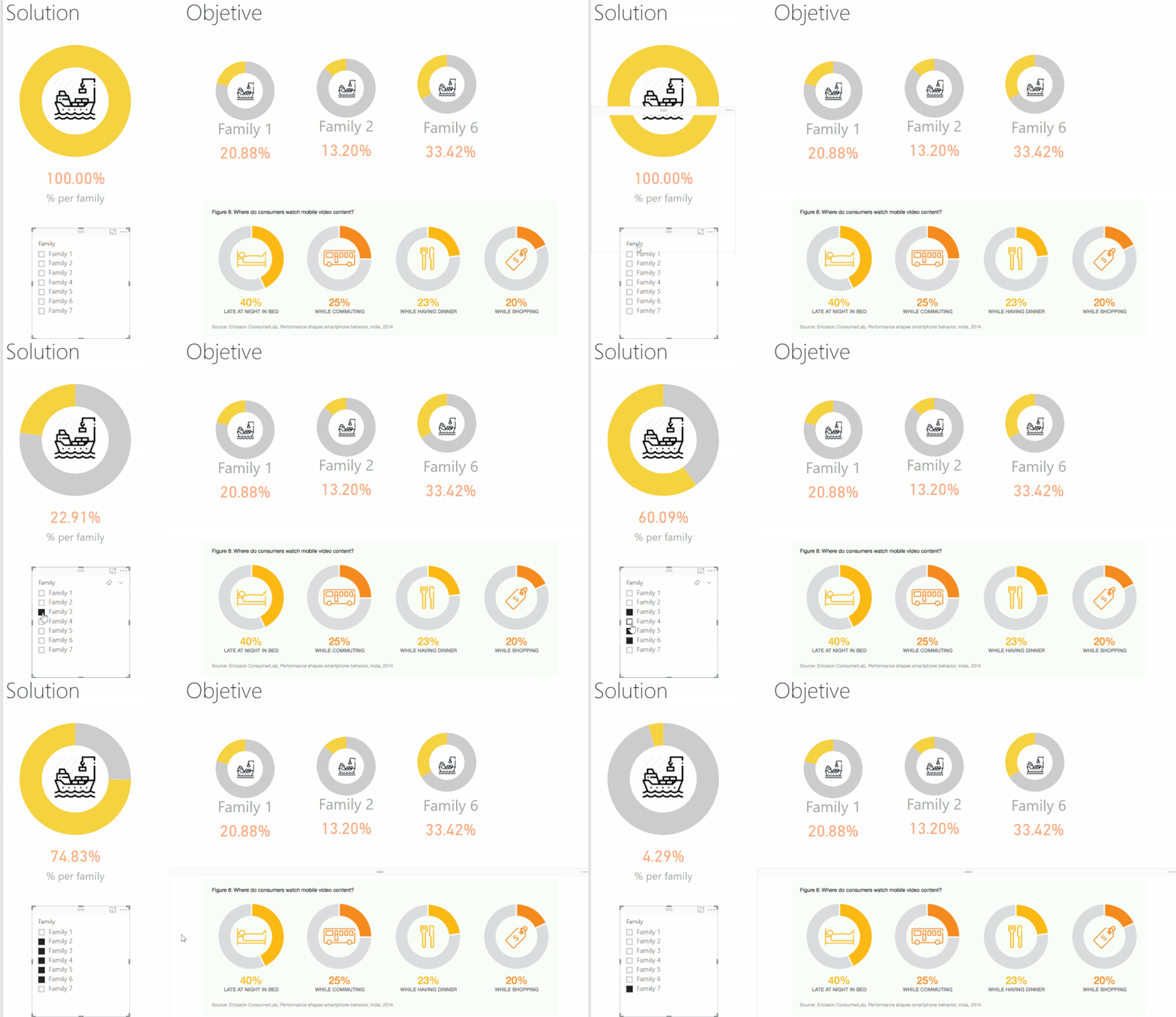
I also add a similiar approach to one dashboard. You simply need to create two measures and add them to your Pie chart:
% per family =
DIVIDE (
    CALCULATE ( [Total Sales]; ALLSELECTED ( Family[Family] ) );
    CALCULATE ( [Total Sales]; ALL ( Family[Family] ) )
)

% Other Family = 1-[% per family]
Format both as % and then your chart will look like below, then you have two choices or add the filter of family in your chart and make it only for that family or create a slicer that filters out the information:
See attach the pbix file (we transfer only available for 7 days) I added a new report with this solution.
If you go for the single chart approach with the slicer you can change images using the bookmark feature.
Any question please tell me.
Regards,
MFelix
Regards
Miguel Félix
Did I answer your question? Mark my post as a solution!
Proud to be a Super User!
Check out my blog: Power BI em Português- Mark as New
- Bookmark
- Subscribe
- Mute
- Subscribe to RSS Feed
- Permalink
- Report Inappropriate Content
@Ciria,
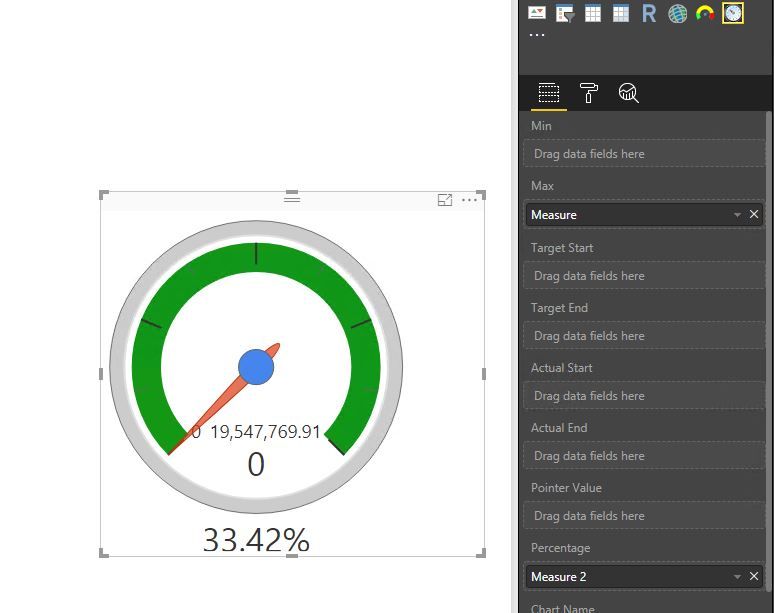
Firstly, there is no exact same donut visual as your describe in Power BI Desktop, however, to make life easier, you can use the Dial Gauge custom visual instead.
Secondly, if you don't want the dial gauge to be filtered by other visuals or slicers, create the following measures. You also need to add image under the Dial Gauge visual.
Measure = CALCULATE([Total Sales],ALL(Family),ALL(Master_Customer_Suppliers))
Measure 2 = DIVIDE( CALCULATE([Total Sales], Family[Family]="Family 6"),'Key Measures'[Measure])
Regards,
Lydia
If this post helps, then please consider Accept it as the solution to help the other members find it more quickly.
Helpful resources

Microsoft Fabric Learn Together
Covering the world! 9:00-10:30 AM Sydney, 4:00-5:30 PM CET (Paris/Berlin), 7:00-8:30 PM Mexico City

Power BI Monthly Update - April 2024
Check out the April 2024 Power BI update to learn about new features.

| User | Count |
|---|---|
| 107 | |
| 100 | |
| 78 | |
| 64 | |
| 58 |
| User | Count |
|---|---|
| 148 | |
| 113 | |
| 97 | |
| 84 | |
| 67 |


