- Power BI forums
- Updates
- News & Announcements
- Get Help with Power BI
- Desktop
- Service
- Report Server
- Power Query
- Mobile Apps
- Developer
- DAX Commands and Tips
- Custom Visuals Development Discussion
- Health and Life Sciences
- Power BI Spanish forums
- Translated Spanish Desktop
- Power Platform Integration - Better Together!
- Power Platform Integrations (Read-only)
- Power Platform and Dynamics 365 Integrations (Read-only)
- Training and Consulting
- Instructor Led Training
- Dashboard in a Day for Women, by Women
- Galleries
- Community Connections & How-To Videos
- COVID-19 Data Stories Gallery
- Themes Gallery
- Data Stories Gallery
- R Script Showcase
- Webinars and Video Gallery
- Quick Measures Gallery
- 2021 MSBizAppsSummit Gallery
- 2020 MSBizAppsSummit Gallery
- 2019 MSBizAppsSummit Gallery
- Events
- Ideas
- Custom Visuals Ideas
- Issues
- Issues
- Events
- Upcoming Events
- Community Blog
- Power BI Community Blog
- Custom Visuals Community Blog
- Community Support
- Community Accounts & Registration
- Using the Community
- Community Feedback
Register now to learn Fabric in free live sessions led by the best Microsoft experts. From Apr 16 to May 9, in English and Spanish.
- Power BI forums
- Forums
- Get Help with Power BI
- Desktop
- Re: Include count of blanks in a chart
- Subscribe to RSS Feed
- Mark Topic as New
- Mark Topic as Read
- Float this Topic for Current User
- Bookmark
- Subscribe
- Printer Friendly Page
- Mark as New
- Bookmark
- Subscribe
- Mute
- Subscribe to RSS Feed
- Permalink
- Report Inappropriate Content
Include count of blanks in a chart
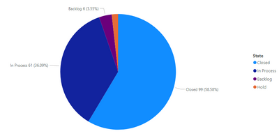
I have a table with a column called States, where values are things like Closed, In Process, Hold, etc. In some rows, the value in this column is blank. I am trying to create a pie chart to show the total number of each state, but it doesn't include the blank values. I know you can create a measure using COUNTBLANK to get the number of blanks, but how do I include this value as a piece of my pie chart?
The chart looks like this
But when I add my measure as a value it becomes like this.
I just want one pie chart where it shows each of the states, including blank.
Solved! Go to Solution.
- Mark as New
- Bookmark
- Subscribe
- Mute
- Subscribe to RSS Feed
- Permalink
- Report Inappropriate Content
@Anonymous
Actually here's a little surprise...
My sample data table:
The measures:
1) Count State = COUNT('DataTable'[State])
2) Count Blanks = COUNTBLANK('DataTable'[State])
3) The final measure to use in the visual:

Did I answer your question? Mark my post as a solution!
In doing so, you are also helping me. Thank you!
Proud to be a Super User!
Paul on Linkedin.
- Mark as New
- Bookmark
- Subscribe
- Mute
- Subscribe to RSS Feed
- Permalink
- Report Inappropriate Content
@Anonymous
I'm hazarding a guess here but maybe you can achieve this by:
Create a measure to count the blanks. Let's call this [count blanks measure].
now create a new measure which is:
final measure = [your current measure] + [count blanks measure]
Did I answer your question? Mark my post as a solution!
In doing so, you are also helping me. Thank you!
Proud to be a Super User!
Paul on Linkedin.
- Mark as New
- Bookmark
- Subscribe
- Mute
- Subscribe to RSS Feed
- Permalink
- Report Inappropriate Content
My other values aren't calculated based on measures though. Are you saying I need to create a measure counting the number of each possible state and then combine it into a chart? I can see why this might work but I find it hard to believe there isn't any other way than to be creating measures for every possible value.
- Mark as New
- Bookmark
- Subscribe
- Mute
- Subscribe to RSS Feed
- Permalink
- Report Inappropriate Content
@Anonymous
Sorry!! I did say I was hazarding a guess (while on the move..)
Ok, so, where do you want to show the blank values? as another field in the legend?
Did I answer your question? Mark my post as a solution!
In doing so, you are also helping me. Thank you!
Proud to be a Super User!
Paul on Linkedin.
- Mark as New
- Bookmark
- Subscribe
- Mute
- Subscribe to RSS Feed
- Permalink
- Report Inappropriate Content
No problem. I want to show them as a slice of the pie.
- Mark as New
- Bookmark
- Subscribe
- Mute
- Subscribe to RSS Feed
- Permalink
- Report Inappropriate Content
@Anonymous
Actually here's a little surprise...
My sample data table:
The measures:
1) Count State = COUNT('DataTable'[State])
2) Count Blanks = COUNTBLANK('DataTable'[State])
3) The final measure to use in the visual:

Did I answer your question? Mark my post as a solution!
In doing so, you are also helping me. Thank you!
Proud to be a Super User!
Paul on Linkedin.
- Mark as New
- Bookmark
- Subscribe
- Mute
- Subscribe to RSS Feed
- Permalink
- Report Inappropriate Content
It worked, thanks so much- and I apologize for doubting you!
- Mark as New
- Bookmark
- Subscribe
- Mute
- Subscribe to RSS Feed
- Permalink
- Report Inappropriate Content
@Anonymous
There is actually a more "elegant" measure which will work:
Alternative measure =
COUNTROWS ( SELECTCOLUMNS ( 'DataTable', "state", 'DataTable'[State] ) )
Did I answer your question? Mark my post as a solution!
In doing so, you are also helping me. Thank you!
Proud to be a Super User!
Paul on Linkedin.
- Mark as New
- Bookmark
- Subscribe
- Mute
- Subscribe to RSS Feed
- Permalink
- Report Inappropriate Content
@Anonymous
In the Pie Chart Fields add Location into the Legend to get required visual!
Did I answer your question? Mark my post as a solution! Appreciate your Kudos!!
MY Blog || My YouTube Channel || Connect with me on Linkedin || My Latest Data Story - Ageing Analysis
Proud to be a Super User!
- Mark as New
- Bookmark
- Subscribe
- Mute
- Subscribe to RSS Feed
- Permalink
- Report Inappropriate Content
Hi @Anonymous ,
If you have access to Power Query (not direct query/live connection) then you can select your [State] column, go to Transform tab and Replace Values, then replace null with "Blank" or "".
This should then show the blanks as distinct dimension values on any visuals.
Pete
Now accepting Kudos! If my post helped you, why not give it a thumbs-up?
Proud to be a Datanaut!
- Mark as New
- Bookmark
- Subscribe
- Mute
- Subscribe to RSS Feed
- Permalink
- Report Inappropriate Content
Unfortunately I can't edit the data since this is a power bi dataset.
- Mark as New
- Bookmark
- Subscribe
- Mute
- Subscribe to RSS Feed
- Permalink
- Report Inappropriate Content
Hi @Anonymous ,
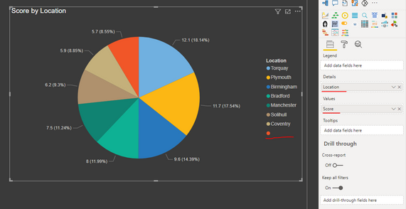
First question. Are there BLANK values in the STATE column? I fthere are blanks then the piechart will show it by itself once you move the count in the values section. See below:
See I have got a LOCATION column with BLANK values and it shows in the pie-chart.
Can you share your screenshot as well like what you are moving at your end?
Thanks,
Pragati
- Mark as New
- Bookmark
- Subscribe
- Mute
- Subscribe to RSS Feed
- Permalink
- Report Inappropriate Content
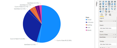
Yes, the blanks are in the state column. Here is what the fields look like.
blankState is my measure to count the blanks, since they are not showing in the first chart.
- Mark as New
- Bookmark
- Subscribe
- Mute
- Subscribe to RSS Feed
- Permalink
- Report Inappropriate Content
Hi @Anonymous ,
Can you just move normal COUNT of STATE in the VALUES section? your STATE column already has BLANK values in it, so just moving it to LEGEND should show a blank. You don't need a different measure for counting blanks like you see in my screesnhots. I don't have a measure to count blanks independently.
Thanks,
Pragati
- Mark as New
- Bookmark
- Subscribe
- Mute
- Subscribe to RSS Feed
- Permalink
- Report Inappropriate Content
State in the legend and the Count of State are the same column, so it's technically already in the legend.
- Mark as New
- Bookmark
- Subscribe
- Mute
- Subscribe to RSS Feed
- Permalink
- Report Inappropriate Content
Hi @Anonymous ,
No they are not.
In the Legend section when you move STATE column, it shows unique values in your STATE column.
In the Values section when you move COUNT(STATE) column, it counts the number of rows for the unique values in STATE column.
Also, what values you get when you just move STATE column in a table visual?
Do you see a BLANK value in this column? Because I am still not convinced on this part. If the STATE column has BLANK value then it should show it in the LEGEND on pie-chart and so does it's distribution.
See like I have at my end:
Thanks,
Pragati
- Mark as New
- Bookmark
- Subscribe
- Mute
- Subscribe to RSS Feed
- Permalink
- Report Inappropriate Content
When I moved Count of State into the legend, it just became State, like what I already had in there. There is a blank value in my State table.
Interestingly, when I have no fields in Values, the legend shows blank, but as soon as I add a field to values, it disappears. I have confirmed in the data that there are blanks (4 of them, to be exact).
Helpful resources

Microsoft Fabric Learn Together
Covering the world! 9:00-10:30 AM Sydney, 4:00-5:30 PM CET (Paris/Berlin), 7:00-8:30 PM Mexico City

Power BI Monthly Update - April 2024
Check out the April 2024 Power BI update to learn about new features.

| User | Count |
|---|---|
| 114 | |
| 99 | |
| 83 | |
| 70 | |
| 60 |
| User | Count |
|---|---|
| 150 | |
| 115 | |
| 104 | |
| 89 | |
| 65 |


