- Power BI forums
- Updates
- News & Announcements
- Get Help with Power BI
- Desktop
- Service
- Report Server
- Power Query
- Mobile Apps
- Developer
- DAX Commands and Tips
- Custom Visuals Development Discussion
- Health and Life Sciences
- Power BI Spanish forums
- Translated Spanish Desktop
- Power Platform Integration - Better Together!
- Power Platform Integrations (Read-only)
- Power Platform and Dynamics 365 Integrations (Read-only)
- Training and Consulting
- Instructor Led Training
- Dashboard in a Day for Women, by Women
- Galleries
- Community Connections & How-To Videos
- COVID-19 Data Stories Gallery
- Themes Gallery
- Data Stories Gallery
- R Script Showcase
- Webinars and Video Gallery
- Quick Measures Gallery
- 2021 MSBizAppsSummit Gallery
- 2020 MSBizAppsSummit Gallery
- 2019 MSBizAppsSummit Gallery
- Events
- Ideas
- Custom Visuals Ideas
- Issues
- Issues
- Events
- Upcoming Events
- Community Blog
- Power BI Community Blog
- Custom Visuals Community Blog
- Community Support
- Community Accounts & Registration
- Using the Community
- Community Feedback
Register now to learn Fabric in free live sessions led by the best Microsoft experts. From Apr 16 to May 9, in English and Spanish.
- Power BI forums
- Forums
- Get Help with Power BI
- Desktop
- Re: In Line Chart persentage of category data
- Subscribe to RSS Feed
- Mark Topic as New
- Mark Topic as Read
- Float this Topic for Current User
- Bookmark
- Subscribe
- Printer Friendly Page
- Mark as New
- Bookmark
- Subscribe
- Mute
- Subscribe to RSS Feed
- Permalink
- Report Inappropriate Content
In Line Chart persentage of category data
Hi There,
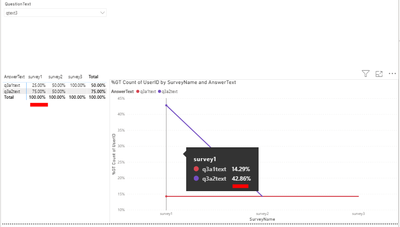
I want to show my data in line chart as persentage of the category. I have handled users' persentage data with "show value as" > "Persentage of Column Total" in this matris visulation.
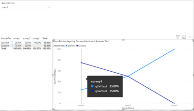
In this image you can see, I have users' distict count, survey name and answertext. I want to show this persentage of distinct count user data by SurveyName in answertext lines. So I need line chart like this:
- Mark as New
- Bookmark
- Subscribe
- Mute
- Subscribe to RSS Feed
- Permalink
- Report Inappropriate Content
@Anonymous You can't use Show value as | Percent of Grand Total?
@ me in replies or I'll lose your thread!!!
Instead of a Kudo, please vote for this idea
Become an expert!: Enterprise DNA
External Tools: MSHGQM
YouTube Channel!: Microsoft Hates Greg
Latest book!: The Definitive Guide to Power Query (M)
DAX is easy, CALCULATE makes DAX hard...
- Mark as New
- Bookmark
- Subscribe
- Mute
- Subscribe to RSS Feed
- Permalink
- Report Inappropriate Content
@Greg_Deckler It is not usefull for me. I need data like the matrix table.
I want to show answertext's userid's distict count per surveyName. So total survey name persentage count must be 100% per every survey name as I send the last graphic.
Best,
- Mark as New
- Bookmark
- Subscribe
- Mute
- Subscribe to RSS Feed
- Permalink
- Report Inappropriate Content
@Anonymous OK, not sure so please provide sample source data and expected output from that source data. Need this as text so I can copy and paste into a mockup. Thanks.
@ me in replies or I'll lose your thread!!!
Instead of a Kudo, please vote for this idea
Become an expert!: Enterprise DNA
External Tools: MSHGQM
YouTube Channel!: Microsoft Hates Greg
Latest book!: The Definitive Guide to Power Query (M)
DAX is easy, CALCULATE makes DAX hard...
- Mark as New
- Bookmark
- Subscribe
- Mute
- Subscribe to RSS Feed
- Permalink
- Report Inappropriate Content
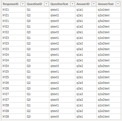
AnswerText Table:
ResponseTable:
Relation:
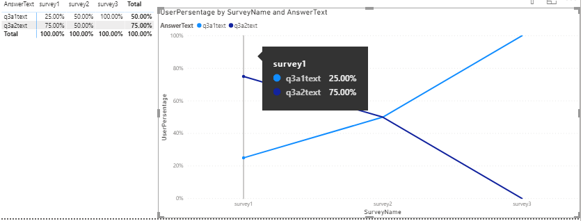
I need a line chart which must show percent of distictcount userID, comlumn is SurveyName, Rows are AnswerTexts
So I need line chart like this for example:
- Mark as New
- Bookmark
- Subscribe
- Mute
- Subscribe to RSS Feed
- Permalink
- Report Inappropriate Content
@Anonymous As text please, I don't want to have to type all that data in to mock this up. Thanks.
@ me in replies or I'll lose your thread!!!
Instead of a Kudo, please vote for this idea
Become an expert!: Enterprise DNA
External Tools: MSHGQM
YouTube Channel!: Microsoft Hates Greg
Latest book!: The Definitive Guide to Power Query (M)
DAX is easy, CALCULATE makes DAX hard...
- Mark as New
- Bookmark
- Subscribe
- Mute
- Subscribe to RSS Feed
- Permalink
- Report Inappropriate Content
@Greg_Deckler ouw, I'm sorry you are rigtht.
You can find data below:
Answers Table:
| ResponseID | QuestionID | QuestionText | AnswerID | AnswerText |
| XYZ1 | Q1 | qtext1 | q1a1 | q1a1text |
| XYZ1 | Q2 | qtext2 | q2a1 | q2a1text |
| XYZ1 | Q3 | qtext3 | q3a1 | q3a2text |
| XYZ2 | Q1 | qtext1 | q1a2 | q1a2text |
| XYZ2 | Q3 | qtext3 | q3a1 | q3a1text |
| XYZ3 | Q1 | qtext1 | q1a1 | q1a1text |
| XYZ3 | Q2 | qtext2 | q2a2 | q2a2text |
| XYZ3 | Q3 | qtext3 | q3a2 | q3a2text |
| XYZ4 | Q1 | qtext1 | q1a1 | q1a1text |
| XYZ4 | Q2 | qtext2 | q2a1 | q2a1text |
| XYZ4 | Q3 | qtext3 | q3a2 | q3a2text |
| XYZ5 | Q1 | qtext1 | q1a3 | q1a3text |
| XYZ5 | Q2 | qtext2 | q2a1 | q2a1text |
| XYZ6 | Q2 | qtext2 | q2a3 | q2a3text |
| XYZ6 | Q3 | qtext3 | q3a1 | q3a1text |
| XYZ7 | Q1 | qtext1 | q1a2 | q1a2text |
| XYZ7 | Q3 | qtext3 | q3a2 | q3a2text |
| XYZ8 | Q1 | qtext1 | q1a1 | q1a1text |
| XYZ8 | Q2 | qtext2 | q2a2 | q2a2text |
| XYZ8 | Q3 | qtext3 | q3a1 | q3a1text |
Responses Table:
| SurveyID | SurveyName | UserID | ResponseID |
| SV_1234 | survey1 | ABC1 | XYZ1 |
| SV_1234 | survey1 | ABC4 | XYZ2 |
| SV_1234 | survey1 | ABC2 | XYZ3 |
| SV_1234 | survey1 | ABC3 | XYZ4 |
| SV_5678 | survey2 | ABC1 | XYZ5 |
| SV_5678 | survey2 | ABC4 | XYZ6 |
| SV_5678 | survey2 | ABC3 | XYZ7 |
| SV_9821 | survey3 | ABC1 | XYZ8 |
- Mark as New
- Bookmark
- Subscribe
- Mute
- Subscribe to RSS Feed
- Permalink
- Report Inappropriate Content
Hey, I can't fix this problem yet. Is there anyone to help me? I can't find anything about this problem on the web. I know it's very complicated but I think it can be fixed by "power bi" experts.
- Mark as New
- Bookmark
- Subscribe
- Mute
- Subscribe to RSS Feed
- Permalink
- Report Inappropriate Content
Hi There,
@Greg_Deckler helped me and I have found participating users both one more survey like this:
Count of Cohort 7c =
    VAR __tmpTable1 =
        CALCULATETABLE(
            GENERATE(
                DISTINCT('Table (7)'[UserID]),
                EXCEPT(
                    DISTINCT('Table (7)'[SurveyName]),
                    CALCULATETABLE(DISTINCT('Table (7)'[SurveyName]))
                )
            ),
            REMOVEFILTERS('Table (7)'[AnswerText])
        )
    VAR __tmpTable2 = SUMMARIZE(__tmpTable1,[UserID])
    VAR __tmpTable3 = EXCEPT(DISTINCT('Table (7)'[UserID]),__tmpTable2)
    VAR __CountMax = COUNTROWS(__tmpTable3)

    VAR __Survey = SELECTCOLUMNS('Table (7b)',"__SurveyName",[SurveyName])
    VAR __Question = SELECTCOLUMNS('Table (7a)',"__QuestionText",[QuestionText])
    VAR __tmpTable4 = DISTINCT(SELECTCOLUMNS(FILTER('Table (7)',[SurveyName] IN __Survey && [QuestionText] IN __Question),"UserID",[UserID]))
    VAR __tmpTable5 = FILTER(__tmpTable4,[UserID] IN __tmpTable3)
    VAR __Count = COUNTROWS(__tmpTable5)
RETURN
    IF(ISBLANK(COUNTROWS(__tmpTable4)),BLANK(),IF(__Count > __CountMax,__CountMax,__Count))
However, when I want to see the answers of users participating in more than one survey on the line chart on the basis of the survey, it shows me the distribution of the answers of all the users who participated in the relevant surveys. I've tried many things, but isn't there a solution?
Helpful resources

Microsoft Fabric Learn Together
Covering the world! 9:00-10:30 AM Sydney, 4:00-5:30 PM CET (Paris/Berlin), 7:00-8:30 PM Mexico City

Power BI Monthly Update - April 2024
Check out the April 2024 Power BI update to learn about new features.

| User | Count |
|---|---|
| 115 | |
| 99 | |
| 88 | |
| 70 | |
| 62 |
| User | Count |
|---|---|
| 151 | |
| 120 | |
| 103 | |
| 87 | |
| 68 |
