- Power BI forums
- Updates
- News & Announcements
- Get Help with Power BI
- Desktop
- Service
- Report Server
- Power Query
- Mobile Apps
- Developer
- DAX Commands and Tips
- Custom Visuals Development Discussion
- Health and Life Sciences
- Power BI Spanish forums
- Translated Spanish Desktop
- Power Platform Integration - Better Together!
- Power Platform Integrations (Read-only)
- Power Platform and Dynamics 365 Integrations (Read-only)
- Training and Consulting
- Instructor Led Training
- Dashboard in a Day for Women, by Women
- Galleries
- Community Connections & How-To Videos
- COVID-19 Data Stories Gallery
- Themes Gallery
- Data Stories Gallery
- R Script Showcase
- Webinars and Video Gallery
- Quick Measures Gallery
- 2021 MSBizAppsSummit Gallery
- 2020 MSBizAppsSummit Gallery
- 2019 MSBizAppsSummit Gallery
- Events
- Ideas
- Custom Visuals Ideas
- Issues
- Issues
- Events
- Upcoming Events
- Community Blog
- Power BI Community Blog
- Custom Visuals Community Blog
- Community Support
- Community Accounts & Registration
- Using the Community
- Community Feedback
Register now to learn Fabric in free live sessions led by the best Microsoft experts. From Apr 16 to May 9, in English and Spanish.
- Power BI forums
- Forums
- Get Help with Power BI
- Desktop
- Identify and then track a type of customer over ti...
- Subscribe to RSS Feed
- Mark Topic as New
- Mark Topic as Read
- Float this Topic for Current User
- Bookmark
- Subscribe
- Printer Friendly Page
- Mark as New
- Bookmark
- Subscribe
- Mute
- Subscribe to RSS Feed
- Permalink
- Report Inappropriate Content
Identify and then track a type of customer over time
Hi,
I'd like to identify a certain type of customer and then plot how much they spend on average over time.
In my example I have people that sometimes buy berries, but also buy other types of fruit.
I've managed to create a list of Berrie Buyers (and can even filter them to get Regular berrie buyers).
However, when I try to calculate my average it gives the wrong answer.
I suspect this is because my list of Berrie Buyers doesn't remain constant over time.
Any idea how I can "mark" my buyers and then track their average spend over time?
If a Berrie Buyer buys apples or oranges I also want that data to show up in my graph.
So, if someone is identified as Berrie Buyer (in my 2 year data), I want to see everything he's bought over time.
Kind regards,
Rogier
AverageSpendonFruitbyBerrieBuyers =
VAR AllBerrieBuyers = ADDCOLUMNS(FILTER(Data;Data[Products]="Berries");"CountBerrie";1)
VAR BerrieBuyers = GROUPBY(AllBerrieBuyers;[Buyer];"FinalCount";SUMX(CURRENTGROUP();[CountBerrie]))
VAR RegularBerrieBuyers = FILTER(BerrieBuyers;[FinalCount]>0)
RETURN
CALCULATE(DIVIDE(SUM(Data[Spend]);COUNTROWS(RegularBerrieBuyers);FILTER(RevitUsers;[FinalCount]>0))
Solved! Go to Solution.
- Mark as New
- Bookmark
- Subscribe
- Mute
- Subscribe to RSS Feed
- Permalink
- Report Inappropriate Content
Hi @Seward12533. No worries, I appreciate all the help I get (and have gotten so far).
I won't expect too much, which is fine. I've already gotten more then I had hoped for.
I'm doing some of the online courses now, so maybe I'll be able to solve it myself soon.
If that's the case I'll post my solution here for others to profit from.
Cheers!
- Mark as New
- Bookmark
- Subscribe
- Mute
- Subscribe to RSS Feed
- Permalink
- Report Inappropriate Content
Can you post a sample workbook with representative data? Need to upload to file sharing service like DropBox, One Drive, Google Drive or whatever, share and post a link.
Also when uing Add Columns, Summarize etc I find it it useful to let PowerBI actually build the table. You can then add columns via the menus, link to other table etc. and more importatly visualize what is going on.
To do this use "New Table" from the Modeling Tab on the report canvas. And enter the Dax
All Berry Buyers Table = ADDCOLUMNS(FILTER(Data;Data[Products]="Berries");"CountBerrie";1)
etc..
But honesly from your describing I don't think even need the transient tables but its hard to tell without more details about your data.
- Mark as New
- Bookmark
- Subscribe
- Mute
- Subscribe to RSS Feed
- Permalink
- Report Inappropriate Content
Hi,
Here is an Excel with some sample data: Sample BerrieBuyers
The source data contains 4 buyers (Jake, Erin, Brad and Paul).
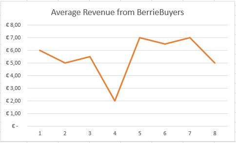
I'd like to identify the BerrieBuyers (Erin and Brad) and plot their average revenue over time.
The result as a table and as a graph would look like below.
| BerrieBuyers | January | February | March | April | May | June | July | August |
| Erin | € 6,00 | € 5,00 | € 8,00 | € 2,00 | € 7,00 | € 8,00 | € 7,00 | € 5,00 |
| Brad | € 6,00 | € 5,00 | € 3,00 | € 2,00 | € 7,00 | € 5,00 | € 7,00 | € 5,00 |
| Total | € 12,00 | € 10,00 | € 11,00 | € 4,00 | € 14,00 | € 13,00 | € 14,00 | € 10,00 |
| Average Rev | € 6,00 | € 5,00 | € 5,50 | € 2,00 | € 7,00 | € 6,50 | € 7,00 | € 5,00 |
- Mark as New
- Bookmark
- Subscribe
- Mute
- Subscribe to RSS Feed
- Permalink
- Report Inappropriate Content
Hi RogierBI,
To achieve your requirement, create a calculate column to achieve the average value as below:
Average = CALCULATE(SUM(Table1[Revenue]) / 2, FILTER(Table1, MONTH(Table1[Date]) = MONTH(EARLIER(Table1[Date])) && (Table1[Buyer] = "Erin" || Table1[Buyer] = "Brad")))
Then you can create a line chart which reproduce your chart in excel.
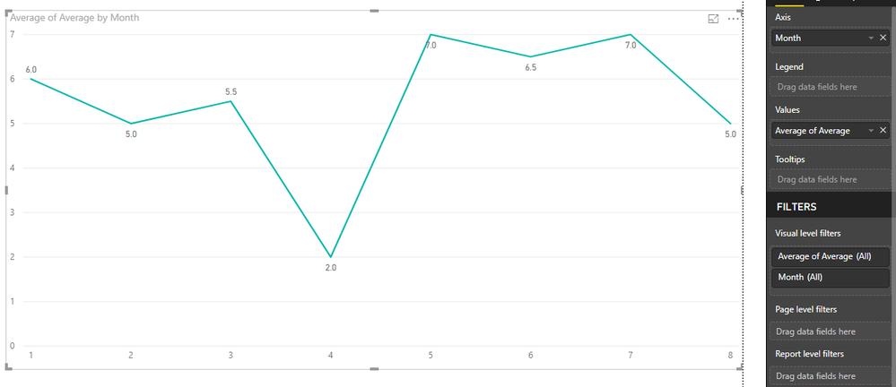
Regards,
Jimmy Tao
- Mark as New
- Bookmark
- Subscribe
- Mute
- Subscribe to RSS Feed
- Permalink
- Report Inappropriate Content
- Mark as New
- Bookmark
- Subscribe
- Mute
- Subscribe to RSS Feed
- Permalink
- Report Inappropriate Content
Thanks for the advice! I very much like the tips and tricks you provided @Seward12533 and have started doing some of the Tutorials. My PowerBI skills are limited but I've become very enhusiastic about the possibilities and am eager to learn more.
The solution of Jimmy is indeed not the way I'd like to do it, because of the need for hard coding (my list has thousands of buyers).
My goal is to have PowerBI identify the people that buy berries and then automatically create the table and graph of everything (not only berries) they've bought over time. I've managed to do this in Excel, but not yet in PowerBI.
The @Seward12533 solution also does not provide this possibility. I still have to identify the Berrie Buyers myself (Brad and Erin) and then manually select them to create the table and graph. Or am I missing something? I do like the possibility of selecting different products, but don't want to have to identify and select the buyers manually.
Kind regards, Rogier
- Mark as New
- Bookmark
- Subscribe
- Mute
- Subscribe to RSS Feed
- Permalink
- Report Inappropriate Content
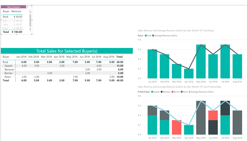
Thanks, that is not too difficult. You can either to it with visual filters or in DAX. See this realted post.
Here is sample using DAX https://1drv.ms/u/s!AuCIkLeqFmlhhJoSaNg6AMjIQC8Sgw
Look at the tab labled Dynamic.
The Top Table lists only Berry Buyers. If you select any of the buyers the table below and the graphs show all sales for that buyer.
- Mark as New
- Bookmark
- Subscribe
- Mute
- Subscribe to RSS Feed
- Permalink
- Report Inappropriate Content
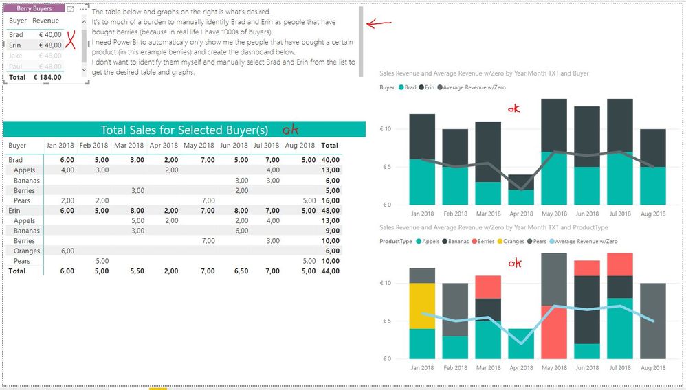
Hi @Seward12533
Sorry, but this is not exactly what I meant.
Although the Table and the graphs look exactly the way I had them in mind by the way, identifying Brad and Erin and then selecting them is still a manual job.
The dashboard should automatically only list people that have bought berries (that would be Brad and Erin). The other people (Jake and Paul) should be filtered out automatically.
My goal is to create a dashboard based on identifying people that have bought a certain product and then showing their purchase history automatically. No manual selection should be needed.
- Mark as New
- Bookmark
- Subscribe
- Mute
- Subscribe to RSS Feed
- Permalink
- Report Inappropriate Content
Its easy enough a fairly simple extension of what I built for you which was intented to show you logic and approach. If I get time I will try to build it for you but please dont' take this wth wrong way, there is a limit to the amount of free consulting you should expect us to do for you and you need to invest in learing how PowerBI works or hire someone who does.
- Mark as New
- Bookmark
- Subscribe
- Mute
- Subscribe to RSS Feed
- Permalink
- Report Inappropriate Content
Hi @Seward12533. No worries, I appreciate all the help I get (and have gotten so far).
I won't expect too much, which is fine. I've already gotten more then I had hoped for.
I'm doing some of the online courses now, so maybe I'll be able to solve it myself soon.
If that's the case I'll post my solution here for others to profit from.
Cheers!
- Mark as New
- Bookmark
- Subscribe
- Mute
- Subscribe to RSS Feed
- Permalink
- Report Inappropriate Content
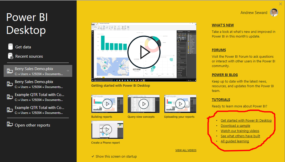
Hi, the table stucture you want is not easy to do in PowerBI showing details and then totals and averages below. I used separate matrix tables, you could write sepearate measures for each and use the same display on Rows trick I used to to build show the totals and averages. (Tip you would use calculate). The paradigm of PowerBI and PowerPivot are very different than Regular Excel. I woudl strongly recommend you take time time to learn the basics with PowerBI (lots of great content out there including links right from inside powerbi.
That said I did build a demo with your data including a few advanced tricks to give you ideas (like Dynamic Titles, creating the date table dynamically via DAX from your data, tweaking formatting options for slicers to get you buttons). Tho the data you shared didn't match the snip you posted.
Helpful resources

Microsoft Fabric Learn Together
Covering the world! 9:00-10:30 AM Sydney, 4:00-5:30 PM CET (Paris/Berlin), 7:00-8:30 PM Mexico City

Power BI Monthly Update - April 2024
Check out the April 2024 Power BI update to learn about new features.

| User | Count |
|---|---|
| 113 | |
| 97 | |
| 85 | |
| 70 | |
| 61 |
| User | Count |
|---|---|
| 151 | |
| 121 | |
| 104 | |
| 87 | |
| 67 |
