- Power BI forums
- Updates
- News & Announcements
- Get Help with Power BI
- Desktop
- Service
- Report Server
- Power Query
- Mobile Apps
- Developer
- DAX Commands and Tips
- Custom Visuals Development Discussion
- Health and Life Sciences
- Power BI Spanish forums
- Translated Spanish Desktop
- Power Platform Integration - Better Together!
- Power Platform Integrations (Read-only)
- Power Platform and Dynamics 365 Integrations (Read-only)
- Training and Consulting
- Instructor Led Training
- Dashboard in a Day for Women, by Women
- Galleries
- Community Connections & How-To Videos
- COVID-19 Data Stories Gallery
- Themes Gallery
- Data Stories Gallery
- R Script Showcase
- Webinars and Video Gallery
- Quick Measures Gallery
- 2021 MSBizAppsSummit Gallery
- 2020 MSBizAppsSummit Gallery
- 2019 MSBizAppsSummit Gallery
- Events
- Ideas
- Custom Visuals Ideas
- Issues
- Issues
- Events
- Upcoming Events
- Community Blog
- Power BI Community Blog
- Custom Visuals Community Blog
- Community Support
- Community Accounts & Registration
- Using the Community
- Community Feedback
Register now to learn Fabric in free live sessions led by the best Microsoft experts. From Apr 16 to May 9, in English and Spanish.
- Power BI forums
- Forums
- Get Help with Power BI
- Desktop
- I need to add Reference Band Per Pane in Power BI.
- Subscribe to RSS Feed
- Mark Topic as New
- Mark Topic as Read
- Float this Topic for Current User
- Bookmark
- Subscribe
- Printer Friendly Page
- Mark as New
- Bookmark
- Subscribe
- Mute
- Subscribe to RSS Feed
- Permalink
- Report Inappropriate Content
I need to add Reference Band Per Pane in Power BI.
Hi All
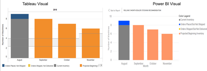
As we are migrating our reports from Tableau to Power BI. I came across this scenerio. My Technology is Tableau. Not sure is it possible in Power BI.
I am having a hard time to add reference band per pane in one of my reports in Power BI.

If You see in above above screen shot. In Tableau i have reference line - Band on each Bar ( Grey Shaded Area per bar). where i am showing 2 measures as Max and Min. I want to replicate same in power BI.
Seems like i have achieved 80% of the chart and need help in rest 20%.
All suggestions are welcomed.
Peace :
MR
Solved! Go to Solution.
- Mark as New
- Bookmark
- Subscribe
- Mute
- Subscribe to RSS Feed
- Permalink
- Report Inappropriate Content
Hi @Anonymous,
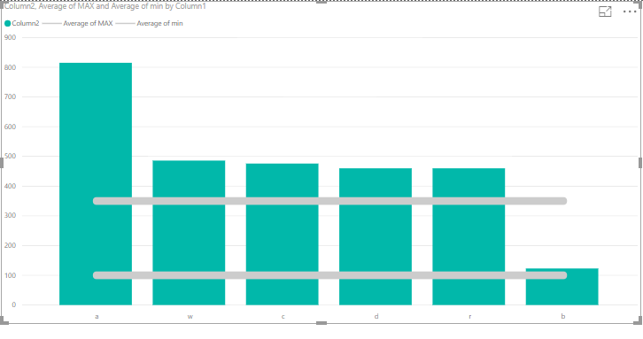
Regarding the legend you cannot show only some of the values or you show all or none.
For the shading if you take out the shading for the bottom line the shading of the top line will be kept, one option maybe is to clear the shading but make the line thicker something like in the bottom.
Regards,
MFelix
Regards
Miguel Félix
Did I answer your question? Mark my post as a solution!
Proud to be a Super User!
Check out my blog: Power BI em Português- Mark as New
- Bookmark
- Subscribe
- Mute
- Subscribe to RSS Feed
- Permalink
- Report Inappropriate Content
Hi @Anonymous,
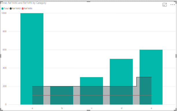
If you add a line and clustered chart and add the lines with the reference and select steped you can have both lines, you can also select the shading on max and min and it will be similar.
Regards,
MFelix
Regards
Miguel Félix
Did I answer your question? Mark my post as a solution!
Proud to be a Super User!
Check out my blog: Power BI em Português- Mark as New
- Bookmark
- Subscribe
- Mute
- Subscribe to RSS Feed
- Permalink
- Report Inappropriate Content
Hi @MFelix
Thanks for your Quick reply.
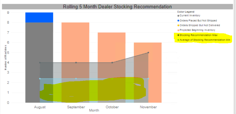
I have created the same visual using Line and Stacked Column chart. And the chart looks as below which seems to be similiar to my tableau with accurate data as well.
1. Is there a way to remove the couple of measures from legend as well. (Need to remove legends from color legend which are highlighted in yellow)
2. Is there a way, i can remove the area(below 1st line in blue color) below the first line. As i need are in grey color between the lines only.

Regards
Mahesh Rakwal
- Mark as New
- Bookmark
- Subscribe
- Mute
- Subscribe to RSS Feed
- Permalink
- Report Inappropriate Content
Hi @Anonymous,
Regarding the legend you cannot show only some of the values or you show all or none.
For the shading if you take out the shading for the bottom line the shading of the top line will be kept, one option maybe is to clear the shading but make the line thicker something like in the bottom.
Regards,
MFelix
Regards
Miguel Félix
Did I answer your question? Mark my post as a solution!
Proud to be a Super User!
Check out my blog: Power BI em PortuguêsHelpful resources

Microsoft Fabric Learn Together
Covering the world! 9:00-10:30 AM Sydney, 4:00-5:30 PM CET (Paris/Berlin), 7:00-8:30 PM Mexico City

Power BI Monthly Update - April 2024
Check out the April 2024 Power BI update to learn about new features.

| User | Count |
|---|---|
| 111 | |
| 100 | |
| 80 | |
| 64 | |
| 58 |
| User | Count |
|---|---|
| 146 | |
| 110 | |
| 93 | |
| 84 | |
| 67 |


