- Power BI forums
- Updates
- News & Announcements
- Get Help with Power BI
- Desktop
- Service
- Report Server
- Power Query
- Mobile Apps
- Developer
- DAX Commands and Tips
- Custom Visuals Development Discussion
- Health and Life Sciences
- Power BI Spanish forums
- Translated Spanish Desktop
- Power Platform Integration - Better Together!
- Power Platform Integrations (Read-only)
- Power Platform and Dynamics 365 Integrations (Read-only)
- Training and Consulting
- Instructor Led Training
- Dashboard in a Day for Women, by Women
- Galleries
- Community Connections & How-To Videos
- COVID-19 Data Stories Gallery
- Themes Gallery
- Data Stories Gallery
- R Script Showcase
- Webinars and Video Gallery
- Quick Measures Gallery
- 2021 MSBizAppsSummit Gallery
- 2020 MSBizAppsSummit Gallery
- 2019 MSBizAppsSummit Gallery
- Events
- Ideas
- Custom Visuals Ideas
- Issues
- Issues
- Events
- Upcoming Events
- Community Blog
- Power BI Community Blog
- Custom Visuals Community Blog
- Community Support
- Community Accounts & Registration
- Using the Community
- Community Feedback
Register now to learn Fabric in free live sessions led by the best Microsoft experts. From Apr 16 to May 9, in English and Spanish.
- Power BI forums
- Forums
- Get Help with Power BI
- Desktop
- I need a better option for tree hierarchy visualiz...
- Subscribe to RSS Feed
- Mark Topic as New
- Mark Topic as Read
- Float this Topic for Current User
- Bookmark
- Subscribe
- Printer Friendly Page
- Mark as New
- Bookmark
- Subscribe
- Mute
- Subscribe to RSS Feed
- Permalink
- Report Inappropriate Content
I need a better option for tree hierarchy visualization
Hello,
I wanted to put items with value with different hierarchy in a tree manner. I found some options in market place.
It worked good, but it only shows absolute value. I wanted to put percentage next to absolute value with different color (for example, in case it is minus red, plus green). I also want to put the percentage value by myself using different column, not want it to be calculated automatically from absolute value that I put.
Is there better visualization option for a tree hierarchy? (with absolute value, percentage, different color depends on the value) If it is easy, I would like to know how to develop my customized visualization. Is there anyone who had this issue? Thank you.
Best regards,
Sichang
- Mark as New
- Bookmark
- Subscribe
- Mute
- Subscribe to RSS Feed
- Permalink
- Report Inappropriate Content
Hi @Anonymous ,
Did you implement it? You could share your own solution. Or if you make sense about my answer, please accept it as a solution. More people who need the same requirement will benefit here.
Best Regards,
Xue Ding
If this post helps, then please consider Accept it as the solution to help the other members find it more quickly.
Xue Ding
If this post helps, then please consider Accept it as the solution to help the other members find it more quickly.
- Mark as New
- Bookmark
- Subscribe
- Mute
- Subscribe to RSS Feed
- Permalink
- Report Inappropriate Content
Hi, I need an interface that can show absolute value and seprate percentage value with different color. (if it is minus red, plus green something like that)
This tree will be used to replace original report. But without these three features I mentioned, I can not use your hierarchy visualization.
Do you think is there any other options for the tree interface? or is it possible to develop one by myself? Thanks.
Cheers,
Sichang
- Mark as New
- Bookmark
- Subscribe
- Mute
- Subscribe to RSS Feed
- Permalink
- Report Inappropriate Content
Hi @Anonymous ,
I have no experience to develop a custom visual. You could go to Custom Visuals Development Discussion to get some support to create one. Hope that forum will help you.
Best Regards,
Xue Ding
If this post helps, then please consider Accept it as the solution to help the other members find it more quickly.
Xue Ding
If this post helps, then please consider Accept it as the solution to help the other members find it more quickly.
- Mark as New
- Bookmark
- Subscribe
- Mute
- Subscribe to RSS Feed
- Permalink
- Report Inappropriate Content
Hi @Anonymous ,
Currently, for existing visuals, I think they can't implement to set different colors based on the value-size.
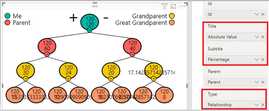
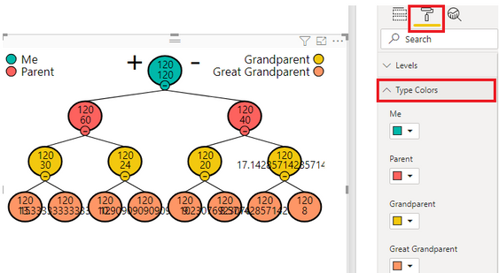
For putting percentage next to absolute value, I tried the custom visual of Hierarchy Chart by Akvelon . It works fine. And the color of data can be changed in the Format when we drag columns to the field of Type.
Best Regards,
Xue Ding
If this post helps, then please consider Accept it as the solution to help the other members find it more quickly. Kudos are nice too.
Xue Ding
If this post helps, then please consider Accept it as the solution to help the other members find it more quickly.
Helpful resources

Microsoft Fabric Learn Together
Covering the world! 9:00-10:30 AM Sydney, 4:00-5:30 PM CET (Paris/Berlin), 7:00-8:30 PM Mexico City

Power BI Monthly Update - April 2024
Check out the April 2024 Power BI update to learn about new features.

| User | Count |
|---|---|
| 106 | |
| 94 | |
| 77 | |
| 65 | |
| 53 |
| User | Count |
|---|---|
| 145 | |
| 105 | |
| 104 | |
| 90 | |
| 63 |


