- Power BI forums
- Updates
- News & Announcements
- Get Help with Power BI
- Desktop
- Service
- Report Server
- Power Query
- Mobile Apps
- Developer
- DAX Commands and Tips
- Custom Visuals Development Discussion
- Health and Life Sciences
- Power BI Spanish forums
- Translated Spanish Desktop
- Power Platform Integration - Better Together!
- Power Platform Integrations (Read-only)
- Power Platform and Dynamics 365 Integrations (Read-only)
- Training and Consulting
- Instructor Led Training
- Dashboard in a Day for Women, by Women
- Galleries
- Community Connections & How-To Videos
- COVID-19 Data Stories Gallery
- Themes Gallery
- Data Stories Gallery
- R Script Showcase
- Webinars and Video Gallery
- Quick Measures Gallery
- 2021 MSBizAppsSummit Gallery
- 2020 MSBizAppsSummit Gallery
- 2019 MSBizAppsSummit Gallery
- Events
- Ideas
- Custom Visuals Ideas
- Issues
- Issues
- Events
- Upcoming Events
- Community Blog
- Power BI Community Blog
- Custom Visuals Community Blog
- Community Support
- Community Accounts & Registration
- Using the Community
- Community Feedback
Register now to learn Fabric in free live sessions led by the best Microsoft experts. From Apr 16 to May 9, in English and Spanish.
- Power BI forums
- Forums
- Get Help with Power BI
- Desktop
- Human infographic visual
- Subscribe to RSS Feed
- Mark Topic as New
- Mark Topic as Read
- Float this Topic for Current User
- Bookmark
- Subscribe
- Printer Friendly Page
- Mark as New
- Bookmark
- Subscribe
- Mute
- Subscribe to RSS Feed
- Permalink
- Report Inappropriate Content
Human infographic visual
Hi,
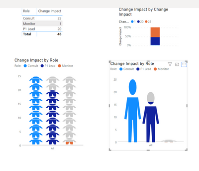
Any visualization that works best with this type of report (breakdown of roles: consult, monitor, and P1 lead)? I am really interested in using a human icon with varying levels to visualize this report. Basically, one person will perform 3 different roles - so I want to be able to visualize that.
First photo: current visual
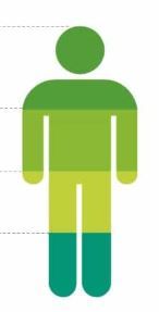
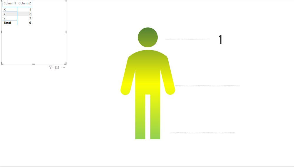
Second photo: what I want to achieve
Any help would be appreciated!
- Mark as New
- Bookmark
- Subscribe
- Mute
- Subscribe to RSS Feed
- Permalink
- Report Inappropriate Content
@Anonymous can you please let me know if you have what you need. If you do, can you please accept a solution.
- Mark as New
- Bookmark
- Subscribe
- Mute
- Subscribe to RSS Feed
- Permalink
- Report Inappropriate Content
Hi @smpa01
None of the responses work for what I am trying to do. There are some constraints given the data I have. Should I still mark it as a solution if it wasn't solved?
Patrick
- Mark as New
- Bookmark
- Subscribe
- Mute
- Subscribe to RSS Feed
- Permalink
- Report Inappropriate Content
@Anonymous it is 100% doable.
Steps
1. open a ppt
2. Insert icon
3. Search by human
4. Insert your choice of icon
5. change to shape
6. add gradient
7. add additional arrows
8. save as png
9. export that png as page backgroud with transparency 0% and adjust image fit
10. put your measure along the arrows
- Mark as New
- Bookmark
- Subscribe
- Mute
- Subscribe to RSS Feed
- Permalink
- Report Inappropriate Content
Hi @Anonymous ,
Another option, although not exactly what you requested, is to try the custom visual Infographic Designer (free) from the marketplace.
You can achieve something like this which gives you a human icon.
I also looked at Synoptic Panel https://okviz.com/synoptic-panel/ but I could not achieve your exact requirements.
Maria
- Mark as New
- Bookmark
- Subscribe
- Mute
- Subscribe to RSS Feed
- Permalink
- Report Inappropriate Content
Hi @MariaP
Thanks for trying it out. I think the issue is that I have is a 'text string' versus a number that can be totalled (sum). I might stick with a pie chart for now until I figure it out.
For some reason, I thought it would be easy to convert a pie chart into an infographic visual. 😞
Patrick
- Mark as New
- Bookmark
- Subscribe
- Mute
- Subscribe to RSS Feed
- Permalink
- Report Inappropriate Content
Hi @Anonymous,
I didn’t find a suitable visual with a humanoid icon in the marketplace after my investigation. The following three types of visualizations(Funnel, Pie Chart and Donut Chart) can display your data intuitively, if can use them?
Best Regards
Rena
If this post helps, then please consider Accept it as the solution to help the other members find it more quickly.
Helpful resources

Microsoft Fabric Learn Together
Covering the world! 9:00-10:30 AM Sydney, 4:00-5:30 PM CET (Paris/Berlin), 7:00-8:30 PM Mexico City

Power BI Monthly Update - April 2024
Check out the April 2024 Power BI update to learn about new features.

| User | Count |
|---|---|
| 119 | |
| 107 | |
| 69 | |
| 68 | |
| 43 |
| User | Count |
|---|---|
| 148 | |
| 104 | |
| 102 | |
| 89 | |
| 66 |


