- Power BI forums
- Updates
- News & Announcements
- Get Help with Power BI
- Desktop
- Service
- Report Server
- Power Query
- Mobile Apps
- Developer
- DAX Commands and Tips
- Custom Visuals Development Discussion
- Health and Life Sciences
- Power BI Spanish forums
- Translated Spanish Desktop
- Power Platform Integration - Better Together!
- Power Platform Integrations (Read-only)
- Power Platform and Dynamics 365 Integrations (Read-only)
- Training and Consulting
- Instructor Led Training
- Dashboard in a Day for Women, by Women
- Galleries
- Community Connections & How-To Videos
- COVID-19 Data Stories Gallery
- Themes Gallery
- Data Stories Gallery
- R Script Showcase
- Webinars and Video Gallery
- Quick Measures Gallery
- 2021 MSBizAppsSummit Gallery
- 2020 MSBizAppsSummit Gallery
- 2019 MSBizAppsSummit Gallery
- Events
- Ideas
- Custom Visuals Ideas
- Issues
- Issues
- Events
- Upcoming Events
- Community Blog
- Power BI Community Blog
- Custom Visuals Community Blog
- Community Support
- Community Accounts & Registration
- Using the Community
- Community Feedback
Register now to learn Fabric in free live sessions led by the best Microsoft experts. From Apr 16 to May 9, in English and Spanish.
- Power BI forums
- Forums
- Get Help with Power BI
- Desktop
- How to visualize most recent known value (measure)
- Subscribe to RSS Feed
- Mark Topic as New
- Mark Topic as Read
- Float this Topic for Current User
- Bookmark
- Subscribe
- Printer Friendly Page
- Mark as New
- Bookmark
- Subscribe
- Mute
- Subscribe to RSS Feed
- Permalink
- Report Inappropriate Content
How to visualize most recent known value (measure)
Hi,
background:
I have a dataset that tracks school performance based on attendance that categorizes the schools into low, medium, or high performing.
The dataset looks like this:
| School_ID | Date | Performance | score |
| 1013 | June 2020 | 0.5 | Medium |
| 1013 | July 2020 | 0.75 | Medium |
| 1013 | August 2020 | 1 | high |
| 1122 | June 2020 | 0 | 0 |
| 1122 | July 2020 | 0.7 | Medium |
| 1122 | August 2020 | 0.9 | high |
| 1135 | June 2020 | 0.6 | Medium |
| 1135 | July 2020 | 0.6 | Medium |
| 1135 | August 2020 | 0.7 | 0 |
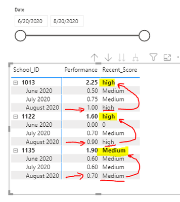
I have a measure that returns the most recent known score of the schools:
Recent_Score =

VAR LatestDate =
max(attendance[Date])
VAR LatestValue =
         MAXX(
            FILTER(
                attendance,
                attendance[Date] = LatestDate
            ),
            attendance[score]
        )
Return
    LatestValue
This works great when used across a date slicer so that we can always determine the most recent performance of that school based on the date (over time):
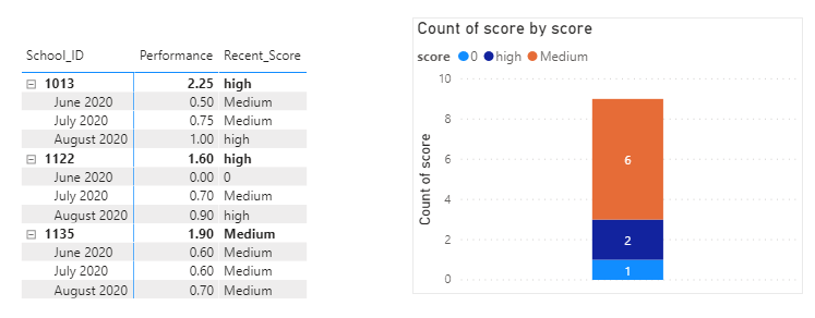
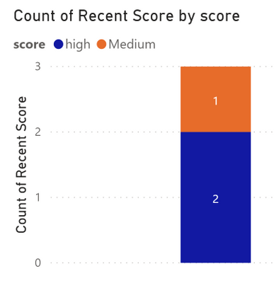
However, the issue I've run into and cannot seem to solve is that I would like to know: How many schools are performing in each category given the most recent known performance in that date period. I essentially want a stacked bar graph like below but instead of medium: 6, high:2, and 0: 1 it would show high: 2, Medium 1 based on the recent score in the matrix to the left.
I've attached a sample .pbix file here.
Help?
Thanks in advance.
Solved! Go to Solution.
- Mark as New
- Bookmark
- Subscribe
- Mute
- Subscribe to RSS Feed
- Permalink
- Report Inappropriate Content
@ttseng, try this measure:
Recent Score =
VAR vMaxDate =
    LASTDATE ( ALLSELECTED ( attendance[Date] ) )
VAR vResult =
    CALCULATE ( COUNT ( attendance[score] ), vMaxDate )
RETURN
    vResult
Did I answer your question? Mark my post as a solution!
Proud to be a Super User!
- Mark as New
- Bookmark
- Subscribe
- Mute
- Subscribe to RSS Feed
- Permalink
- Report Inappropriate Content
Hi,
I'd like to help. While you already have a Score column in your dataset, could you let me know the logic of assigning scores based on the performance? Is it that 0.76 and above is high? PLease clearly share the lower and upper value performance figure of each score.
Regards,
Ashish Mathur
http://www.ashishmathur.com
https://www.linkedin.com/in/excelenthusiasts/
- Mark as New
- Bookmark
- Subscribe
- Mute
- Subscribe to RSS Feed
- Permalink
- Report Inappropriate Content
Hi @Ashish_Mathur ,
Thank you for your help.
The scores is supposed is based on a range:
"0" = "0",
<.5 = "low".
<.79 = "medium",
<= 1 = "High"
Thanks,
- Mark as New
- Bookmark
- Subscribe
- Mute
- Subscribe to RSS Feed
- Permalink
- Report Inappropriate Content
@ttseng, try this calculated column in the Values field well of the column chart:
Recent Score =
VAR vSchool = attendance[School_ID]
VAR vSchoolTable =
    FILTER ( attendance, attendance[School_ID] = vSchool )
VAR vMaxDate =
    MAXX ( vSchoolTable, attendance[Date] )
VAR vTargetRow =
    FILTER ( vSchoolTable, attendance[Date] = vMaxDate )
VAR vResult =
    MAXX ( vTargetRow, attendance[score] )
RETURN
    IF ( attendance[Date] = vMaxDate, vResult, BLANK () )
Did I answer your question? Mark my post as a solution!
Proud to be a Super User!
- Mark as New
- Bookmark
- Subscribe
- Mute
- Subscribe to RSS Feed
- Permalink
- Report Inappropriate Content
HI @DataInsights ,
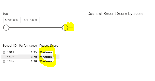
Thanks for your work on this. I tested it and it works in returning the most recent score in the whole dataset. However, when I move the date slicer to anytime before the max date it returns blank. I would like for it to return the score for the max date defined by the date slicer. The example should return a column chart with 3 for medium since those are the scores in that date range.
Thanks in advance for helping me.
- Mark as New
- Bookmark
- Subscribe
- Mute
- Subscribe to RSS Feed
- Permalink
- Report Inappropriate Content
- Mark as New
- Bookmark
- Subscribe
- Mute
- Subscribe to RSS Feed
- Permalink
- Report Inappropriate Content
@ttseng, try this measure:
Recent Score =
VAR vMaxDate =
    LASTDATE ( ALLSELECTED ( attendance[Date] ) )
VAR vResult =
    CALCULATE ( COUNT ( attendance[score] ), vMaxDate )
RETURN
    vResult
Did I answer your question? Mark my post as a solution!
Proud to be a Super User!
Helpful resources

Microsoft Fabric Learn Together
Covering the world! 9:00-10:30 AM Sydney, 4:00-5:30 PM CET (Paris/Berlin), 7:00-8:30 PM Mexico City

Power BI Monthly Update - April 2024
Check out the April 2024 Power BI update to learn about new features.

| User | Count |
|---|---|
| 112 | |
| 97 | |
| 82 | |
| 67 | |
| 61 |
| User | Count |
|---|---|
| 150 | |
| 120 | |
| 99 | |
| 87 | |
| 68 |


