- Power BI forums
- Updates
- News & Announcements
- Get Help with Power BI
- Desktop
- Service
- Report Server
- Power Query
- Mobile Apps
- Developer
- DAX Commands and Tips
- Custom Visuals Development Discussion
- Health and Life Sciences
- Power BI Spanish forums
- Translated Spanish Desktop
- Power Platform Integration - Better Together!
- Power Platform Integrations (Read-only)
- Power Platform and Dynamics 365 Integrations (Read-only)
- Training and Consulting
- Instructor Led Training
- Dashboard in a Day for Women, by Women
- Galleries
- Community Connections & How-To Videos
- COVID-19 Data Stories Gallery
- Themes Gallery
- Data Stories Gallery
- R Script Showcase
- Webinars and Video Gallery
- Quick Measures Gallery
- 2021 MSBizAppsSummit Gallery
- 2020 MSBizAppsSummit Gallery
- 2019 MSBizAppsSummit Gallery
- Events
- Ideas
- Custom Visuals Ideas
- Issues
- Issues
- Events
- Upcoming Events
- Community Blog
- Power BI Community Blog
- Custom Visuals Community Blog
- Community Support
- Community Accounts & Registration
- Using the Community
- Community Feedback
Register now to learn Fabric in free live sessions led by the best Microsoft experts. From Apr 16 to May 9, in English and Spanish.
- Power BI forums
- Forums
- Get Help with Power BI
- Desktop
- Re: How to use "Box and Whisker chart by MAQ Softw...
- Subscribe to RSS Feed
- Mark Topic as New
- Mark Topic as Read
- Float this Topic for Current User
- Bookmark
- Subscribe
- Printer Friendly Page
- Mark as New
- Bookmark
- Subscribe
- Mute
- Subscribe to RSS Feed
- Permalink
- Report Inappropriate Content
How to use "Box and Whisker chart by MAQ Software"
Power BI community
With new Jan release, I would like to use Box and Whisker chart by MAQ Software visual properly
to show
- average price a product is sold at a store
- Max price the product is sold at the store
- Min Price the product is sold at the store
I am currently showing the average price of each product by would like to show Max price and Min price as well.
How can I achieve this using the new "Box and Whisker chart by MAQ Software"??
Many thanks,
H
Solved! Go to Solution.
- Mark as New
- Bookmark
- Subscribe
- Mute
- Subscribe to RSS Feed
- Permalink
- Report Inappropriate Content
Hello,
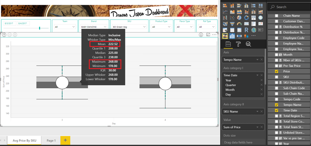
As the visual cannot distinguish between one price of August 3rd to another price of August 3rd, so the visual was providing data as a sum. We have assumed that the 'Tempo Name' field is able to distinguish between these two prices.
So for brand 'Baby Danone' and SKU 'BD Green Veg' for August 3rd 2017, the data is
Min - 178
Max - 268
Average - 222.52
Which we can easily display by providing 'Tempo Name' in Axis field -
If 'Tempo Name' is not the correct field, then just provide any primary id which can distinguish between the data.
Thanks!!
- Mark as New
- Bookmark
- Subscribe
- Mute
- Subscribe to RSS Feed
- Permalink
- Report Inappropriate Content
Hello,
I am attempting to use the whisker box to display salaries across the business. Our salary ranges have a minimum, midpoint, and maximum. How can I separately show those points on the chart along with the chart-generated quartile ranges?
- Mark as New
- Bookmark
- Subscribe
- Mute
- Subscribe to RSS Feed
- Permalink
- Report Inappropriate Content
- Mark as New
- Bookmark
- Subscribe
- Mute
- Subscribe to RSS Feed
- Permalink
- Report Inappropriate Content
Hi,
Is it possible to choose which statistical measure to see on the tooltip of the visualization? I would not like to have values for quartiles, for example.
- Mark as New
- Bookmark
- Subscribe
- Mute
- Subscribe to RSS Feed
- Permalink
- Report Inappropriate Content
Hello,
In the current version of Box and Whisker by MAQ Software, the tooltip is not configurable as to which measures needs to be displayed.
But in view of your request, we have added this enhancement in our backlog and will notify you on this thread when we have this in our next update for this visual.
Thanks.
- Mark as New
- Bookmark
- Subscribe
- Mute
- Subscribe to RSS Feed
- Permalink
- Report Inappropriate Content
Hello,
We have gone through your data, but we were unable to understand your requirement.
Please provide the items listed below so that we can reproduce the issue and further investigate it:
Detailed description of requirement
- Issue faced (if any)
Providing the details listed above will help us better prioritize this issue in our backlog and address it sooner.
We can be reached at support@maqsoftware.com
- Mark as New
- Bookmark
- Subscribe
- Mute
- Subscribe to RSS Feed
- Permalink
- Report Inappropriate Content
Hello. Thank you for your response.
I have created a simple sample data such as below.
Here is what I would like to do.
- Create a filter on Store Names and Product Names which I did as below.
- Use a box and whisker visual to show the max price, the min price and the average price of a particular product by month (axis)
This last step I am struggling with.
Thank you for your support!
Many thanks,
H
- Mark as New
- Bookmark
- Subscribe
- Mute
- Subscribe to RSS Feed
- Permalink
- Report Inappropriate Content
Hello,
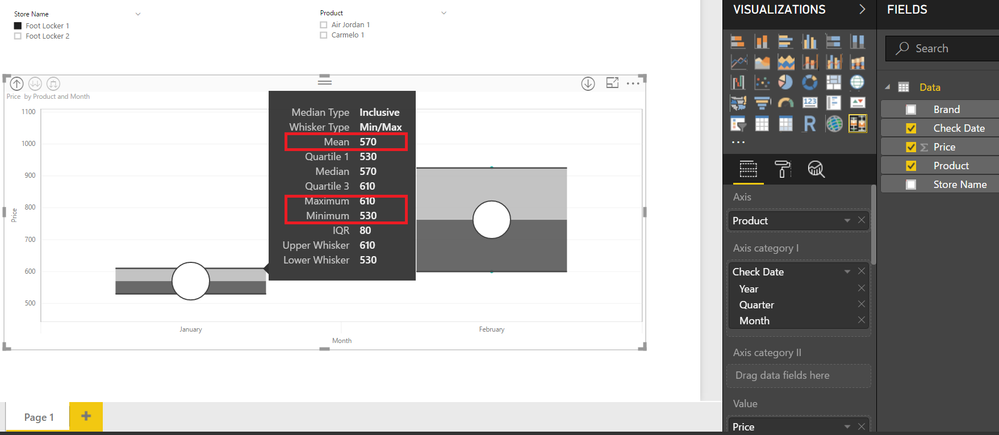
Just add 'Product' to 'Axis' field, as shown in the snapshot.
Here max price is value shown in front of Maximum, min price is value shown in front of minimum and Arithmetic mean is the average.
Please reach out to us at support@maqsoftware.com for any further queries.
Thanks!!
- Mark as New
- Bookmark
- Subscribe
- Mute
- Subscribe to RSS Feed
- Permalink
- Report Inappropriate Content
Thank you for the response.
The problem with this is that the visual is not showing the max and min value of the product.
It is showing the summation of the price.
For instance, in below shot, based on the data,
I would like to see a visual with the following for Jan (Carmelo 1)
- Max: 150
- Min: 110
- Average: 132.5
Thank you for your help!
H
- Mark as New
- Bookmark
- Subscribe
- Mute
- Subscribe to RSS Feed
- Permalink
- Report Inappropriate Content
Hello,
For that,
Just provide 'Check Date' in 'Axis' and 'Axis Category I'; 'Product' as 'Axis Category II' and 'Price' as 'Value' as shown in snapshot below -
For further information please download the User Guide of Box and Whisker by MAQ Software from here
If the information meets your needs, then we would greatly appreciate it if you posted your review of this visual at AppSource.
Thanks!!
- Mark as New
- Bookmark
- Subscribe
- Mute
- Subscribe to RSS Feed
- Permalink
- Report Inappropriate Content
Thank you for the reply and the manual on how to use.
With the sample data set provided, your solution works perfectly.
However, with my actual dataset, the price is summing up.
I have set up the rows and columns as you mentioned.
I am not sure why the price is summing up.
Any advise?
Many thanks,
H
- Mark as New
- Bookmark
- Subscribe
- Mute
- Subscribe to RSS Feed
- Permalink
- Report Inappropriate Content
Hello,
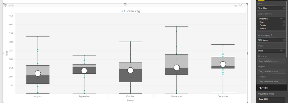
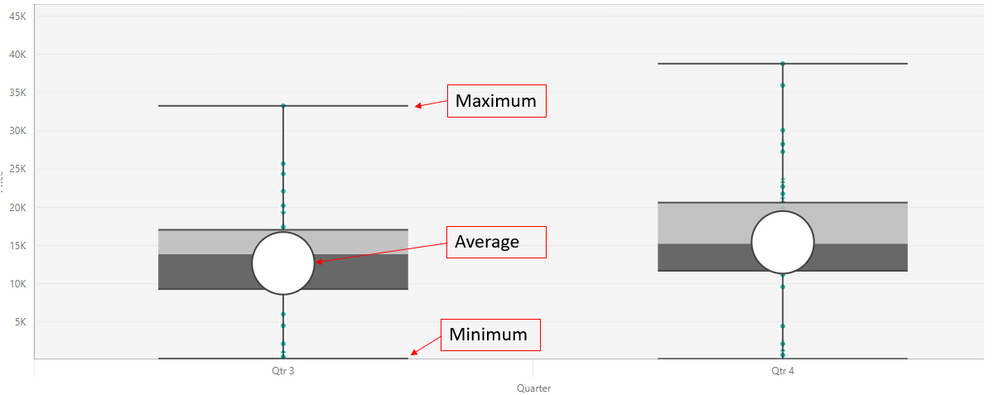
The data is not summarized. The dots represent the individual data. As shown in the image below
Thanks!!
- Mark as New
- Bookmark
- Subscribe
- Mute
- Subscribe to RSS Feed
- Permalink
- Report Inappropriate Content
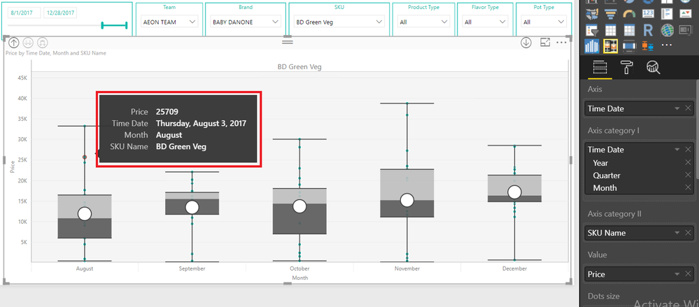
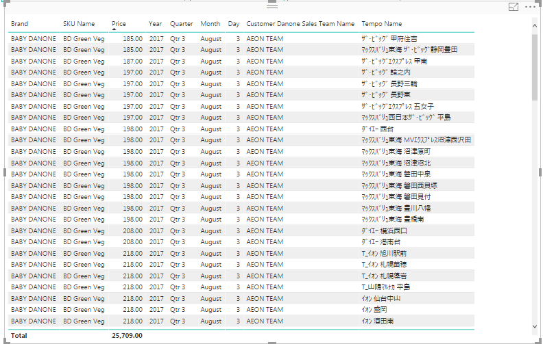
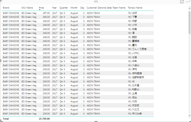
Thank you for your response, and it actually is summing up the data at store level.
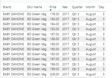
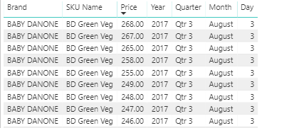
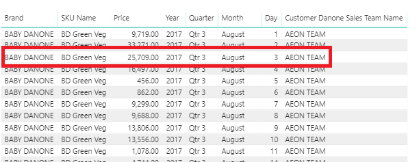
25709 on Aug 3 that you see below for the team is a summation of all the prices at each store (tempo) level for the team.
Please refer to the second screenshot.
Tempo means a store.
So what I would like to see on Aug 3 is that
Max: 267
Min: 185
Average: 227.5
(Exclusing a value 0)
Do you think my requirement above is feasible with Box and Whisker visual?
Many thanks,
H
- Mark as New
- Bookmark
- Subscribe
- Mute
- Subscribe to RSS Feed
- Permalink
- Report Inappropriate Content
Hello,
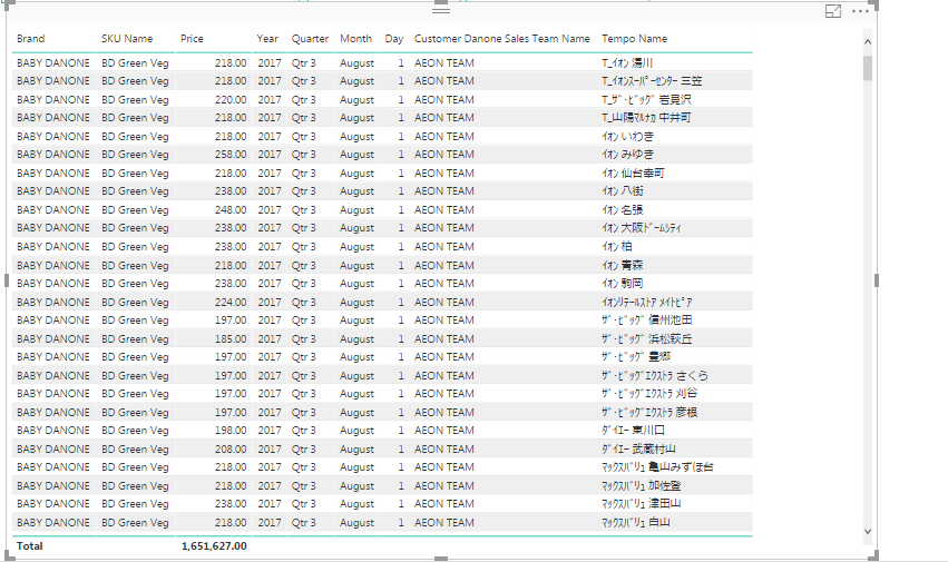
As the visual cannot distinguish between one price of August 3rd to another price of August 3rd, so the visual was providing data as a sum. We have assumed that the 'Tempo Name' field is able to distinguish between these two prices.
So for brand 'Baby Danone' and SKU 'BD Green Veg' for August 3rd 2017, the data is
Min - 178
Max - 268
Average - 222.52
Which we can easily display by providing 'Tempo Name' in Axis field -
If 'Tempo Name' is not the correct field, then just provide any primary id which can distinguish between the data.
Thanks!!
- Mark as New
- Bookmark
- Subscribe
- Mute
- Subscribe to RSS Feed
- Permalink
- Report Inappropriate Content
- Mark as New
- Bookmark
- Subscribe
- Mute
- Subscribe to RSS Feed
- Permalink
- Report Inappropriate Content
Hello!
i’m also interested in the visual. Is there any way to display the max/min/average values in the visual (apart from the tooltips)?
It would be great if you could, and also enable the option of which values to dsiplay in the tooltips itself.
I would like to use the visual to display simple values stated above, to reflect max/min/average prices, and it would be more user friendly if the option to actually see the values was available, and lower the “clutter” (in my instance) within the tooltips.
regards,
Paul.
Did I answer your question? Mark my post as a solution!
In doing so, you are also helping me. Thank you!
Proud to be a Super User!
Paul on Linkedin.
- Mark as New
- Bookmark
- Subscribe
- Mute
- Subscribe to RSS Feed
- Permalink
- Report Inappropriate Content
Hello Paul,
Max, Min and Average are already shown in the visual as shown in the snapshot below
For tooltips visible when we hover on dots, all fields are necessary to identify the dot.
For tooltips visible when we hover on Box and Whisker, we have added your request to our backlog. Please reach out to us with detailed description regarding which fields you want to display at support@maqsoftware.com
Thanks!!
- Mark as New
- Bookmark
- Subscribe
- Mute
- Subscribe to RSS Feed
- Permalink
- Report Inappropriate Content
Thank you for that explanation. I apologise since I was not clear. What I mean by displaying the values is to see the atual "number" for max/min/average, as well as the line/dot.
What I think would also be very useful is if the tooltips displayed the number of samples analysed.
Thanks again,
Paul.
Did I answer your question? Mark my post as a solution!
In doing so, you are also helping me. Thank you!
Proud to be a Super User!
Paul on Linkedin.
Helpful resources

Microsoft Fabric Learn Together
Covering the world! 9:00-10:30 AM Sydney, 4:00-5:30 PM CET (Paris/Berlin), 7:00-8:30 PM Mexico City

Power BI Monthly Update - April 2024
Check out the April 2024 Power BI update to learn about new features.

| User | Count |
|---|---|
| 114 | |
| 101 | |
| 78 | |
| 75 | |
| 49 |
| User | Count |
|---|---|
| 145 | |
| 108 | |
| 107 | |
| 89 | |
| 61 |
